Custom Flash Cards for Kids – Cognitive Card Decks
$1.20
Custom flash cards for kids learning, built for gift shops, toy distributors and DTC education brands. The photographed decks teach with words: large centered lowercase terms over paired-word footer bands, sight-word sets grouped by blue, green, yellow and red gradient tabs, rounded corners on every stiff matte board, and an upright tuck carton whose front panel is left blank for your brand. The sample stack is annotated 4.75 by 3.5 inches, a pocket proportion that survives diaper bags and stocking stuffers, with corner-punched ring binding available as a quoted option. Retail-ready packs, bilingual footer swaps and planogram quantities all run from your word list. MOQ 100 pcs per design, free digital mock-up, samples 3-5 days, production 7-15 days after artwork approval, FBA prep handled at our line.
A gift-shop endcap needs a product a parent understands in three seconds. Custom flash cards for kids learning fill that slot: a stiff box, big type, and a deck that survives being dropped, chewed near and re-shelved. Our photographed samples show the word-card genre this line runs: paired opposite words, sight-word sets with color-coded tabs, rounded corners on every face, and a printed carton that does the selling before anyone opens it. Retail buyers, toy distributors and DTC education brands order the same construction with their own word lists and box art.
Why Card Decks Reorder Faster Than Most Shelf Toys
Plush, hard goods and screens fight for aisle attention once a season. A word deck gets used at breakfast, in a waiting room and at bedtime, then gets asked for again as a birthday add-on and a stocking filler, because the purchase decision is a parent’s quiet hope, not a child’s demand. For shop owners that means stable sell-through on a small footprint: a single deck splayed flat beside the register takes centimeters, not shelf meters. For museums and visitor centers with a learning corner, the same SKU doubles as the take-home item after hands-on play. And for online DTC brands, a deck is light, flat, cheap to ship in a bubble mailer and easy to bundle into tiered kits, which is why subscription toy boxes keep this category on recurring purchase orders instead of one-off launches.
There is also a returns-and-breakage angle that favors this build. The photographed cards are stiff boards with rounded corners, the geometry that resists curling in a bag and blunt-edge complaints on a listing page. A soft-paper deck gets bent inside a week; the board weight shown in these photos is what keeps review scores honest on marketplaces.
The Box Is the Sales Pitch
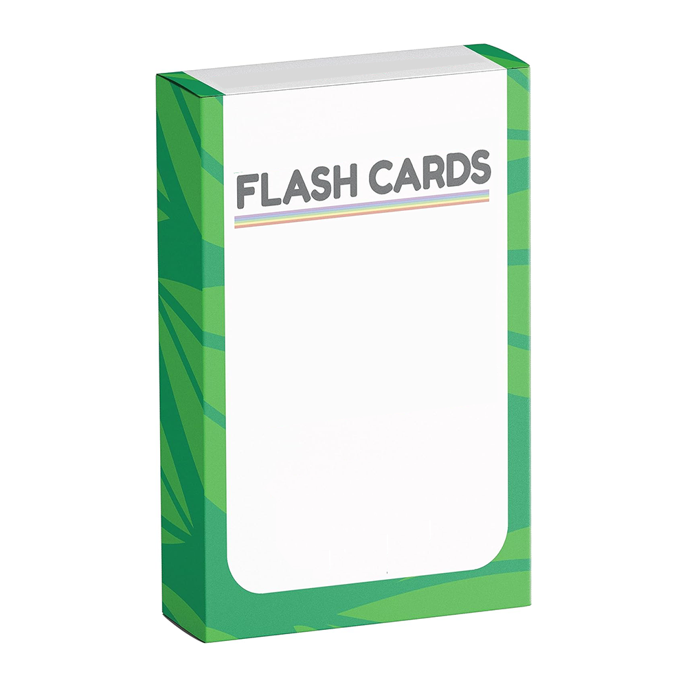
First photograph: an upright portrait carton, three-quarter view, body wrapped in overlapping green fronds across the sides and corners while the front holds a big white rounded-corner field. At the top of that field, FLASH CARDS prints in bold gray caps over three thin pastel rules, purple, green and orange. Below the title the panel is deliberately blank in our sample, which is exactly the zone your brand takes: series name, mascot, method claim line, window, whatever your packaging plan needs. The carton is a tuck-flap folding box with square corners, matte flat print, no foil or relief anywhere, and a design that reads cleanly at arm’s length through a shelf face-out. Retail buyers who need a hang-hole, a window die-cut or a bilingual panel order those as layout changes to the same tooling class, quoted against your artwork.
Two construction details in that first photo carry real freight consequences. The carton prints flat, without any metallic or raised decoration, which means no foil dust on the die and no crushed relief under pallet weight; a gift program shipping forty decks per master gets a flatter, cheaper box that still looks designed on the hook. And the portrait proportion itself is deliberate: tall boxes stand in demo towers and window displays without a riser, while a square box needs a jig to face out. When you send carton dielines from your designer, we map them against these proven folds, because the tuck-flap geometry that keeps a deck from migrating out of its box in transit is the one detail customers never photograph but always notice when it fails.
The Word-Pair Face: Two Words per Card, Zero Extra Print
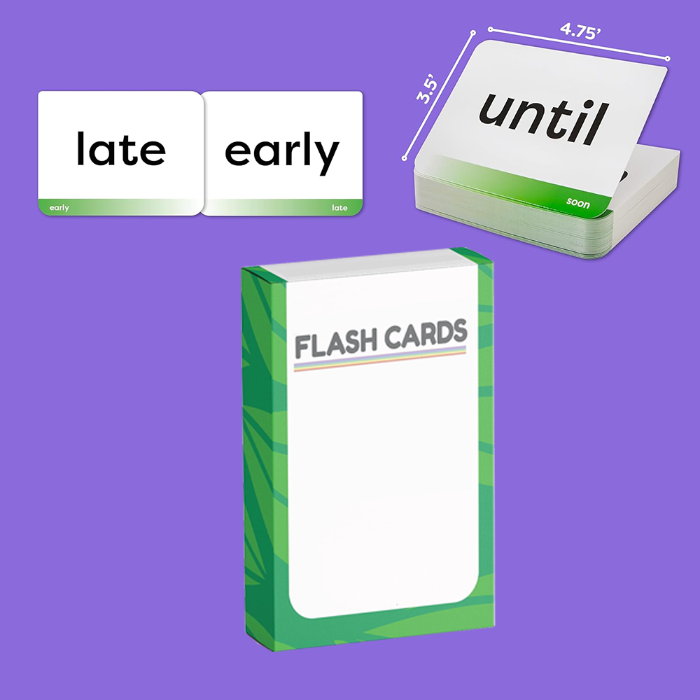
Second photograph lays out the deck’s teaching format and its dimensions at once. Two loose landscape cards sit side by side: one prints late as a large centered lowercase word with a small green gradient footer band carrying the paired word early; the mirror card flips the composition. A third pairing, until over soon, rides the top card of a thick deck stack. The layout logic matters commercially: one face, two words, a relationship the reader completes. No pictures needed, so artwork costs drop and translation becomes a text edit. The stack in the same frame is annotated 4.75 inches wide by 3.5 inches tall in a listing overlay, a pocket size that slides into diaper bags and car consoles without bending. Every visible card corner is rounded, the faces print flat and matte on white board, and the deck in the photo ships loose, no holes and no rings, which keeps unit cost at its honest floor.
A buyer comparing quotes should note where money goes in this format. The footer gradient is a two-color zone repeated across the whole run, cheap and consistent. Swapping gradients for full-bleed art backgrounds turns every card into a print-heavy page. Keeping the face mostly white with one large word and one small band is what lets retail price points stay aggressive while the box carries the decoration budget.
The paired-word mechanic also buys your marketing team options it rarely notices at spec time. Because the relationship words live in the band, one print run serves two readings: flip the pair mentally and it still teaches, which gives reviewers a reason to photograph stacks rather than single faces. Because nothing depends on imagery, the same die and the same color count carry an early-reader list of two hundred words and an ESL list of two hundred more; only the text layer changes between the two SKUs, so a second edition is a proofing exercise, not a re-tooling one. Language programs exploit this constantly, pairing a local first word with an English band word for travel gift racks. One caution from the file-checking desk: keep each word on a single line at the chosen point size. The centered field is the design’s spine, and a wrapped second line collapses the hierarchy that makes the format readable from a meter away.
The stack photo quietly answers the other question every toy buyer asks: how many cards make a deck. Counting the exposed edge grain of that block, our sample deck runs thick enough to feel substantial in the box yet shallow enough to price as an impulse item, and card counts are yours to set per design, from a sixty-word starter deck to a two-hundred-face program across three tab colors. There is no tooling penalty for a bigger count because every face is just another slot in the same imposition; the real cost break comes when word count pushes a deck past what one carton cavity holds, which is a packing decision, not a print one. Send your target count with the word list and we spec the cavity around it, so the deck fills its box instead of rattling in empty space, a detail reviewers notice on video the moment a unit arrives.
The In-Use Shot: Color Tabs Do the Wayfinding
Third photograph is the one parents actually recognize: a staggered grid of loose cards on a warm wood table, a small child’s hand pinching one face up from the spread. That held card reads ship with a small companion word riding a blue gradient tab along one edge, and the grid behind it repeats the system in four tab colors, blue, green, yellow, red, each grouping a level or theme. Every card follows the same field order: big lowercase word upper-center, small paired word inside the color band, rounded corners, stiff matte board. The color band is doing quiet merchandising work: a shop can shelve blue next to green and the assortment looks like a program, not a pile, while at home a parent sorts levels by glance instead of reading backs. Cards in the spread are cut off at the frame edge and one face sits blank, ordinary staging, but it proves the blank-reverse option exists: some sets print both sides, ours ships whichever your layout specifies.
Note the scale cue too. The hand lifting the ship card is a toddler’s, and the card spans roughly two adult-child palm widths, consistent with the 4.75 by 3.5 annotation in the second photo rather than a smaller kindergarten strip size. If your market skews younger, a shorter edge and heavier radius on the corners are both spec changes we quote from the same tooling families.
Merchandisers reading that spread should also clock the blank face lying at the grid’s edge. It shows the reverse-of-card state honestly: nothing printed, nothing to align in double-sided imposition, which trims plate count and keeps the deck cheap enough for a gift-shop margin stack. Teams that want double-sided faces, a pronunciation note or a small pictogram opposite the word, move to a duplex layout and price accordingly; both builds are routine, and the decision belongs at the quote stage rather than mid-production.
Set counts deserve the same hard look at this stage. A four-color tab program is naturally four designs under our ordering rules, each starting at 100 pcs, and many gift accounts launch with two tabs and expand toward holidays, which keeps first capital low while the shelf story still reads as a family. DTC brands do the opposite and buy all four levels at once to feed bundle offers, three decks shrink-wrapped for a gift price point. Both paths work against the same plate files, and neither forces a minimum you have to sell through before the next stage of the ladder ships. Ask for the tab-color sheet early: naming the colors to your levels, not to our stock inks, is the step that makes reorders painless two seasons later when you have brand guidelines to protect.

The Layer Graphic: What It Shows and What It Asks
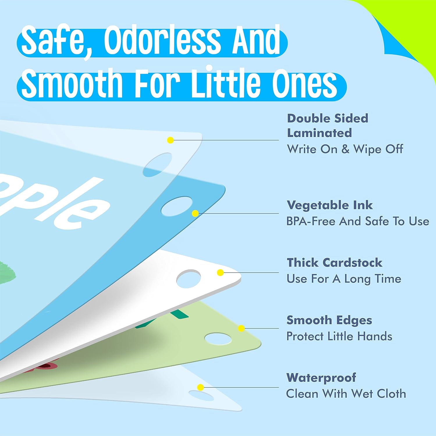
Fourth photograph belongs to a different genre: a listing-style build graphic that explodes one card into fanned layers over a blue field, with leader lines pointing from printed callout text to each sheet. We keep our copy strictly to what such a frame proves. Aligned punched holes sit in one corner of every layer, showing the optional ring-bind build: deck, minus a ring, plus a corner hole. The corners are again rounded and the core layer reads as a thick white board. The marketing wording printed inside that sample graphic, its safety, ink and cleaning claims, is artwork from the reference image and not a statement of ours; we do not reproduce it on this page. What we will tell you plainly: coating, core board weight, wipe-clean film and single-ring binding are all quotable build options, and each moves unit price, so spec them against a physical proof, not against a competitor’s infographic.
Your Specification Points per Design
- Word list and pairing logic: opposites, synonyms, categories or first-word sets from your editor
- Face layout: large centered word plus footer band as photographed, or full-art faces quoted against proofs
- Tab or band colors: four-color grouping system shown in the spread, matched to your level naming
- Card size: 4.75 x 3.5 inches as annotated in the sample; other common pocket sizes quoted on request
- Corners: rounded on every photographed card; radius depth set with the die
- Binding: loose deck as shown, or corner-punched with open rings as the layer graphic’s holes imply
- Box: tuck carton with your art panel; window cuts, hang tabs and bilingual faces as layout changes
Deck Construction, Line by Line
| Item | Custom flash cards for kids learning, word decks in printed retail cartons |
| Size | 4.75 in x 3.5 in as annotated on the sample stack; other common sizes quoted on request |
| Stock & Finish | Stiff white board with matte flat print in photos; core weight and coating upgrades quoted with your proof |
| Printing & Artwork | Full-color fronts, paired-word or color-tab layouts; free digital mock-up from your word list |
| Envelope or Extras | None applicable; open rings for punched decks, inserts and shelf cards quoted as extras |
| Packing | Decks in printed cartons, inner boxes into export masters per the freight chart below |
| MOQ | 100 pcs per design |
| Sample time | 3-5 days |
| Lead time | 7-15 days after artwork approval |
| Capacity | 1,000,000 pcs per month across our gift lines |
Getting a Deck onto a Planogram
Retail slots move on dates set long before you need stock. A stocking-stuffer or spring shelf reset means approving artwork, then counting back through 7-15 days of production plus your freight window; sea freight demands sign-off months early, while air and courier lanes rescue a late planogram with a thinner margin. Physical decks come back in 3-5 days after the free digital mock-up, which is the stage where tab colors, radius depth and carton heft get judged by hands rather than pixels. Mixed assortments split cleanly across the MOQ rule: each card design or each themed deck counts as its own design at 100 pcs, so a four-level program is four line items, not one huge order. Online pricing shown reflects the 100-piece tier as a reference, never a fixed rate for full-planogram quantities.
Packing and Freight for Shelf-Ready Decks
Cartons ride interleaved in fitted inner boxes so carton corners reach the store shipper unbruised, and master cartons get counted, weighed and labeled per lane: sea, air, DHL, UPS, FedEx or TNT. Marketplace sellers routinely ask for FBA prep on this SKU, retail-polybag counts and carton-level labeling handled here so inbound skips the prep center markup. Seasonal gift accounts co-load decks with flat print items into one master so a holiday bundle lands in a single delivery.

Questions Retail Buyers Ask Before the First Order
Do the photographed decks come with binding rings?
Can we keep the box shape but replace all artwork with our brand?
What content formats have you printed besides word pairs?
How small can one test order be before a planogram commitment?
Is the 4.75 x 3.5 size mandatory for this layout family?
Can a school or museum gift shop order bilingual faces?
Decks and Print Lines That Share Your Shelf
Compare siblings in the cards category, browse the wider printed items index for co-load freight, or pair this toddler format with the reading-method custom phonics flash cards our curriculum buyers reorder termly. Gift programs bundling decks at holiday can price against festival gift sets, and a quote request reaches the line planner directly at [email protected] or +86-15967739086.
Send your word list, your colors and your shelf date. Mock-up next, deck in hand within 3-5 days, and a planogram-ready carton before the season starts selling it for you.
One more check before you spec a run: ask us to return your artwork over this exact build — same exploded layers, your word list, your tab colours, one aligned ring punch — as a single digital mock-up inside 48 hours of the brief. It is the fastest way to catch a mismatched pair, a tab that reads too dark on a grey shelf, or a corner hole that lands on a word.
Related products
-
Custom DIY Sticker Food
$1.10