Custom Hooded Blanket With Pockets For Merch
$10.80
Cinema retail, esports org stores, festival booths and streaming drops all sell the one wearable that advertises itself mid-use: a custom hooded blanket with pockets, built double-layer — plush outer pile turned to a white sherpa inner that faces the hood opening, lines the crown and binds both kangaroo entries, so hands meet loop pile on either side of the pouch. Five studio photographs on this page hold the spec visible: dimpled minky or smooth plush faces, deep unstructured or shape-holding pointed hoods, three cuff answers (open hemmed, rib-knit, dolman-uncuffed) with one purple frame’s turned corner flashing the sherpa backing as construction proof. Merch artwork maps to signed zones — chest hero block bounded by hood seam and pouch stitch, uninterrupted full back, collector details on the hood crown, curve-compensated sleeve wings — rendered worn on a free mock-up before anything runs. Adult-versus-kid grading follows your target chart and gets verified on the 3-5 day physical sample, because no photograph on this page prints body-length numbers, and no gsm does either: weight quotes against a sample, never a picture. MOQ 100 pcs per design covers a graded run as one line; bulk ships 7-15 days after artwork approval against a 1,000,000 pcs per month capacity across our gift lines; pack tiers from store-bound light vacuum to e-commerce flat brick ride the freight calendar you give us.
A Custom Hooded Blanket With Pockets That Works As Merchandise
A custom hooded blanket with pockets is the one textile SKU that advertises itself while being used: someone in a stadium concourse, a dorm movie night or a tournament finals run is walking merchandise the moment they pull the hood up. This page is written for fandom merchandisers, cinema and streaming retail teams, esports org stores, label merchandise managers and campus bookstores who sell wearables alongside tees. The construction argument comes first, and it comes entirely from five studio photographs of our own product: plush outer face, sherpa inner layer, oversized lined hood, front kangaroo pouch, and cuff behaviour that changes with the cut. Anything a frame cannot show — body-length grading between adult and kid runs, pile weight, licence artwork — is marked quoted-on-request instead of promised.
The division inside our textile floor keeps this lane clean: the lightweight printed throw handles corporate gifting, the heavy double-layer bed panel handles homeware aisles, and this wearable sits squarely in the novelty-merchandise business, where the product is meant to be worn into public and photographed by strangers. Business numbers up front so merch planners can build the calendar: MOQ 100 pcs per design, samples 3-5 days, bulk production 7-15 days after artwork approval, capacity 1,000,000 pcs per month across our gift lines. Tour dates, season drops and album windows all inherit those numbers without negotiation.
The Chest Panel Is Your Whole Merch Board
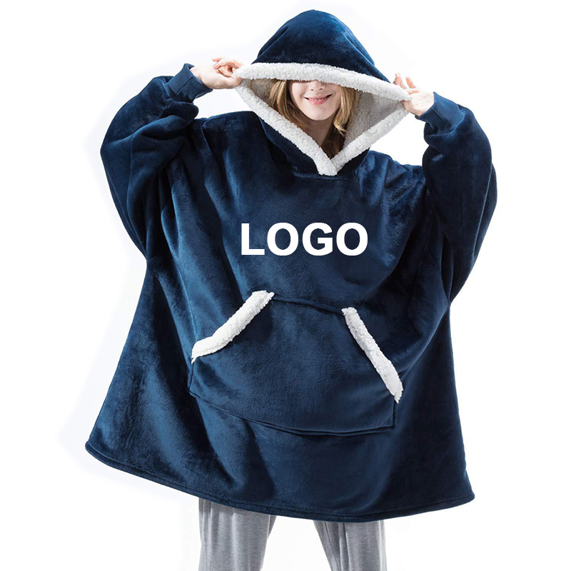
The frame above is the money shot of this page, and the reason is typographic. A bold one-word placeholder sits centred across the chest in white capitals — a slot, nothing more, but positioned exactly where merchandise earns its keep: eye level when the wearer stands, centred when they sit, unbroken by the hood seam above or the pouch below. Whatever replaces it — tour wordmark, crest, artist lockup, squad tagline — inherits that placement physics. Around the placeholder the garment reads its spec sheet: deep navy face with a dimpled, dotted minky pile that photographs with soft texture rather than flat colour, a cream sherpa hood lining held open by the model’s hands, the same sherpa binding the pocket entries, and sleeves finishing in navy rib-knit cuffs rather than the open hems of our other cuts.
Three construction notes carry weight for merch teams. First, the dimpled pile: patterned-texture faces like this take sublimation print differently from smooth plush — the dots survive as shadow-play inside large solid fills of artwork, which can flatter or fight your design, and the only honest way to decide is a printed proof on the actual pile, inside the 3-5 day sample window. Second, the chest zone is bounded: below it the kangaroo pocket topstitch runs across, above it the hood seam curves — safe-area lines exist whether artwork respects them or not, and our mock-up draws them before your file arrives at prepress. Third, the cuff: ribbed knit at the wrist is a different cost stack and a different washing behaviour than an open hemmed sleeve, so it is a specification choice you make at sample stage, not a surprise on the packing list.
Nothing in this frame claims a licence. The word on the chest is deliberately blank — every wearable we photograph is unprinted product carrying generic placeholder type, because merch runs are, by definition, the buyer’s artwork on our blank. The blank is the promise: a wearable that behaves exactly like the photographs from this page on every order, with your mark doing the talking.
The staging itself is part of the pitch. Face visible, hands gripping the hood open, grey jogger legs below the hem — the image shows fit and drape on a standing person, which is the only angle that sells wearables online. Retail listings that borrow flat-lay photos of hooded blankets understate the hood; this pose exists to be copied honestly, with your artwork dropped into the same coordinates.
Scale is legible too: the placeholder’s cap height reads roughly a tenth of the chest width, which is where festival merch wants a wordmark to sit — readable three rows back in a standing crowd, still confident on a thumbnail in a storefront grid. Send artwork sized against that proof and the first mock-up comes back merchandising-ready, not just printed.
Two Fabrics, One Garment: Anatomy Of The Poncho Cut
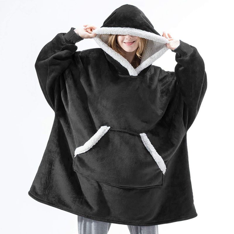
Strip the colour away and this model shot is a construction diagram in plush. Black face pile, smooth and dense; white sherpa doing the lining work everywhere the garment touches a person — inside the hood, inside the deep V of the face opening where the sherpa folds forward as facing, and along both angled pocket entries. That last detail is the giveaway of a real double-layer build versus a printed imitation: the sherpa isn’t decorative trim applied after sewing, it is the second fabric of the panel itself, turned and stitched so the wearer’s hands meet loop pile on both sides of the pouch. Sleeves here finish as plain hemmed cuffs, the face fabric folded and stitched, no rib — the loosest, cheapest wrist option and the one that slips over watch faces and wristbands without pulling threads.
The silhouette is poncho geometry: wide body falling straight from shoulder, integrated sleeve panels cut as one system with the hood, the whole thing read on a live model rather than a dress form. Fit behaviour visible in the frame matters to merch planners: the hem lands mid-thigh over the joggers, the hood sits off the shoulders when open, and the pouch spans the full belly width — meaning one garment absorbs size variance the way tees never do, which is exactly why the wearable blanket category survived three straight merch seasons when printed apparel margins got squeezed.
Where this cut earns its shelf space: esports org stores and festival merch. An org drop wants the crest visible at chest height, hands warming between sets inside a sherpa-lined pouch, hood up for the loser’s walk and hood down for the winner’s interview — one SKU that photographs well in both emotional registers. The black-and-white two-tone also does something brand teams quietly love: it frames any coloured artwork against a neutral field, so the mark never competes with the garment’s own colour story.
Washing reality sits in the same frame, honestly: plush faces show nap direction under studio light, and a black pile is the most forgiving of merch colours precisely because directional shading hides between washes. Pale faces — see the pink further down this page — advertise every rub. That is a selling-floor fact, not a care-leaflet courtesy, and merch buyers who plan for it sell through faster.
Order behaviour for this build follows the numbers stated above: one signed garment spec — cuff style included — becomes the stored reference every tour-date reorder is cut against, inside 7-15 days per bulk window.
What The Process Chart Means For A Cut-Up Wearable
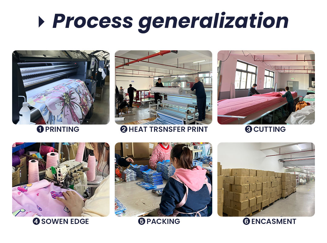
Flat throws and bed panels treat this six-station chart as a straight line: print, transfer, cut one rectangle, bind one edge, box it. A hooded wearable breaks that line into tailoring, and reading the chart through garment logic is what separates a merch buyer from a throw buyer. At station one, artwork printing still happens roll-first — but the roll is no longer a poster waiting for a frame. It is cloth that will be sliced into body panels, hood panels, sleeve wings and pouch pieces, each of which must land its share of the design in the right position after the cutter moves. A chest-centred wordmark survives that trivially; an all-over print that spans a sleeve seam demands a marker who plans the repeat around the pattern, and that planning is agreed at your mock-up stage, not discovered in the carton.
Station two, heat transfer, fixes the dye into pile before the panels exist — which is exactly why sublimated merch wearables do not crack at stress points. A screen-printed block across a hood seam flexes every time the wearer shrugs; the same colour driven into fibre tips at transfer temperature bends with the pile. For festival merch that will survive a season of rucksacks and bar counters, the difference is the difference between tour merchandise and tour souvenir. Station three is the garment moment: cutting. Body, hood, cuffs, pouch — a wearable is five to seven cut pieces where a throw is one, and every curve — the hood’s crown, the face-opening V, the pocket’s diagonal entries — is a knife path a blanket supplier without pattern experience gets wrong on exactly the seams you photograph.
Station four, sewn edge finishing, is where the sherpa second layer meets the plush face: the lining is turned and stitched as facing at hood opening and pocket slits — the folded-forward white trim visible on both black and red model frames of this page — while outer perimeters bind flat. Stitch order matters to drape: panels join before edges bind, so the seam allowances live inside the garment and the outside stays clean under stadium lighting. Stations five and six, packing and carton encasement, get their own section lower on this page, because a hooded wearable’s air volume is mostly hood, and nobody boxes a hood the way they box a throw.
Every numbered caption on the chart corresponds to a workstation on our floor, photographed mid-shift — the same audit trail both neighbouring blanket pages carry. When a merch client’s QC walks it, they spend their time on station three and four, because for cut-up wearables that is where a blanket factory and a garment factory diverge, and our line is built so it is the same floor either way.
Colour As Merchandise Strategy: What The Red Frame Proves
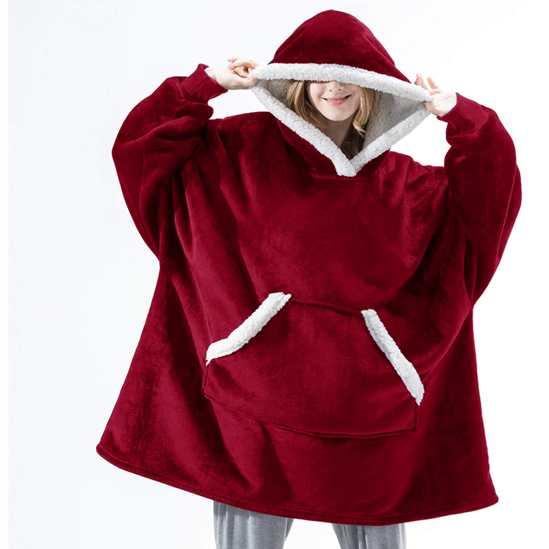
Deep red sells merchandise. Ask any tour merchandiser why the classic band hoodie leans maroon, burgundy or fire-engine and the answer is photographable: saturated pile reads premium under stage and store lighting, hides the nap-direction shading that makes pale plush look worn, and the sherpa contrast at hood and pocket reads crisp against it rather than muddy. This model frame is that lesson in one garment — a solid red plush wearable, pointed crown hood lined in white loop pile, split kangaroo entries bound in the same white facing, wide loose sleeves falling to a plain hemmed wrist. No print anywhere on the cloth, which is the point: this is the blank your artwork goes onto, and the blank’s colour is half the artwork decision.
Notice what the two-tone system does for brand palettes. Sherpa stays white; face pile shifts — red here, black on the previous frame, pink and purple further down — which means one garment family can carry a colourway per act, per squad, per campaign wave while the construction language stays recognisable on a shared shelf strip. Colourway programmes at the 100 pcs per design floor work exactly like this: same pattern, same fabric order, different face rolls, staged across a run so drop two lands the month after drop one sells out.
Merch buyers comparing this wearable against hoodies and crewnecks are really comparing print economics. Textile printing onto a fleece panel before assembly handles full-colour, edge-to-edge artwork at one price regardless of ink count — a photographic album sleeve across the back is the same method as a single crest on the chest, and it will not crack in the wash because there is no ink film to crack. What the red frame cannot show — because nothing here is printed — is the artwork zone map; that lives in the customisation diagram further down, and it is drawn on the same pattern blocks this garment is cut from.
Construction again in plain sight: the face-opening facing, the pouch’s split entries, the pointed hood crown that holds its shape away from the head instead of collapsing like a tee hood. That stiffness is a pattern and interlining decision made at sample stage, and it is the detail that decides whether a hood-up photograph flatters or embarrasses the wearer. Request the red sample; tilt it; it keeps its triangle.
One colour caution the frame also earns by existing: red pile shades. Merch programmes reorder across seasons, and a deep red from a different dye lot next August reads brick against this June photo. The stored reference solution is the same one the bed-panel and throw lanes use — logged shade standard, lot-checked against the signed physical sample at every run — and substitutions get photographed to you before production rather than defended afterwards.
The Wheel, Worn: Four Fandom Moments
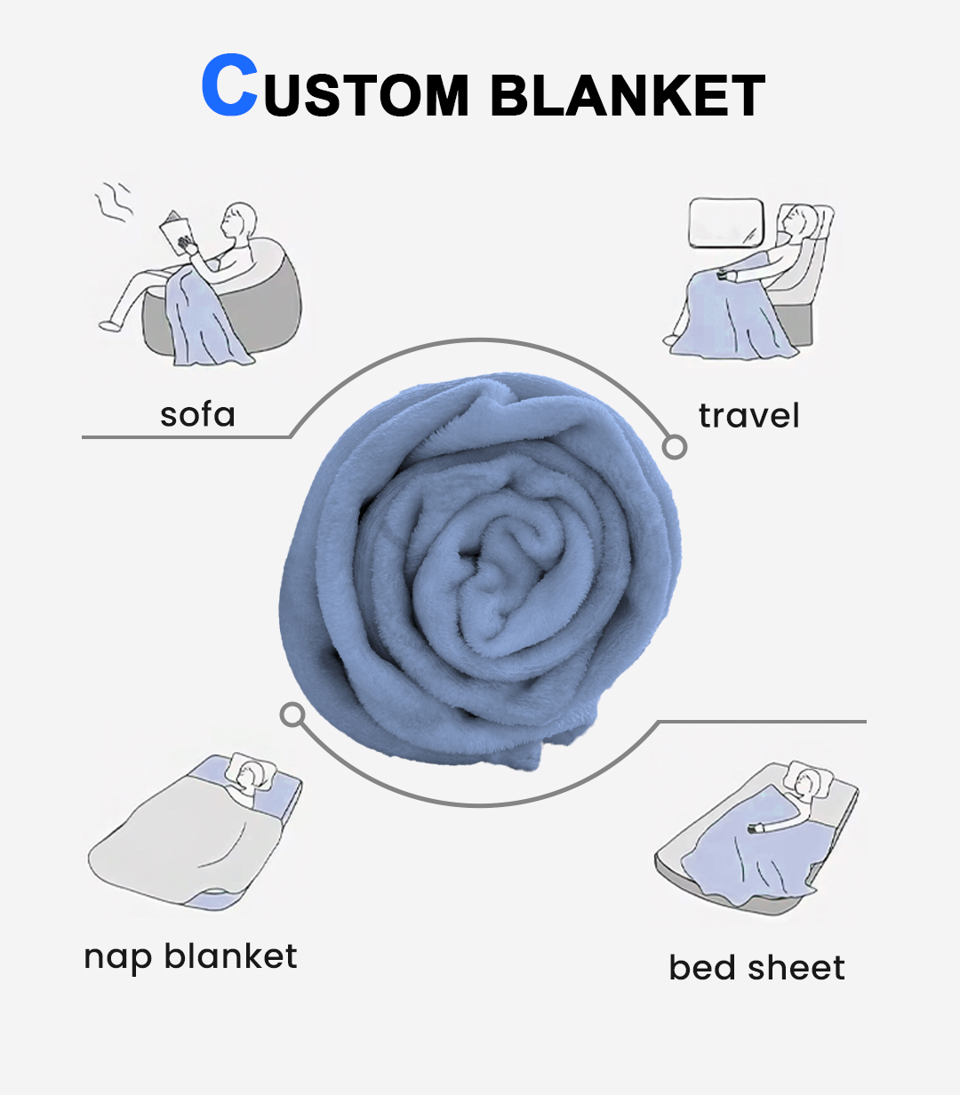
Same diagram, different reading. On the gift-throw and bed-panel pages the four scenes around the rolled sample map to purchasing occasions; for a wearable they map to venues, and venues are how merch gets bought. Sofa is the streamer’s frame — the hoodie-blanket visible on camera for a nine-hour subathon, half the merch pitch happening while the product is worn. Nap reads as the dorm and the late train: the wrap pulled over shoulders in a night coach, hood up, hands in pockets, the exact use that turns one viewer into fifty enquiries. Bed layering is the binge-watch tier, blanket-and-show crossover sales where the artwork is the show itself.
Travel is the venue case that merch decks always forget until it sells out: the stadium concourse, the airport lounge between tournament legs, the festival gate queue at 4 a.m. A wearable carries those moments because it replaces two products — the hoodie and the blanket — in one bag, and bag weight is the fan’s real budget line. The wheel’s centre roll, with its plush spiral and tucked tail, is the same object shown folded on the shelf strip: a wearable vacuumed flat, then springing hood-first into display volume, which is why the packing section below treats hood air as its own freight variable.
Read the four quadrants as venue SKUs and each gets a buying pattern that the sales desk quotes directly: cinema retail takes the binge tier with the release artwork; streaming platforms take the subathon tier with channel marks; esports teams take the concourse tier with crest and colourway; festivals take the gate-queue tier with line-up type across the back. One garment spec, four storefront strategies — and every strategy runs through the identical sample, mock-up and approval rhythm stated on this page’s numbers.
The diagram also carries a warning label in plain sight: those drawn scenes are soft furniture, not hard use. Wearables live in the rougher venue world — dragged, sat on, spilled on, left on bus seats — and the sewn-and-bound construction on this page’s model frames is what makes them survive it. Planners who read the wheel as bedroom positioning order the wrong product; planners who read it as venue positioning order this one.
Because merch is repeat business, every quadrant links back to the reorder mechanic: the stored garment file plus venue tag becomes a part number for next season’s run, quoted in a day and produced inside the standard bulk window — which is the quiet reason wearables outlast tees in franchise catalogues.
Cuffs, Hoods And The Adult-Versus-Kid Question
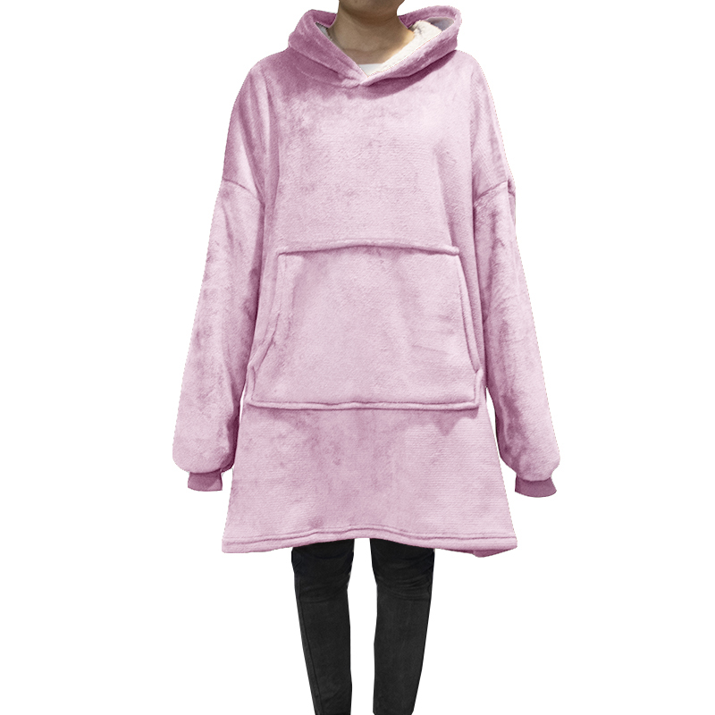
Face deliberately cropped out, this frame makes the merchandising point instead: the garment is the product, not the model. What it shows is the third cuff answer in our wearable line — ribbed knit bands at the wrist, in a slightly deeper mauve than the pale pink pile, a proper garment trim that holds shape against the sleeve bone. Compare back through the black and red frames and the ladder is clear: open hemmed cuff, ribbed fitted cuff, and later the no-cuff dolman. Each changes cost, warmth retention and the washing profile, and each is a checkbox on your sample sheet, decided the same week you sign pile and sherpa.
The hood here is the deep, unstructured, fully sherpa-lined kind, collapsing softly around the neck when open — the lounging silhouette — versus the pointed crown on the red frame that holds its triangle. Merch teams choose by photo intent: soft hood for cozy shelf lifestyle, structured hood for the hood-up concert shot. Both are the same base pattern with a crown and interlining decision; neither can be judged from a folded carton, which is exactly why the 3-5 day sample exists and why colour and cuff get signed together in one parcel.
Now the sizing question every fandom store asks before approving anything: adult versus kid. Honest answer from the photographs: these studio frames prove fit on an adult model only, and no wearable on this page carries printed body-length markings, so grading — hem height, sleeve wings, hood depth for a child silhouette — is quoted against your target size chart and confirmed on a physical sample, not invented here. What the size board further down proves is our own printed footprint reference for blanket panels; the wearable cut is patterned around body scale, and the desk runs kid and adult grades as the same design line at the same 100 pcs per design floor when a merch programme splits the run. School-age licensed characters sell the kid grade; stadium concourses carry adult — plan the split at mock-up and one fabric order serves both.
Colour behaviour finishes this frame: pale pink pile is the most honest colour in the line, showing nap wear and lint before its darker siblings do. Retail reality says it still sells out first, because pastel wearables photograph like comfort itself — the crop-out staging being the proof. Buyers who merchandise the pink grade as hero colour and the black grade as core replenishment learn this from their second sell-through report.
One governance line worth stating plainly for licensed programmes: characters, marks and album art enter production only with your paperwork on file, logged at mock-up. The blank garment carries zero artwork by default; that is a feature, not an absence.
Three Steps To A Worn Design, Including The Awkward Zones
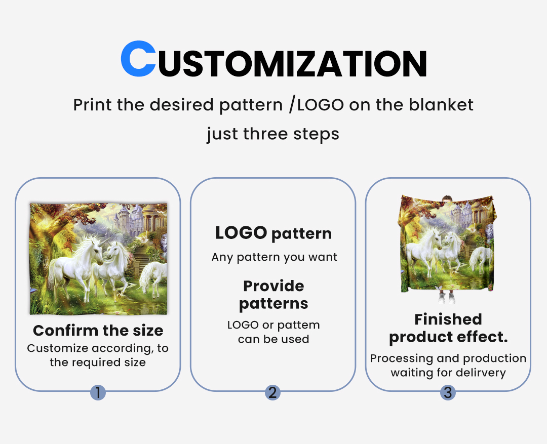
The customisation diagram’s rhythm — pick the size, drop in the artwork, see the finished effect — reads simple because on a flat panel it is. A wearable inherits that same three-step gate, and then adds the zones a throw never has: seams that curve, hoods that fold, pockets that cut the composition in half. Step one on this page’s product is pattern choice, not just rectangle choice: body length, sleeve wing and hood depth all sit inside the size decision before artwork moves. Step two places your file onto the pattern pieces, and step three renders the worn effect — which is where the honest conversation happens, and the desk would rather have it on a free mock-up than in your returns inbox.
The zone map, in merchandising order. Chest centre is the hero block: bounded by hood seam above and pouch stitch below, it takes a wordmark, a crest or a small photographic panel cleanly — the placeholder on this page’s first frame lives exactly there. Full back is the statement block: a tour-date list, a band logo at scale, a show key-art spread — one uninterrupted panel between shoulder seams, and our pile handles it the way the throw page’s full-field photo handles paper texture. The hood crown is the collector block: small marks, dates, coordinates, the detail that fans photograph for social and never mention in the product listing — a zone that costs nothing and sells everything.
The two zones that catch teams out sit at the pouch and the cuffs. A print crossing the kangaroo’s topstitch line gets interrupted by the pocket entry every time a hand goes in; either design around the split or place artwork above it. Sleeve wings taper, so any mark that must read square needs its baseline curved on the flat pattern to appear straight on the worn arm — prepress handles that distortion automatically when you flag sleeve zones at mock-up, and produces nothing when nobody mentions them. The diagram exists so all of this is decided in one proof round, with the finished effect rendered worn, not flat.
Artwork ownership is the same policy as every line on our floor: we print what your paperwork covers, and licensed characters or label art appear in production only when the licence record arrives with the file. Mock-up is where that record gets named, per zone, in writing.
Reorders reuse everything: zones, coordinates, curve compensations and colour standards stay stored against your design line, so next season’s tour run proofs in a day rather than starting the conversation from zero.
The Purple Frame: Bound Hems And Built-In Photography
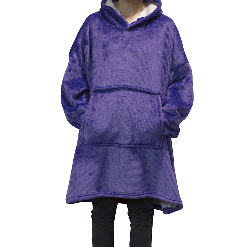
Four frames down and the line’s vocabulary is fully visible: this one is purple pile, poncho geometry again, and the wrist answer nobody else on this page shows — no cuff at all. Wide dolman sleeves fall open to the hand, which is the cheapest construction in the family and the most dramatic on camera: fabric moves when the wearer moves. Hood lining, again sherpa, reads cream against purple; the bottom edge carries a bound finish; and most usefully of all, one corner has been deliberately turned up to flash the white backing. That turned corner is the double-layer proof, same evidential device the bed-panel page uses at its folded stack — visible confirmation that the reverse is a second fabric doing a second job, not a printed illusion.
The hands tell the other story: both tucked into the kangaroo, elbows resting inside the garment’s own volume. A hooded wearable’s pocket is not a storage feature, it is a posture feature — the exact pose every fan photographs, and the reason pouch size gets its own line on the sample sheet: it must swallow both hands at once without straining the facing seams. This frame’s pouch clears that bar visibly; measure your own target hand-in-pocket look against it when grading a kid size, because a shrunken hoodie-grade with a proportionally oversized pouch reads as costume rather than comfort.
Colour strategy closes the loop: purple sits between the red frame’s heat and the pink frame’s softness, and it is the hue fandoms have quietly trained consumers to read as premium merch — convention halls, esports finals, streaming platform branding. Same base pattern as every wearable on this page, different face roll; the artwork zones from the customisation section inherit unchanged, so a design system built for black can ship purple without re-proofing placement, only pile shade against your stored standard.
The bound hem visible here also answers a wear-and-tear question merch stores get from parents rather than fans: a turned-and-stitched perimeter on plush resists the corner-fraying that an overlocked cut edge shows after a season of car doors and backpack straps. It is a one-line cost decision at sample stage with a multi-season shelf story — the kind of choice physical samples make obvious in a hand and spec sheets never communicate.
Nothing printed, nothing branded, nothing borrowed: the frame is the blank in its most photogenic register, and the brief your merch designer writes should start from this exact image, colour aside.
The Size Board Read From A Wearable’s Point Of View
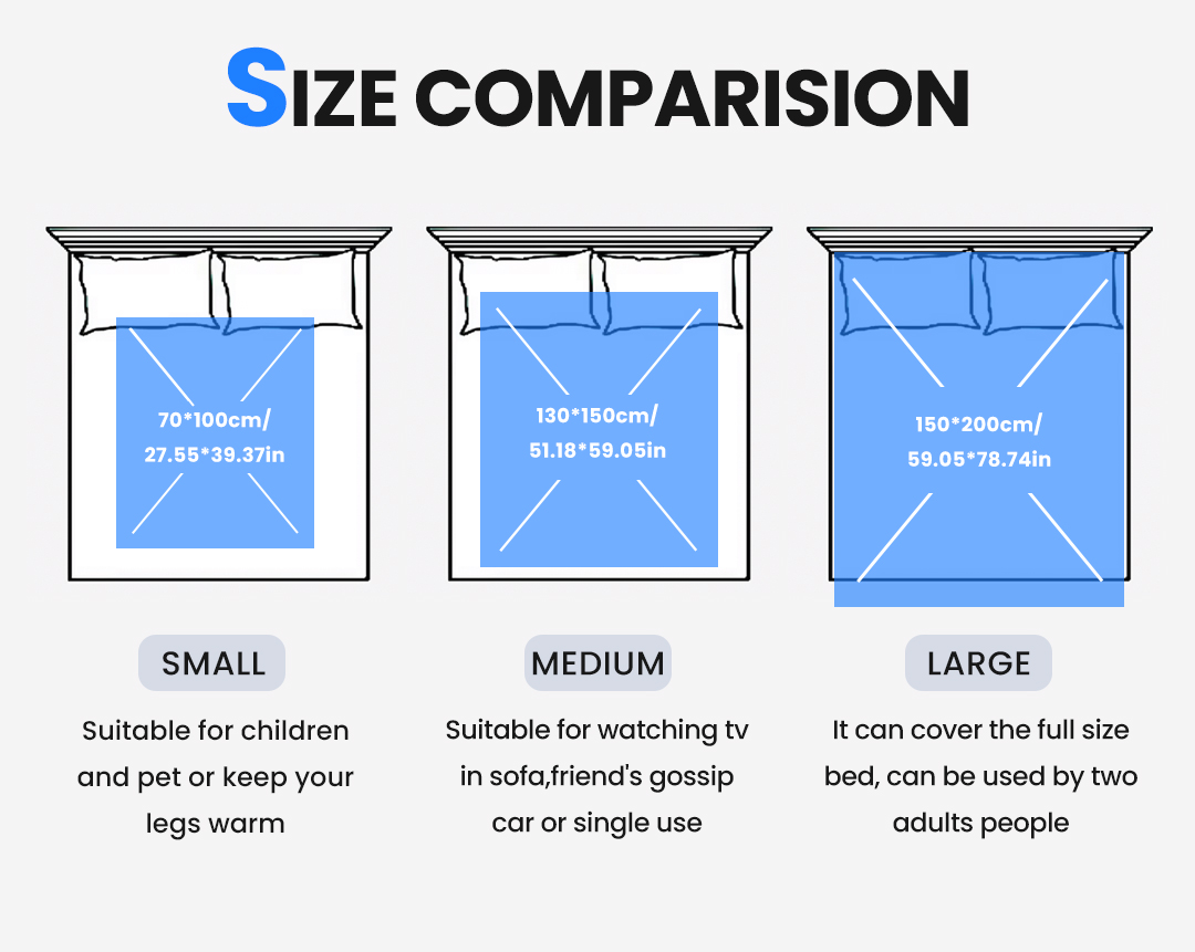
Our printed comparison chart carries three panels in centimetres and inches, and on this page they do a different job than on the gift or bed pages. The small cell — 70*100 cm, 27.55*39.37 in, drawn low on the bed outline and captioned for kids, pets and leg warmth — is the closest photographed reference for where our child-grade wearable pattern starts, because a kid hooded blanket wraps less body than the adult frames above without becoming a tent. The medium cell — 130*150 cm, 51.18*59.05 in, climbing halfway up the drawn mattress and captioned for sofa viewing and solo nights — maps to the compact adult grade: lap coverage when seated, hem at mid-thigh when standing, the tour-bus silhouette. The large cell — 150*200 cm, 59.05*78.74 in, swallowing the drawn bed and hanging past the rail, captioned for shared full coverage — is the oversized adult grade that streaming and dorm merch now sells as a feature rather than a fit accident.
Say it straight, though: the chart prints blanket-panel footprints, not garment measurements. No photo on this page carries a sewn label, a printed body length or a chest width for the wearable cut, so adult-versus-kid grading specifics — hem drop, sleeve wing length, hood depth — come from your target size chart and get verified on the physical sample we ship in the 3-5 day window. What the board legally proves is that our fabric rolls cover these three scale families, that one print run can supply all of them, and that the 100 pcs per design floor treats a graded run (kid, compact, oversized from one artwork) as a single design line rather than three minimums to fight.
The merch strategy hides in that last sentence. Fandom stores historically lost margin by splitting adult and kid runs into separate suppliers; a graded wearable programme ordered as one design keeps one colour standard, one pile decision, one sherpa reference and one inspection protocol across every body. Sell the oversized grade as the hero listing, the compact grade as the core, the kid grade as the family add-on — same artwork file, three cartons on the same pallet, one replenishment rhythm between tour legs.
Grading tolerance itself belongs to the sample sheet, not to the printed chart: how much hem length per size step, how the pouch moves with a smaller body, whether the hood crown shrinks proportionally or keeps its volume. All three answerable on a physical grading sample, none honestly answerable from artwork on a comparison board.
Ask the desk for the wearable size ladder before finalising artwork — because a zone map sized for the oversized grade reads small on the kid run, and that conversation is free at mock-up and expensive after inspection.
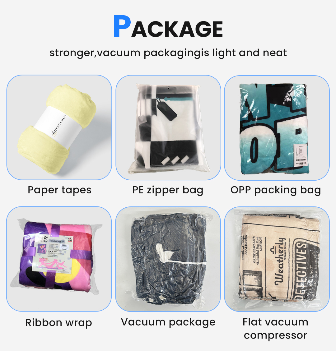
Packing Air: The Wearable’s Freight Problem In Six Cells
The six-style pack menu — banded roll, zip poly, cellophane bag, ribbon-and-card, vacuum, flat brick, every caption legible on the graphic — exists for flat panels, and a hoody-blanket inherits its own physics from it. Volume is the enemy: a wearable is mostly hood, and hood is trapped air. Roll it like the graphic’s first cell and the hood bulks the spiral until the band cannot hide it; fold it retail-flat into the zip poly and the face creases along the crown seam within a month on a shelf strip. Merch packaging, therefore, starts at the vacuum cells and then argues about how hard to pull.
Standard vacuum is the default for store-bound wearables: the parcel halves, the pile rebounds within days of opening, and the hood re-inflates when the merchandiser fluffs it before the display — a five-second motion that makes the whole pack tier look intentional rather than compressed. The flat brick exists for e-commerce fulfilment where parcel-size bands decide the shipping line, and it is honest engineering with one condition: a hoody grade compressed flat for a long storage window needs a rest period after receiving, and the receiving calendar should say so. FBA-bound merch programmes get exactly the brick treatment plus your label plan at line end, because Amazon’s size tiers reward the flattest legal fold.
Retail theatrics ride the last cells. A ribcage-card header on the zip poly turns the shelf strip into a hanging display without a fixture budget. Ribbon-and-card presentation is how an anniversary run ships to fan-club members at a higher ticket off the same garment cost. The printed belly band works for rolled programmes where the band itself carries tour dates — one more artwork zone nobody asked for and everybody photographs.
Whatever the tier, the pack decision lives and dies on one calendar number: weeks between container arrival and lid opening. Give us that number and the vacuum level sets itself, quoted in the same tier sheet as the fabric. And like the artwork zones, the pack spec stays stored against your design line between seasons, so a restock in band and a drop in brick are part numbers, not projects. Store-direct programmes get one extra courtesy from this system: a labelled shipper that opens without knife damage to the bag face, because the second-hand market for unopened merch hoodies prices the packaging as loudly as the garment — a collector-grade bag is part of the product, and ours cut, seal and label to stay that way across a courier leg.

Tour Math: Dates, Cartons, Deadlines
Closed cartons on a pallet, courier parcels stacked in front — the dispatch frame above is the last photograph your order takes before it becomes your inventory problem, so anchor the whole page’s rhythm here. Numbers first, pattern second. MOQ 100 pcs per design, one graded run counting as one design. Samples 3-5 days once the pattern sheet and artwork zones settle. Bulk 7-15 days after artwork approval, the clock starting at your signature rather than at your first enquiry. Capacity 1,000,000 pcs per month across our gift lines, which for merch means a stadium-show restock never queues behind a festival’s opening drop. Sea for the container fill, air for the leg-two top-up, DHL, UPS, FedEx or TNT for the emergency single-carton case — the desk routes by date, not by habit, and FBA prep runs at line end against your routing sheet.
Tour calendars invert the way gift calendars do: a spring festival wants approval in deep winter, a summer residency lands its first cases by courier while the restock follows on air, and a winter arena run is a September conversation that nobody remembers having in January. Send the first date on the poster and the desk returns the last artwork day the math supports — before you budget, not after.
Reorders are the quiet margin story of merch lines: the stored garment file, graded splits, zone coordinates, colour standard and pack tier all sit on record between runs, so next season’s restock proofs in a day and ships inside the standard window. Where a pile colour gets discontinued between years, a substitution photo reaches you before production; brand continuity is a specification duty here, not a marketing slogan.
No unit price on this listing pretends to be your price: the displayed figure anchors the 100-piece tier for the photographed configuration, and your quotation rebuilds per grade mix, cuff choice, pack tier and freight mode. Flammability and labelling paperwork follows destination-market rules — say the country and channel, and the compliance conversation happens in writing before the order signs.
Reference Specifications
| Product | Wearable hooded blanket, poncho-cut, double-layer plush-plus-sherpa build for merch programmes |
| Face | Plush pile in solid colourways as photographed; dimpled minky texture shown on navy frame; sublimation zones accept full-colour artwork |
| Inner layer | White loop-pile sherpa at hood lining, face-opening facing and pocket entries — turned-and-stitched, not applied trim |
| Hood options | Deep unstructured lined hood or pointed crown with shape-holding crown, chosen at sample stage |
| Cuff options | Open hemmed sleeve, rib-knit fitted cuff, or dolman with no cuff — three photographed answers on this page |
| Front kangaroo pouch, split or single entry, sherpa-bound; sized for both hands inside | |
| Panel footprints (printed on our chart) | 70 by 100, 130 by 150 and 150 by 200 centimetres, each beside the chart’s own inch conversion |
| Grading | Adult and kid grades from your size chart, verified on physical sample; body lengths not printed in any photograph |
| Weight | No gsm appears on any frame — quoted on request against a physical sample |
| Artwork zones | Chest hero block, full back, hood crown, sleeve wings (curve-compensated), pouch-safe placements |
| Licensing | Characters and marks enter production only with buyer’s licence paperwork logged per zone at mock-up |
| MOQ | 100 pcs per design |
| Sample | 3-5 days |
| Production | 7-15 days after artwork approval |
| Capacity | 1,000,000 pcs per month across our gift lines |
| Freight | Sea, air or courier — DHL, UPS, FedEx, TNT; FBA labelling and end-flap size splits per your routing plan |
Merch Managers Ask These Before Drop One
Can you reproduce a band logo, team crest or show character on our run?
Do adult and kid sizes count toward the 100-piece minimum separately?
Will the pile survive venue laundering on a merch programme?
Which cuff should a merch run pick?
Can we split one design across colourways for a drop schedule?
What fire-safety or compliance paperwork can you provide?
The Family Around This Page
Merch buyers comparing the wearable against our other plush builds start with the family links. The lightweight printed throw for corporate gifting and boxed giveaways is the custom fleece throw blanket page; the heavy two-fabric bed and homeware panel is the double-layer sherpa blanket page. All three share one printed-textile shelf — the blanket category under the textiles hub — and one quote desk, so a venue programme that wants merch, gifts and bed panels in a single freight conversation builds all three files from the request-quote page in one pass.
Book A Wearable Slot
Send the first date, the grade split, the cuff answer and the artwork zones, and the desk comes back with a free worn-effect mock-up, a tier sheet on the 100 pcs per design floor, and the sample parcel inside the week — colour, sherpa, hood crown and cuff in one box. Write [email protected], call +86-15967739086, or drop the quote request form through the site; whichever door you use, the same merch desk opens it.