Custom Fleece Throw Blanket With Logo
$4.50
Corporate gifting and retail checkout lanes run on this build: a custom fleece throw blanket with logo, sublimation-printed on short-pile plush fleece before cutting, so the mark never fights a seam. Photographed facts on this page: a matte printed face and a brushed loop-pile reverse shown at a turned bed-photo corner, three printed size steps from our own chart — 70*100 cm, 130*150 cm and 150*200 cm with inch pairs — and six pack styles from paper-band roll to flat vacuum compressor, so gift runs and ocean containers each get the right box math. A keepsake tier adds names, dates and crests in centre, corner or full-panel zones, gated by a signed per-order name list. Gram weights are never invented: gsm is quoted on request against a physical sample. MOQ 100 pcs per design, one artwork across several sizes stays a single line; samples 3-5 days; bulk 7-15 days after artwork approval; capacity 1,000,000 pcs per month across our gift lines; sea, air, DHL, UPS, FedEx or TNT with FBA labelling at line end. The displayed figure anchors the 100-piece tier — your tier sheet comes back per size, pack style and placement zone.
A Custom Fleece Throw Blanket With Logo That Survives The Gift Hand-Off
A custom fleece throw blanket with logo earns its keep in three seconds: the moment a recipient lifts the lid. That is why this page is built around the gift hand-off rather than a fabric poem — what the print does to the pile, how the throw folds, which package holds its shape through a courier, and where a name or emblem can sit without being eaten by a seam. Everything below is read off our own photographs of running product, and anything a photo cannot prove is marked as quoted on request instead of guessed.
The lane this SKU owns in our textile range is the light, boxed, giveaway-friendly throw: short-pile plush face, brushed reverse, sublimation print, three photographed size steps, and a personalisation tier for keepsake orders. Heavier two-layer sherpa homeware is a separate build and lives on its own page; wearable hooded blanket throws are a third. If your brief says corporate gift, retail add-on, fundraiser or client thank-you in quantities that ship before a date, this is the right shelf.
What The Photo Actually Proves About The Fabric
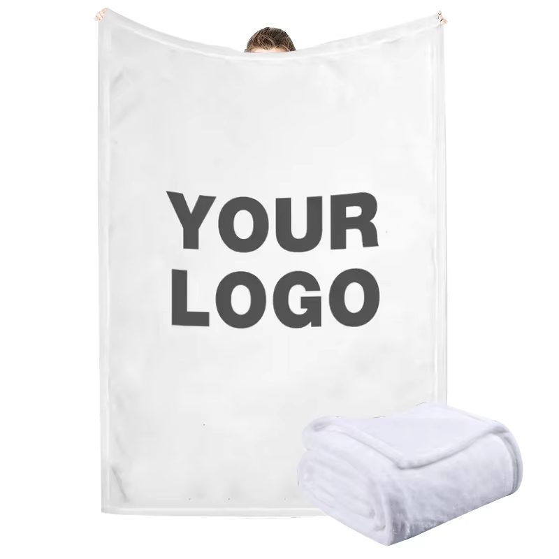
Take the two views in the image above apart before buying anything. The held-open throw shows a white, matte, low-to-medium pile face under studio light: colour sits flat across it with no sheen pooling, which is how a sublimation print behaves on short plush fleece — dye bonds into the fibre tips and the nap direction stays invisible to the camera. The dark two-line placeholder at centre proves scale: a print zone roughly a third of the panel width keeps margins clear of the gathered top corners, and the words YOUR LOGO are a slot, not a suggestion. Whoever owns the final artwork replaces them position for position.
The small folded bundle in the lower corner is the more useful half of the photo. Three stacked layers of the same white plush read as rounded, dense edges — pile wrapping over the cut, no raw fringe, no contrasting thread visible at fold height. That is the fold a gift buyer pictures when they imagine opening a box, and it is what our packing table produces before any ribbon goes near it. The underside of the held piece is not shown in this frame, so we describe reverse face from the bed photo further down rather than claim a double-sided print from this one.
Hand, not pixel, decides a gifting programme, but the pixel here is honest: no sewn label in frame, no printed care tag, no dimension number on the white goods themselves. Every spec that is not photographed — pile density, exact grams per square metre, backing knit — is quoted against a physical sample you request, and we would rather send you that sample in 3-5 days than write a number the camera cannot back up. The edges that do show are clean stitched finishes with no binding tape, which is the low-cost, high-loft look this lane sells on.
One more read matters for print buyers. The placeholder is one colour on white. Move to a dark face or a full-panel photograph and the method changes nothing — dye sublimation still prints the roll before cutting — but proofing changes everything, so a black-face throw with a pale emblem gets a printed fabric proof, not a PDF colour swatch, before any bulk run commits. That proof ships inside the same 3-5 day sample window as the plain sample.
Finally, what the photo deliberately omits: packaging, hardware, props, people’s faces. The staging is blank on purpose, the same way your brand should land — one mark, one pile, one fold. When you compare supplier pages, count what a photo refuses to show you; on ours, the omissions are listed in plain words right here.
The Bed Shot, The Folded Corner, And What Retailers Order From It
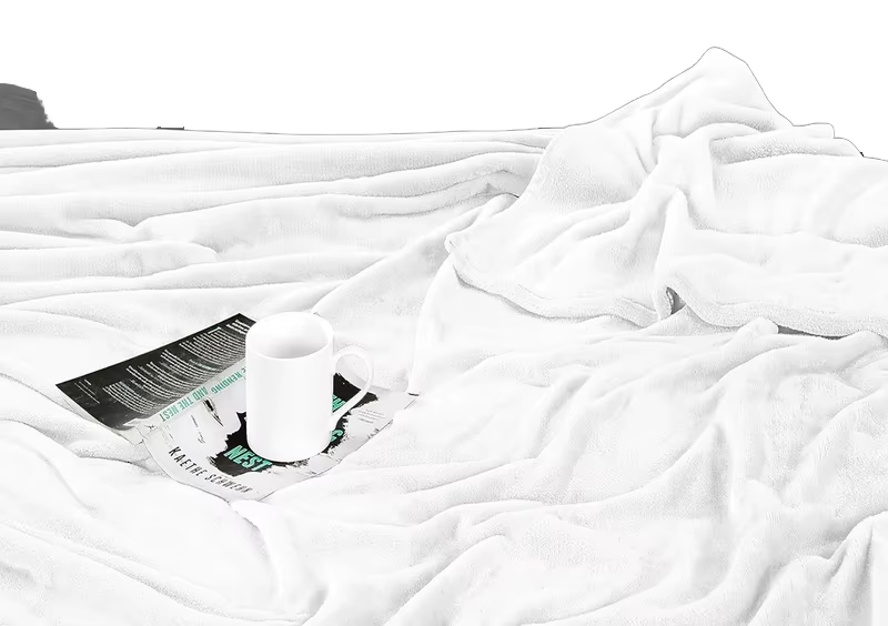
This is the photo every throw buyer secretly shops from: a dressed bed, rumpled white fabric taking soft mountain ridges down the frame, a mug resting on a folded newspaper at centre-left, and the upper corner turned back to show the reverse. Read it the way a retail planner does. The turned-back corner exposes a looped, brushed underside against the smoother printed face — the two-surface construction that lets a throw look crisp on the store shelf’s front fold and feel familiar on the couch’s back side. The pile catches light along the crests and shadows in the valleys, which is the visual signature of dense short plush rather than thin coral fleece, and it explains why these throws photograph well without styling tricks.
The edges in frame are stitched and flat, no fringe, no piping, no label tails. The mug and paper are set dressing with tiny unreadable prop print — we call that out because competitor pages quietly let lifestyle props imply features; here they imply nothing except morning. If your merchandising team needs the same image family for a shelf-talker or a catalogue spread, we license nothing off a prop; our studio shoots your face print with the identical corner fold on request, and that shoot is scheduled inside the sample stage so campaign files arrive with the product approval, not after it.
What buyers actually order off this picture is the colour story, not the composition. All-white or near-white faces print the widest colour gamut on sublimation, which is why the photograph-style gift tier — family portrait throws, event artwork, memorial florals — concentrates in this colourway. Charcoal and navy faces exist and sell, but pale emblems sink into them, so we move that crowd to the proof-first lane described above instead of talking them through a monitor. And because the fabric in frame is the plain face of the same blank your logo lands on, there is no bait photo: the pile you see is the pile you ship.
For corporate gifting programmes the bed shot also solves an internal-approval problem. Procurement decks rarely accept a folded-product render; they accept this — a room, a hand of fabric, a believable object. Several buyers have told us the rumpled-bed image got the programme signed off when the mock-up alone could not, so we supply it as a licensed campaign frame with the signed order rather than as a stock cliché.
Store the exact construction facts from this photo: plush short-pile face, looped brushed reverse, flat stitched perimeter, no visible hardware or tag in frame. Anything beyond that — thread count, backing percentage splits, gsm — goes on the quotation sheet after a physical sample, per our rule against number-inventing.
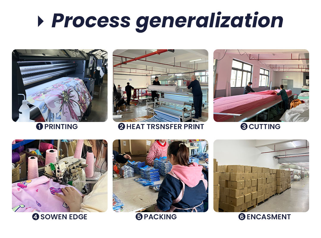
Reading The Process Chart As A Throw Buyer
The chart above is our lane on the gift-throw line: print first, cut second, finish last. Follow it the way a programme buyer should, because each step answers a different complaint you have heard about promotional blankets. Step one, artwork printing: the full pattern or single logo is sublimated onto plush rolls while the pile still lies flat. Printing before cutting means the logo never fights a seam — a centred emblem stays centred on the finished rectangle because it was placed on uncut fabric, not stamped onto a folded one.
Step two, heat transfer, is where the dye turns to gas and locks into fibre tips under pressure and temperature. For throw buyers this is the step that decides whether a photograph-grade gift print looks like fabric or like a sticker. Sublimated pile keeps its nap after transfer; surface-applied ink would flatten it and crack at the fold lines you saw in the bed photo. Multi-colour artwork costs nothing extra here — the method is the same whether the panel carries one Pantone mark or a full scenic image — which is exactly why this lane supports keepsake prints at giveaway quantities.
Step three is cutting: printed rolls come off the long table as sized rectangles with the artwork already inside them. Because cutting happens after printing, your sizes can share one print run — order across the three photographed steps on the size board later in this page, and every panel comes from the same ink batch on the same day. Step four, sewn edge finishing, wraps and stitches the perimeter so pile turns the corner; the rounded, thread-free look of a folded gift throw comes from this pass, not from steaming or glue. Steps five and six, packing and carton encasement, are covered properly under the packaging section below, where the six photographed pack styles decide your freight math.
What the chart also proves to quality auditors is traceability by stage: each panel is a real workstation photograph from production, not a rendered stock illustration, so when a buyer asks where a defect could originate — ink, transfer temperature, cut offset, edge stitch density — we can walk them to the station that would have touched their run. That is the whole argument for keeping gifting throws on a printed-then-cut flow: every failure mode has one owner, and every approval you sign at sample stage locks one owner down. Ask any station for its log and the answer is a shift sheet, not a shrug — the reason a complaint desk can name a cause within a day of a carton opening. Keep the six captions in order while you read, because the questions buyers ask us land exactly on them: what ink, what temperature, what blade, what stitch, what bag, what carton. Every answer below traces back to one numbered panel, and every approval you sign references one of them by number, which is why our quotations read like checklists instead of paragraphs.
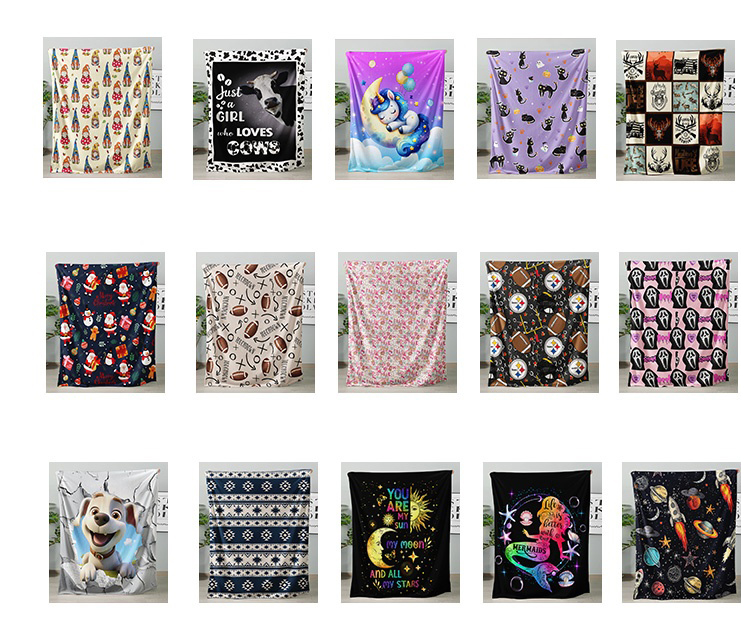
The Fifteen-Tile Wall: What A Print Library Is For
Fifteen throws on one wall, same blank, same fabric, fifteen completely different lives. That grid is our argument that the face print is the product: every tile hung flat against the same white wall reads as a separate SKU because sublimation turns short plush into whatever the artwork asks for. There are script-slogan tiles, cartoon-animal tiles, a heart-eyed cat motif tile, a sleeping-unicorn-on-the-moon tile, dense small-floral all-overs, celestial word-art, space-print kids throws, Christmas figure repeats, patchwork emblem grids and a football-fan print — one print file per blank, and none of them costs more in fabric than the others.
Say plainly what the wall does not mean. Several demo tiles carry artwork that belongs to other people — team-logo-style roundels and event-word lines a fan print borrowed from, a mermaid-style cartoon that evokes a licensed film, nameable characters of the sort legal departments ask you to delete. They stay in our internal artwork bank as motif-class references, never in your files, and we will not reproduce them on order. The commercial point of the photo is different: it shows the band your own artwork gets cut from. Original photography, licensed franchise art you own paper for, an all-over of your pattern library, a campaign slogan in type — all sit on this same wall in the next shoot. Naming is the discipline: motif class yes, franchise no, and the mock-up sheet is where that line gets enforced on your order, in writing, before a single roll moves.
Retail buyers use the grid as a line-plan tool. A greeting-card shop takes the word-art tiles; a pet retailer takes the paw and dog-script lane; a kids’ channel licensee takes space and alphabet prints; a stadium merch desk takes the fan-motif direction with its own licensed crest. Because the blank is identical, assortment width is free in a way woven product never is: fifteen SKUs, one reorder point, one fabric purchase, one inspection protocol. Minimum is 100 pcs per design, which for this wall means you can split an order across motifs at whatever tier the mix supports rather than betting everything on one print.
Corporate buyers use the same grid backwards: their mark is the artwork. A single-colour emblem behaves like any tile on this wall; a full-bleed conference photograph behaves like the florals. What changes between those two is only proofing depth, and proofing is scheduled, free in digital form, and physically confirmed inside the 3-5 day sample window. The wall exists so committees can stop imagining and start choosing from photographs of cloth that already exists, at prices that already hold.
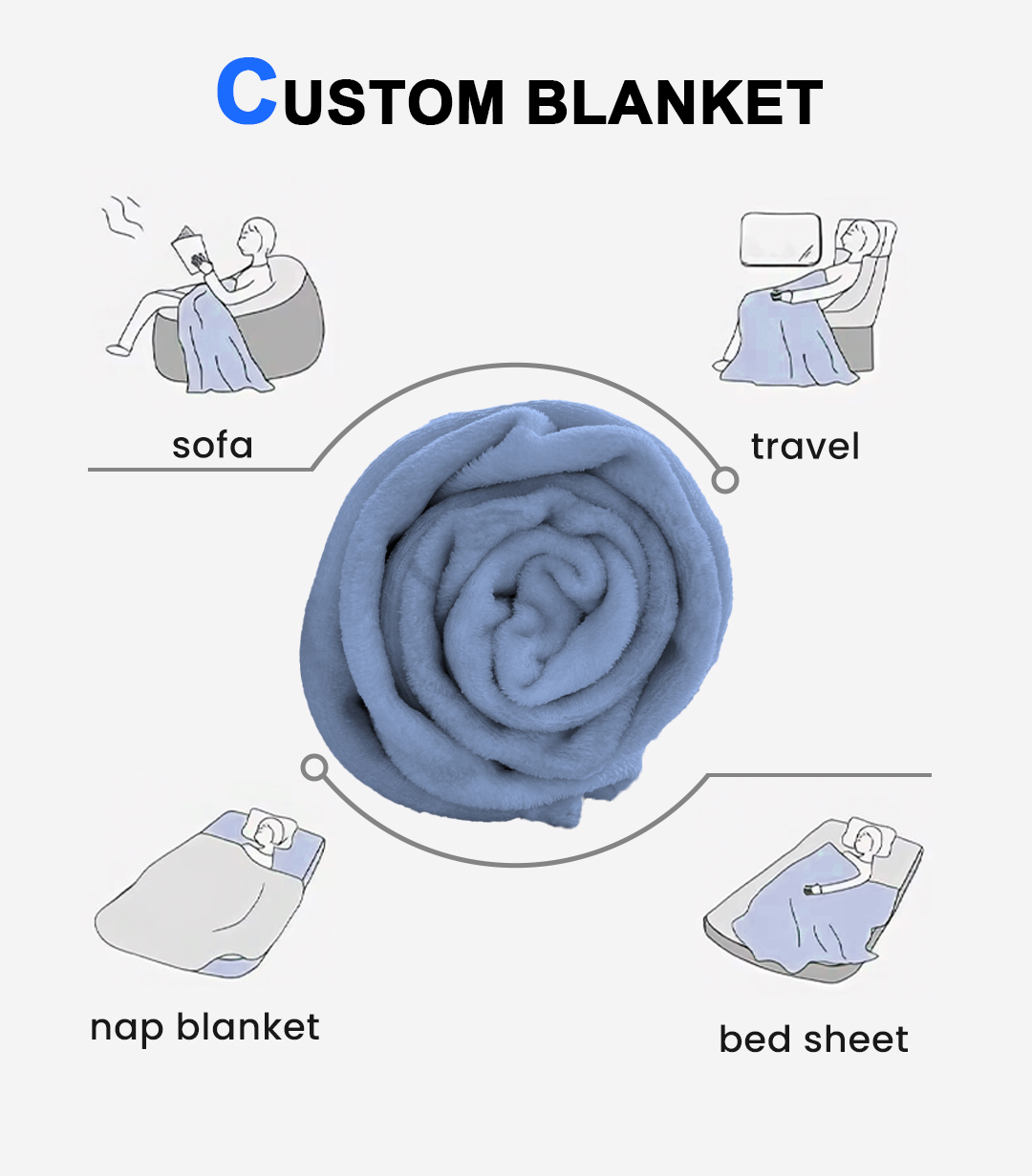
Four Scenes Around One Roll: Mapping Gifts To Occasions
The diagram places a rolled plush sample at the centre of four drawn scenes — sofa, travel, nap, bed layering — and for this lane the wheel is really an occasion calendar. Sofa is the living-room gifting event: housewarming, client thank-you, real-estate closing gift. A throw left visibly on a couch is the product photograph your buyer re-shares, and the scene confirms the medium sizes in the size board below are the sofa scale, draping a lap with fabric reaching the cushion front.
Travel is the corporate-travel and airline-lounge tier, and it is the reason our gift throws concentrate on the smallest photographed size: a rolled 70×100 cm panel fits an overhead bin and a car seat-back, which a bed-sized rectangle does not. Nap reads as nursery, new-baby and kid-gifting — the keepsake tier where personalised names actually sell — while bed layering is the wedding, anniversary and hospitality line, the size step that covers pillows on the comparison board.
Each quadrant converts into a distinct buying pattern you can quote directly. Insurance, bank and brokerage gifting runs sofa scale with a discreet mark. Conference kits run travel scale with the event logo — 100 pcs per design keeps per-session runs affordable. New-parent and teacher gifts run nap scale with names. Hotel welcome turndown runs bed scale, unbranded or crest-cornered. The four-scene diagram is the deck page procurement teams approve fastest because it argues occasions, not fabric, and occasions are how gifting budgets are actually written.
The centre roll itself carries the construction argument quietly: plush spiral wound tight, tail tucked, no hardware. A throw that rolls this cleanly survives being unrolled in a living room in front of guests; stiff-backed fakes photograph well and fold badly, and gifting dies at the second use. That is the whole standard we pack to: it must look as good opened at dinner as it did boxed.
Rule of thumb used by our desk: travel-size throws for crowds, sofa-size for names, bed-size for ceremonies.
Seasonality completes the wheel. Q4 floods the travel and sofa quadrants — year-end client boxes, advent-retail hangs, conference swag bags — while Q1 clears the bed-layering quadrant for weddings announced over the holidays. Nap runs steady all year because babies arrive on no calendar. Knowing which quadrant your order belongs to tells you which size step to quote and which freight lane to book against the date, and the desk will route both from a single line in your enquiry, no meeting required.
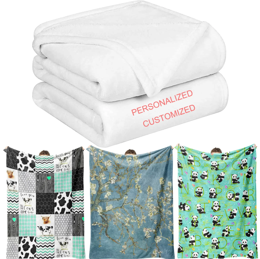
The Keepsake Tier: Names, Panels And Proof Lines
The four-panel image above is the personalisation pitch for this SKU. On top, the folded throw lies reverse-side up — dense white plush pile, round folded edges, no print visible anywhere — under two marketing words, PERSONALIZED and CUSTOMIZED, printed on the graphic rather than the fabric. Below it, three throws held open at shoulder width show the other half of the promise: a patchwork of alternating panels carrying a fixed script slogan, a blossom-painting reproduction across the full field, and a cartoon-alphabet repeat. The reading: customisation here runs from a small name block to a full-panel artwork, on one construction.
Keepsake orders — memorial gifts, retirement presents, new-baby throws with the month’s date, sports-parent season gifts — buy the name block, not the wall print. A name behaves like any other print element in a sublimation flow: same ink, same pass, same proof. What it demands is a different approval discipline. Spell-check happens on your file, on our proof, and again on the packed-carton manifest, because one mistyped grandfather name in a hundred-unit memorial run is a returns story, not a reprint opportunity. We gate this with a per-order name list signed back to you exactly as printed, and production does not start until that sheet returns.
Scale cues in the photo are deliberate. Held-open throws are roughly shoulder-width, which is how buyers read lap size without a tape measure; the folded stack above reads thickness. Together they answer the two questions gift catalogues get weekly: how big does the name sit, and how thick does the fold look boxed. The slogan panels on the patchwork throw are sample artwork supplied by the client who commissioned the demo; your file — monogram, wedding date, team crest, one-line message — replaces every square with it, and positions from this photo transfer to your run unchanged.
Painting-reproduction throws round out the tier: gallery-shop and museum-store buyers order exactly like the blossom panel shown, from public-domain or licensed art they bring paper for, printed full-field. We do not source artwork; we place yours on this wall of constructions, and the keepsake lane is why one blank price covers a name as comfortably as a masterpiece. File hand-off for the keepsake tier is deliberately boring: the artwork as vector plus the names as one spreadsheet column, and our prepress team merges them per piece inside the same imposition that places the shared crest — no extra plates, no extra colour approvals, one signed sheet covering every spelling. That merger is the service; the plush is the same plush.
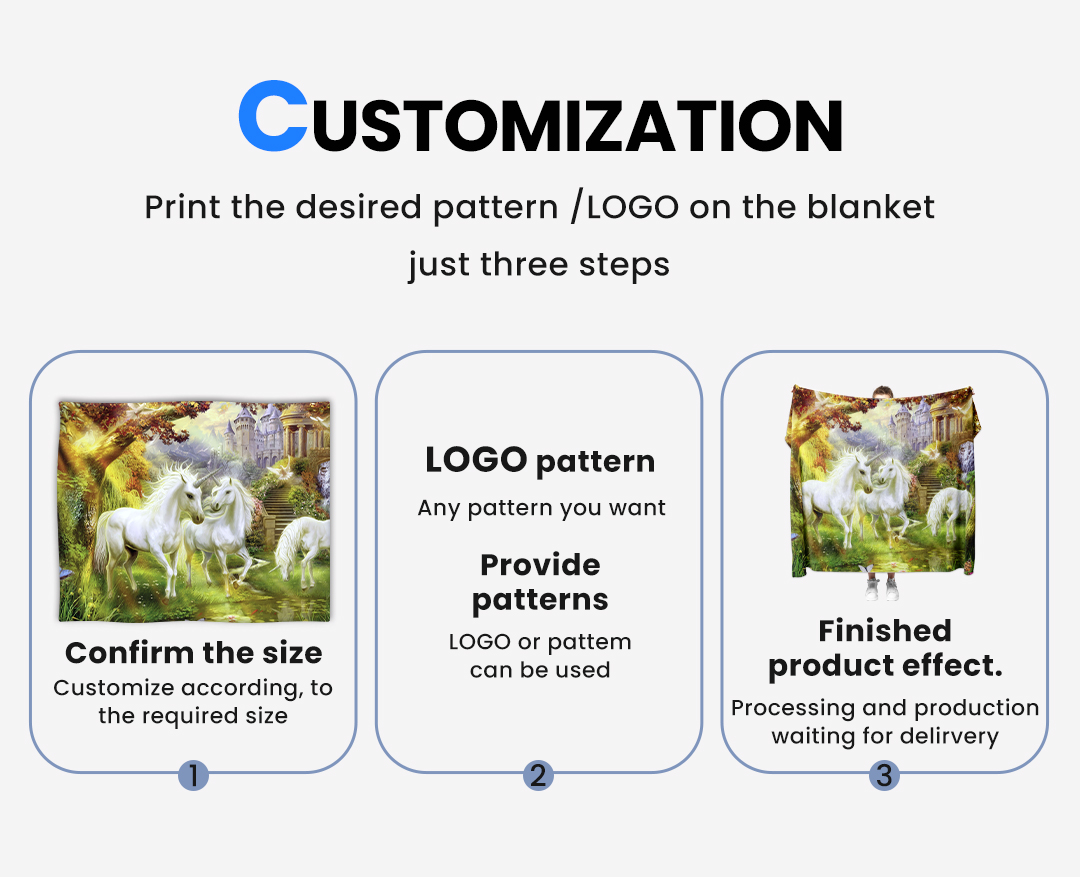
Panel Placement: Three Steps From Your File To A Finished Face
The diagram walks the placement question this lane gets most often: where does a mark sit once the artwork enters production? Step one is size confirmation against the panel before anything else, because placement coordinates are meaningless until the rectangle exists. Step two takes your file — an emblem, a name block, a full-bleed pattern, whatever the gifting occasion calls for — and drops it onto the layout at the agreed zone. Step three is the finished-product effect: the printed panel, worn or draped exactly as the artwork promised, waiting for delivery. On a gift throw, three zones do ninety percent of commercial placement, and the diagram is the shorthand we use to sign off which one you bought.
Centre panel is the keepsake zone: a name, a date, a portrait — the eye lands there first in every held-open photograph like the ones above. The trade-off is folding: a boxed centre print disappears inside the fold lines, which is why centre-panel gifts ship in packaging that shows the face, not a compression bag. Corner panel is the corporate zone — crest or wordmark low-right, product reading as fabric first and advertisement second — and it survives every fold, every drape and every washing-cycle crease, which is why procurement with a brand-visibility mandate picks it without argument. Full panel is the artwork zone: photography, pattern, season print; it turns the throw into the image and the mark into a small credit line at the hem.
Placement also decides cost behaviour. Zones cost nothing extra — the print pass is one event regardless of mark position — but a second colour approval on a hard-background emblem adds a proof cycle inside the sample window, not a surcharge. What genuinely shifts price is zone count per run (naming thousands of unique throws versus one shared block), which is why personalisation tiers quote on your list structure, not your logo. The diagram exists to end that conversation in one mock-up; send artwork, confirm the zone, and the free digital mock-up comes back showing exactly where your mark will fold. If your brand manual already fixes clear space and minimum sizes, send it with the file — prepress keys the zone coordinates to those rules, so the legal department’s spacing chart and the factory’s cut table read the same document before the first roll prints. Zones can also change between reorders at zero tooling cost — a programme that ran corner marks for two years can move centre for an anniversary edition inside the same 7-15 day window, because nothing but the artwork file moved.
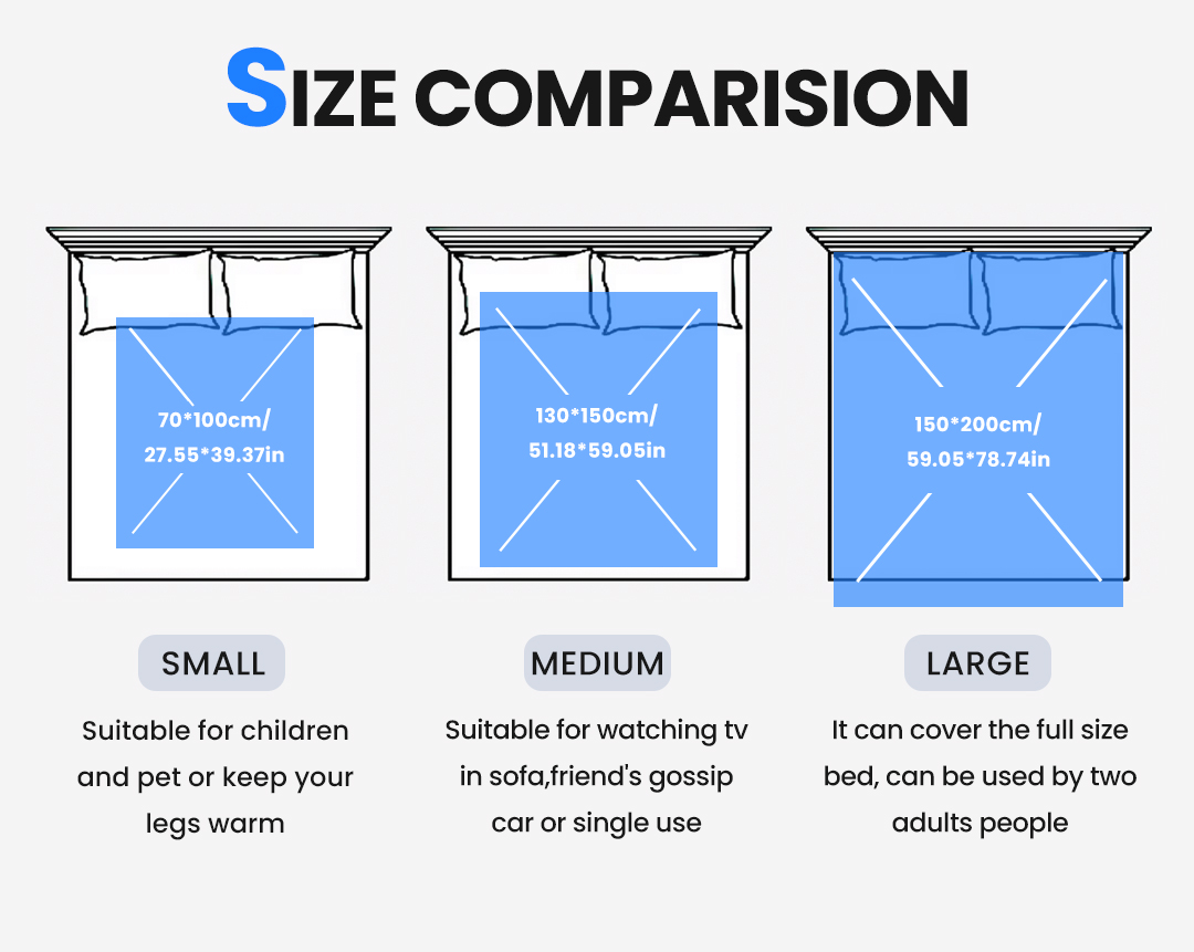
Three Printed Sizes, And What Each One Is Bought For
The comparison board prints its own numbers, which means we can quote them as photographed rather than approximate. Small: 70*100 cm, given on the chart as 27.55*39.37 in, drawn as a panel covering the lower half of a made bed with both pillows clear — the chart’s own line reads that it suits children and pets or keeps legs warm. Medium: 130*150 cm, 51.18*59.05 in, overlapping the pillow bases, described on the chart for watching tv in sofa, sharing a car, or single use. Large: 150*200 cm, 59.05*78.74 in, swallowing the full bed outline with a strip hanging past the foot and the chart’s note that it covers a full-size bed for two adults.
In gifting, those three steps map to three order shapes. The small step is the volume tier: conference kits, advent-calendar retail units, teacher gifts, add-on checkout merchandise — the size that keeps per-piece freight under the cost of the print. Medium is the standard corporate gift and the retail shelf’s default throw, draping a sofa arm with the mark visible while a person is wearing it. Large is the wedding, anniversary and hospitality line, the one bought singly with a card attached instead of fifty with a spreadsheet.
Size also governs artwork economics. A logo sized for the small panel reads like a stamp on the large one, so emblem scale is defined against the rectangle, not against your letterhead. The board’s bed drawings double as that guide: we mock your file onto each of the three rectangles before approval, so nobody discovers at the warehouse that the crest looks tiny on a 150*200. Mixed-size orders from one artwork file are routine — the printed roll gets cut across all three steps in the same run — and the 100 pcs per design minimum applies to the design, so one file spread across three sizes is one line item, not three minimums.
What the board does not claim, and we will not either: any size beyond these three printed steps, plus or minus tolerance figures the chart does not carry, and any gsm tied to a size. Cut tolerance for plush panels is confirmed on your physical sample; ask and it ships with the 3-5 day proof. One planning habit worth stealing from box-store buyers: they order the small step in the volume ratio, the medium in the gift ratio, and keep large rare, then store one shared artwork file per programme so a mid-season shift moves quantities between sizes without touching a single pixel of artwork. That flexibility is the practical value of a printed-then-cut flow: the roll is one decision, the cutter is another, and the split between them is yours to re-plan until the carton ships.
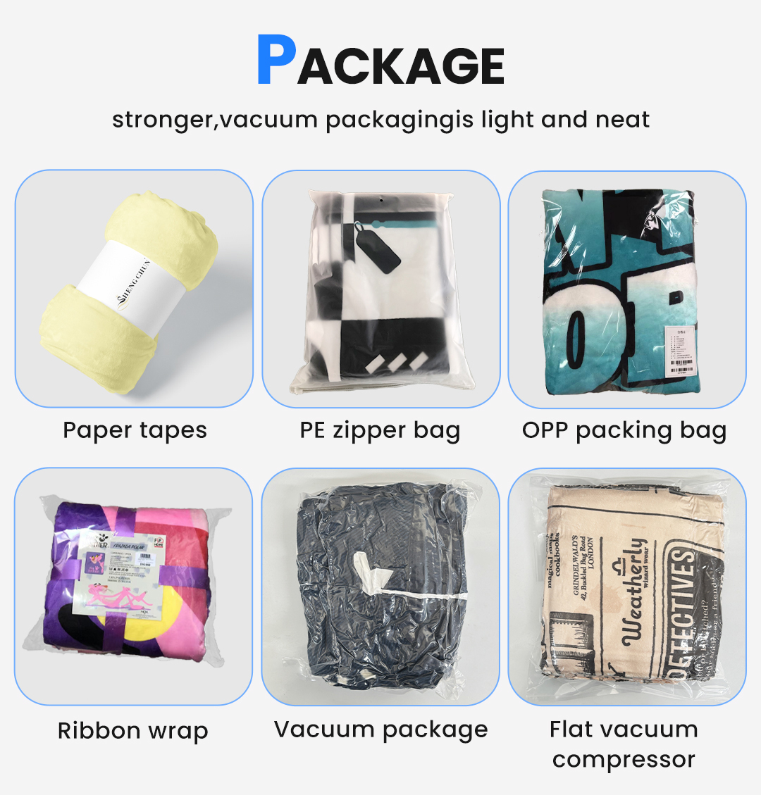
Packaging Is The Second Product In Gifting
A gift throw is judged twice: once as fabric, once as parcel. The six-cell grid shows exactly what we run and names each option on the graphic — Paper tapes, PE zipper bag, OPP packing bag, Ribbon wrap, Vacuum package, Flat vacuum compressor — with a rolled sample, folded bags, a ribbon-tied bundle and two vacuum-brick forms photographed beside them. Each cell is a decision, so read the grid as a price ladder, not decoration.
Retail shelf buyers live in the middle cells: the PE zipper bag with its visible hang-tag window and the OPP bag with a barcode label are the shelf-ready options, opening and reclosing on a customer’s shelf at home. Paper-band rolled presentation is the low-waste, high-style tier for store-exclusive colours — a printed belly band is one of the cheapest co-brand surfaces we own, and it wraps the roll the diagram above proves the fabric holds. Ribbon wrap with a printed card converts the same throw into a gift-with-purchase without touching the fabric cost at all.
Freight lives in the last two cells. Vacuum package shrinks the parcel; the flat vacuum compressor shrinks it to a brick that stacks in master cartons with almost no air — on ocean moves for a corporate programme, the compression choice can change the cube count, and cube count is money your warehouse actually pays. The trade-off is honesty about plush: strong vacuuming a printed pile for months dulls the nap until it re-fluffs, so gifting runs ship light-vacuumed or uncompressed while pure volume runs ship flat-compressed. Tell us how long the goods sit before they are opened, and we set the vacuum level by your calendar instead of by habit.
Packaging also decides your fold graphics. A centre-panel keepsake print must meet the customer face-out — band roll or zipper bag, never a fold that buries it — while a corner corporate mark survives any of the six. We lock pack style against artwork zone at mock-up stage; this grid is the menu that approval happens on. Small wordmark, gift box with lid, or ribbon: all quoted separately per piece so the gifting budget and the freight budget stay visible as two numbers. Barcode reality also sits in this section: the OPP cell photographs a retail label with scannable codes, and we print your SKU panel into that bag face at mock-up stage, so the throw arrives shelf-scannable instead of arriving and then waiting for a label vendor between continents. Whichever cell you pick, the pack spec travels with the artwork file on record, so a March reorder in band-roll and a September reorder in zipper bag are both one part number, not two meetings.

From Packed Throw To Pallet: Timelines That Hold
The photo above is our line’s packing stage reference: finished goods, cartons marked and closed, courier parcels staged before export labelling. It is the right place to say the whole business rhythm once, plainly. Minimum order is 100 pcs per design — one artwork file, one size-and-pack configuration counted as one design; mixes are quoted against that floor. Samples run 3-5 days once your file is settled. Bulk production runs 7-15 days after artwork approval — after, not including, the proof round you sign. Capacity across our gift lines is 1,000,000 pcs per month, which in practical terms means a ten-thousand-unit corporate run never waits behind someone else’s novelty drop.
Ship modes are chosen backwards from your date. A Christmas corporate programme approved in October is DHL, UPS, FedEx or TNT territory — sample-courier speeds at carton rates. The same programme approved in August is a sea move with the flat-compressed pack from the grid above, and FBA forwarding or your own 3PL receives it pre-labelled to your routing sheet; we do pick, pack and label work at line end. Air sits between the two for convention-week emergencies. Every carton carries item, size, artwork and pack-style splits so receiving is a scan and not a dig.
Reorders are where gifting programmes actually get cheap. A signed artwork, pack spec and size split stays on file, so the December anniversary restock of last spring’s launch throw is a part number against the stored reference — same Pantone hold, same fold, same band — quoted in a day and running inside the standard 7-15 days. If the blank colourway is ever discontinued between seasons, you get a substitution photo before production, not a surprise after inspection, because gifting continuity is a spec issue dressed as a calendar issue.
And the deadline reality this lane lives by: gift seasons are inverted. Corporate year-end giving and Christmas retail want landed stock by early autumn, which pushes artwork approval into late summer; spring wedding and graduation programs order in January. Tell us the event date and we will hand you back the approval deadline the freight math actually supports, free of charge, before you commit a budget line.
Reference Specifications
| Product | Printed fleece throw for corporate gifting and retail — light single-panel construction |
| Face | Short-pile plush fleece, matte sublimation print surface (photographed white and printed face samples) |
| Reverse | Brushed loop-pile underside shown in the folded-corner bed photo; double-sided print quoted separately |
| Edge | Flat stitched and turned perimeter, no fringe or binding tape, visible in fold photography |
| Sizes (as printed on our chart) | 70*100 cm (27.55*39.37 in) · 130*150 cm (51.18*59.05 in) · 150*200 cm (59.05*78.74 in) |
| Weight | Gsm not printed on photographs — quoted on request against a physical sample |
| Dye sublimation on rolled fabric before cutting; single colour to full-bleed photo from one file | |
| Personalisation | Name / date / crest blocks, centre, corner or full-panel zones, per-order signed name list for keepsake runs |
| Packing | Paper band roll · PE zipper bag · OPP bag · ribbon wrap · vacuum · flat vacuum compressor; gifting boxes quoted separately |
| MOQ | 100 pcs per design |
| Sample | 3-5 days |
| Production | 7-15 days after artwork approval |
| Capacity | 1,000,000 pcs per month across our gift lines |
Questions Gift Buyers Ask Before Signing
Can the logo be printed on a dark fleece face without surcharge?
Do you reproduce artwork from famous characters, teams or films?
What is the smallest useful gift run, and can sizes mix inside it?
Will a vacuum-packed gift throw arrive looking crushed?
Are these throws treated for flammability standards?
How close to Christmas can I order and still land?
Compare The Textile Shelves Before You Lock A Line
Most throw programmes end up weighing neighbours on this shelf. For boxed, heavier homeware retail with seasonal print capsules, the double-layer sherpa blanket page carries the two-fabric construction this light lane deliberately leaves out, and the wearable hooded blanket page owns the novelty and fandom tier that turns the same pile into something you wear instead of fold. Browse the wider blanket category inside the textiles hub for the full printed-textile family, and pair the throw line with cushion covers when a retail client wants a living-room story instead of a single item. Every configuration on this page is priced against your list rather than a sticker: use the request-quote desk and the tier sheet comes back per size, per pack style, per zone.
Open A Gift-Throw File
Send the artwork, the size step from the printed board, the pack style from the six-cell grid and the delivery date, and the desk returns a free digital mock-up on the real panel, a tier quote against the 100 pcs per design floor, and a sample slot inside the same week. Write [email protected] or ring +86-15967739086, or submit the quote request form; the form below lands on the same desk either way.