

Custom Acrylic Sports Award | Faceted Tournament Plaques
$6.50
Custom acrylic sports awards built for tournament calendars: slanted-edge printed boards on clear plinth feet, faceted self-standing columns, and tall wedge trophies that stand on a polished bottom edge — three proven silhouettes sharing one artwork system, with place, division, and athlete names merged from your results sheet against locked coordinates. First, second, and third share one master unless the layout differs, so tier arithmetic counts designs, not recipients. MOQ 100 pcs per design, physical sample boards in 3-5 days to verify self-standing height and edge behaviour, bulk 7-15 days after artwork approval with season commitments quoted per silhouette. Full-colour face print bleeds to the slab edge and refracts through the depth; boards sleeve individually, feet box separately, double-wall cartons mark by division so volunteer crews unpack straight to the medal table. Sea, air, or courier legs and FBA prep included.
Custom acrylic sports awards get bought on two clocks at once: the tournament calendar that cannot move, and the registration count nobody can predict until two weeks before the event. This line answers both with printed or engraved boards in proven silhouettes — slanted-edge plaques on clear plinth feet, faceted shard columns, and tall wedge trophies that stand on their own polished base — plus an engraving data sheet that turns a results file into place-tiered units without a second proof cycle.
Tournament buyers here are league operators, club secretaries, race-event offices with podium hardware to match their finisher medals, esports and school-sport programmes, and corporate games suppliers ordering a full season at once. Standing terms: MOQ 100 pcs per design, samples in 3-5 days, bulk 7-15 days after artwork approval, capacity 1,000,000 pcs per month across our gift lines for season-sized runs.
Three Silhouettes, All Proven on Studio Tables

First silhouette, six boards deep: a vertical plaque with a horizontal base edge, upright sides, and a top that shears down from a high right corner to a low left one — a slanted profile that reads dynamic even standing still. The studio row shows the same cut in six artwork moods: deep-blue starfield, magenta glitter field, pastel cloud wash, cyan circuit traces, a dotted world map on navy, and black with warm bokeh. Every board carries the same white text block low-centre — a presentation line, a recipient zone, and a body line over a signature rule — proof that one master layout scales across any number of background variants. Each board drops into its own small clear rectangular foot, keeping the thick printed slab upright and leaving the bottom artwork edge visible.
The mechanics buyers should note from that row: because the print bleeds to the slab’s side, the exposed edge shows colour refraction through the depth rather than a frosted white cut line, and the leftmost board’s dark artwork makes its side read near-black while the lighter prints keep their edges bright. Background choice therefore changes the piece’s apparent edge colour — a small fact that decides whether a podium photo shows a dark column or a glowing one under arena lights.
Look twice at those plinth feet before dismissing them as packing afterthoughts. Each is a plain clear rectangle with a centred slot, sized low to hide under the board it carries, and identical across all six artworks — one foot stock serving an unlimited number of design families. That interchangeability is what keeps replacement cost near zero when a season of venue use eats a base or two, and it lets the packing line sleeve boards and box feet as separate populations so a printed face never rubs a foot’s edge in transit. If your league prefers no loose parts anywhere, that is the moment to move a tier to one of the self-standing silhouettes below rather than to engineer around the foot.
Faceted Columns and Self-Standing Wedges
Between the six-board row and the columns sits a structural question every league desk eventually asks: why do some of these silhouettes need a foot and others refuse one? The answer is in the bottom edge. The slanted plaques end in a thin horizontal line — enough contact area to lean into a plinth slot, not enough to stand free. The columns terminate in a wide beveled foot that spreads their mass under the front panel, and the wedges carry a full-width flat bottom polished clear, so both self-support on the table with nothing added. Tournament planners care because feet are loose inventory: at a venue they get walked off, at a warehouse they get lost between seasons, and a podium set with missing bases photographs as an incomplete season. Specifying self-standing silhouettes for the recurring tiers and keeping the footed plaque for the one-off top award eliminates that failure mode entirely, and both answers come from the same board stock with the same artwork system.

Second silhouette: an elongated column with working optics — a broad flat front panel, angled bevel facets running down both sides, a faceted cap that peaks along the top, and a beveled foot. The three samples stand in a row showing pink-violet, deep indigo, and warm orange artwork fields, each with white centred text over the colour and every facet catching light on its own edge. No separate base appears anywhere in that shot; the block’s own beveled bottom does the standing, which is the behaviour an individual-category winner wants from a shelf piece at home — one slab, no loose foot to lose between seasons. For league buyers, that geometry has a second consequence worth pricing in: the side facets make the column read wider than its footprint, so a division’s top-three columns line up visually as a set even when the height tiers differ slightly, an effect the flat-faced plaques cannot produce at any layout.
Design around the facets and they work for you; ignore them and they eat your artwork. The angled side strips on these columns refract whatever print crosses them, so a clean safe margin between your central text block and the facet start line is the single most important call in the master — it keeps names legible head-on while the bevels throw colour toward the audience. The peaked cap behaves the same way: a headline mark placed flat in the centre reads crisp, the same mark running across the cap’s ridge fragments into three little mirrors. The three sampled artworks all respect that geometry, which is why their white text stays calm against busy colour fields, and it is the exact check the desk runs on your file during mock-up, before a column of your design enters the cutting queue. Ask for the facet start lines to be printed on your proof overlay and you will see immediately why a logo that “fits” on a rectangle sometimes has to shrink for a column.
Third silhouette, five deep in the final studio frame: the wedge — a tall slab with one long diagonal facet cutting from low corner to high corner, full-face print in five themes (amber-and-black animal artwork, orange sunrise ridgelines, teal with gold botanical detail, deep-blue contour lines, emerald geometric peaks), a large headline mark up top and a small emblem zone near the base. These stand directly on their polished bottom edges with no foot at all, fan-rotated so the diagonal cut and the slab depth read together. Same family of geometry, three mounting answers: plinth foot, beveled self-base, or flat self-stand — pick the silhouette per tier, keep the artwork system shared.
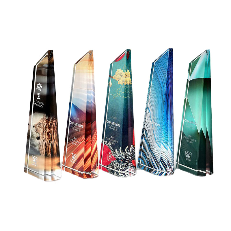
Read the wedge row as a tier ladder and the purchasing logic becomes obvious. Five pieces, one cut, five colourways — that is a season’s divisions rendered from a single master, with the headline zone carrying the event mark and the base zone carrying a small emblem, while the recipient data sits mid-face on every unit. The diagonal top gives each board a directional lean toward the podium centre when a row of them stands on a table, an effect no straight-edged plaque achieves, and because the slab is one solid piece the boards pack without any sub-assembly step at the venue. Volunteer-run events consistently choose this silhouette for exactly that reason: box opens, boards stand, ceremony starts. If your programme wants the tier ladder plus a single larger statement piece, pair the wedge family with the footed plaque at a taller height on the same artwork master — two silhouettes, one design family, one shipping window, and the desk will nest both cuts from shared board runs so the material math works in your favour.
Place Tiers from a Spreadsheet, Not a Design Meeting
A tournament’s award structure is data: category, division, place, name — one row per recipient, sometimes four hundred rows on a weekend. The production answer is not four hundred layouts; it is one master per tier level with the name and place fields driven by the results file. First place gets the faceted column, second and third the wedge, category winners the slanted plaque — three silhouettes, three masters, every name merged from the same sheet, every unit marked at the same depth and position because the merge is machine-run against locked coordinates.
Two layout disciplines make the merge boring in the best way, and both come from watching results exports fail. Reserve generous width for the name field and let it govern the block: the longest entry in your file — the double-barrelled surname, the club name that reads like a postal address — should set the type size for every unit, not an optimistic sample row. And keep place or division words on their own line rather than sharing one with a name, because place labels vary from one to four words and a shared line re-centres the whole block unit by unit. Fix those two habits at master stage and four hundred merged boards behave like four hundred copies of one proof. Fix them later and you re-approve the design family mid-season, which is the only genuinely expensive mistake in this category.
That structure also decides how your order counts against MOQ 100 pcs per design. A tier is a design; a name is not. Twelve divisions with three podium places each is three qualifying designs if the masters stay identical across divisions, or thirty-six if every division wants its own crest — the desk quotes both shapes, and leagues consistently pick the shared-master version once they see the per-design arithmetic. Mid-registration changes — a division that folds, a tie that adds a row — cost nothing if the sheet re-merges before artwork approval and schedule as a small follow-on run if it lands after; that’s what the 3-5 day sample lane exists to absorb.
Season planning runs backwards from the final whistle. Summer league closes need podium stock on-site by the last round, which means files approved while spring registrations are still open; winter tournaments collide with December freight surcharges in exactly the weeks every other supplier is air-lifting hardware. Order the season as one bulk commitment per silhouette family and the 7-15 days after artwork approval window covers every event in it, with split deliveries quoted against stored proof references instead of fresh setups.
Configuration List for League Buyers
- Silhouette per tier: slanted-edge plaque on clear foot, faceted self-standing column, or plain wedge board
- Face artwork: full-colour printed background with white text zones, or shared tournament key visual across all tiers
- Engraving or print of recipient data: place line, division name, athlete/team rows from one results sheet
- Board slab depth scaled to board height so a wedge self-stands plumb; thickness quoted on request against a physical sample
- Emblem zones: crest at headline position, small mark near base edge, optional sponsor strip on quote
- Feet handled separately from boards in packing so plinth units don’t scratch printed faces
- Per-event sizing sets: one design family, multiple heights for individual versus team podiums
- Carton marking by division so volunteer crews find the right box at the right medal table
| Spec line | Tournament build standard |
|---|---|
| Item | Printed or engraved acrylic award board: slanted plaque, faceted column, or wedge silhouette |
| Size | Per-silhouette height sets from desk-top to podium presentation; dimension sheet returns with the mock-up |
| Board & Thickness | Clear cast acrylic slab, polished edges with print bleed to the side; thickness quoted on request against a physical sample |
| Decoration | Full-colour face print; white or dark text zones; data-driven place/name merge; optional emblem marks top and base |
| Assembly or Mounting | Clear plinth foot for slanted plaques; beveled or flat bottom self-stand for columns and wedges — no adhesive |
| Packing | Boards sleeved per unit, feet boxed separately, foam rows in double-wall export cartons; pallets on request |
| MOQ | 100 pcs per design (tiers sharing one master count as one design) |
| Sample time | 3-5 days |
| Lead time | Bulk 7-15 days after artwork approval |
| Capacity | 1,000,000 pcs per month across our gift lines |
Sample-First Is Non-Negotiable on Multi-Size Runs
The six-board studio row looks identical in shape because it is — same cut, six artworks. Real tournaments order the same artwork in three sizes, and that is where a physical sample earns its 3-5 days. A wedge that self-stands at twenty centimetres can tip forward at thirty-five because the diagonal facet shifts the centre through the bottom edge; a column’s side bevels read sharp at catalogue scale and soft in a gymnasium photo from four metres away; a plinth foot sized for the small plaque shows under the large one unless the foot set scales with it. None of these failures show on a digital proof. They show on the one sample board the desk mails before the season’s master enters the cutting queue, checked against your tier list and your podium photo distance, not against a render.
Freight for Boards That Are All Edge

Every silhouette on this page is a slab whose value sits in its perimeter — polished facets, refracted colour edges, a diagonal cut that only reads when unchipped. Export packing treats the edge as the protected component: individual protective sleeves per board, foam rows that stop facet touching facet, feet packed in their own orientation, double-wall cartons, pallet patterns on request. The reference price on this page is a reference rate at the 100-piece tier for one design; multi-size season sets re-tier per silhouette, never as a blended average. Sea or air or express (DHL, UPS, FedEx, TNT) quotes land with freight legs itemised, and FBA prep runs the same line for sellers stocking podium hardware year-round — division-by-carton marking included so event volunteers unpack straight to the medal table.
Do first, second, and third place count as separate designs?
Can boards self-stand, or does every unit need a foot?
We need names merged from our results export — what format works?
How late can registration numbers change before the order breaks?
Does the printed artwork wrap onto the board’s edge?
Pages That Finish a Podium Order
Event hardware rarely buys one category. Pair these boards with the clear finisher medals on ribbon for the mass start list, and keep the round disc plaque for corporate-official recognition inside the same programme. The awards category indexes both, under the acrylic items catalogue; the standee branch — photo panel, character block, moving-part cutout — covers event merch beyond podium stock, and printed items handles the signage and programme side. Send results sheets and tier lists to the request-quote desk and one reply returns masters, merge proof, and season pricing.
Book the Season, Not Just the Event
One silhouette family, one master system, every division merged from the file you already have. Mail the tier list, approve the sample board, and the 7-15 days after artwork approval clock covers your final whistle.


