
Custom Embossed Foil Luxury Cards & Envelopes
$0.60
High-end greeting and invitation cards where the depth is real: blind embossed scrollwork fields with clear foil medallions, hot-stamped monograms, letterpress-style type pressed into soft cotton-feel board, duplexed builds thick enough to edge-finish, and die-cut skyline bands cut clean through the sheet. Envelopes are developed as printed components – weight-matched stock, corner cuts matched to the card, bow-and-ribbon seals pressed inkless into the flap. Date cards, details cards and map cards board onto one press language so a suite reads as one program instead of four printings. Physical proof samples ship in 3-5 days with raking-light photos of every impression; MOQ is 100 pcs per design, bulk lands 7-15 days after artwork approval. Send your artwork and field list to the quote desk for a free digital mock-up before any tool is cut.
These are custom embossed foil luxury greeting cards built the way premium stationery programs actually need them built: deep relief pressed into soft cotton-feel board, metallic accents placed only where light should catch them, and envelopes specified alongside the card instead of bolted on after. The samples on this page come straight off our proof table, so every claim below can be checked against a photograph rather than a render. Buying teams comparing us to mall-grade invites are usually comparing tooling depth, not ink colour, and that is the right instinct. A letterpress-quality deboss costs dies and press time; a printed faux-relief does not. We quote the real thing, show the impression under raking light, and ship it paired with the envelope that matches its weight.
Relief First: What the Depth on These Cards Actually Is
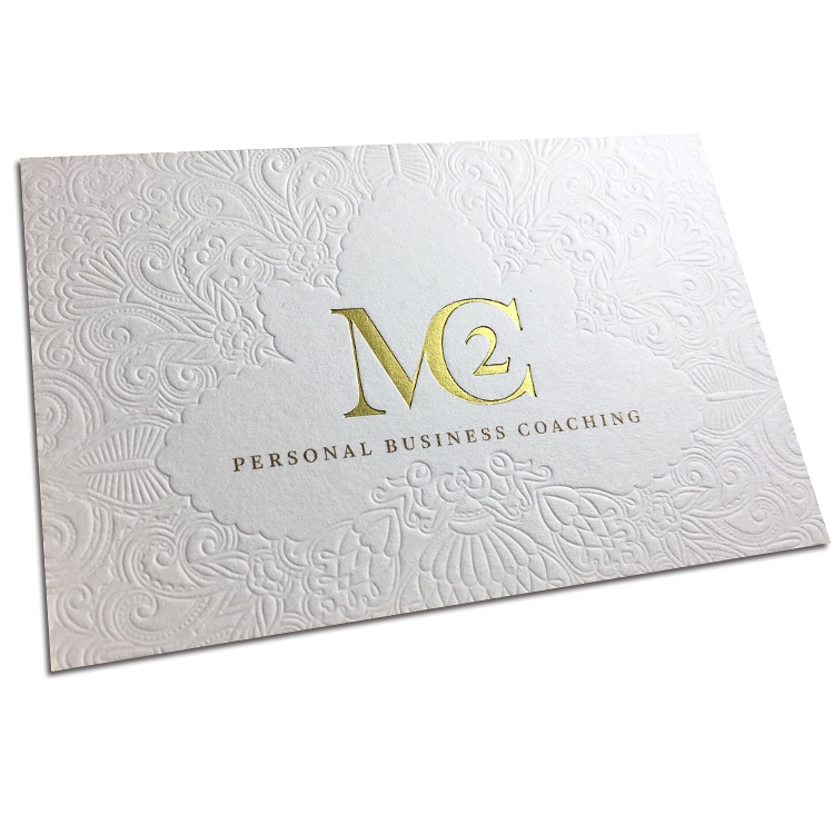
Run a thumb across the face of the first sample and the pattern wins. That card is covered edge to edge in raised scrollwork pressed without a single gram of ink on the texture itself. Blind embossing like that is the quietest expensive move in printing: no foil, no pigment, just steel and pressure arguing with soft fibre until the paper changes shape permanently. The field is dense acanthus-style damask, and in the optical centre the press stops early, leaving a smooth scalloped medallion like a window cut out of the storm. Inside that clear zone sits a metallic monogram in warm gold, and beneath it one small line of spaced capitals in a bronze-toned metallic. The composition works because of the contrast: matte tooth everywhere the eye rests, raised pattern everywhere the light travels, metal only in the centre where the message lives.
Two tooling notes matter for anyone specifying this construction. First, the embossing die and the foil die are separate charges, and on a card like this they register in sequence on the same sheet – our pre-press team builds both into one holder so the monogram lands dead centre in the medallion instead of drifting across a relief field. Second, the medallion has to be designed, not hoped for: the raised border around the smooth window is created by the die’s shoulder, and it is what keeps a busy texture from crawling under the logo. When buyers send us a busy pattern and a centred mark without a clear zone, this is the moment we push back and mock it up free before tooling, because a foil monogram pressed over live relief reads as a mistake even when the print shop did everything right.
One commercial note on the emboss-plus-foil combination, because it comes up in every tender: the two processes share press time but not scrap behaviour. Relief-heavy sheets are inspected for strike-through at the deboss shoulders, foil stations are inspected for pinholes in the metal, and the failure modes are different enough that a run of a hundred thousand pieces is scheduled with separate quality gates, not one. If your program needs that volume on a fixed wedding or corporate date, the die and the foil station get booked in the same press window and the inspection notes travel with the carton – buyers who request it get the tally, not just the pallet.
Two Faces, One Identity: Building the Information Side Against the Pattern Side
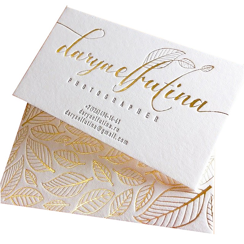
The next pair shows the other classic premium move: a restrained information face married to a full-bleed decorative reverse. The upper card carries a single centred stack – a flowing script wordmark in gold foil with a delicate line-art leaf sprig grown out of the lettering, a tiny vertical tick below it, then a role descriptor in widely tracked miniature capitals, and a three-line contact block in the same small gold type. Nothing is justified, nothing is boxed, and the whole layout leans on generous margins over a cream sheet with visible tooth. The lower card is the opposite personality: the same heavyweight cotton stock covered in an all-over botanical pattern where every leaf is drawn twice over, once in metallic gold outline and once in pressed relief, so some leaves flash when the card tilts and others just throw a shadow. No text at all on that face – the pattern is the brand.
For corporate programs this pairing solves a real procurement problem: the information face reprints every time a title or number changes, while the pattern face never moves, so the decorative tool gets amortised across years of reorders and only one small plate renews per staff cycle. It also gives wedding clients the same architecture under different clothes: monogram-and-date on the front, family pattern on the back. One caution we pass to every design team: deep all-over relief plus metallic ink on the same face rubs. Foil sits on top of the sheet; metallic ink sits in it. Where the pattern embosses, ink-based text scuffs off the peaks during carton transit. On this sample the metal is foil, and the relief under it is shallow enough that edges survive counting and banding. We specify the relief depth per job instead of borrowing a setting from last season, and it is worth asking any supplier to show you a corner of a stock-run batch, not a fresh proof, before you trust a combo.
One workflow note for program owners: because the two faces live on one card, changes arrive together whether you want them or not. A rebrand touching the script wordmark still renews the pattern plate unless the artwork layers are built to separate, so we ask every corporate buyer for their identity file with the decorative motif as its own layer before quoting – not as a formality but because the tooling quote is literally different once the pattern decouples. Wedding resellers get the same lesson from the opposite side: the couple cipher on the front and the family pattern on the back are one plate pair today, and re-plating is cheap on flat art, so the layered file protects budgets in both channels.
Cut, Not Printed: Die-Cut Skyline Bands and Edge Work
Some depth cannot come from pressing paper; it has to come from removing it. The standing card in this shot is the proof. A city skyline runs across the upper third of the sheet as negative space – towers, blocks, one thin spire – cut clean through a thick off-white board so the buildings are gaps you can see the background through. Below the pierced band the lower two-thirds stay solid, carrying a centred block of charcoal-grey type pressed with enough pressure to sit slightly into the fibre: a personal name line, a title line, an organisation line, and three stacked contact lines. The layout logic is exactly a business-card grammar, which is the point – the same construction scales down to corner-card weights for conferences and up to invitation weights for gala suites without changing the story people read off the card. The cut itself does quiet work at the deboss edge of every opening, giving a faint relief rim around each tower that no ink could copy, and the fibre shows honestly, which is why this treatment demands an uncoated soft sheet rather than a clay-coated one that frays white at the cut.
The cut band costs one flat steel rule and a scoring session; the budget conversation is mostly about waste. Skyline negative space throws confetti, so on huge runs we gang it smart and quote board utilisation transparently. Where the standing sample hints at edge work – one cut edge reads faintly warm, like a painted or coloured-core line – we treat edges as a separate priced option on duplexed builds: paint a chosen Pantone on the seam after lamination, or laminate a tinted core so the edge colours itself when trimmed. Either way it is only visible, and only worth money, once two or more sheets are pressed together. That brings us to thickness. A single ply never feels like this under the thumb. The cards that read as premium in a handshake are duplexed or triplexed, and every construction decision above – relief depth, cut registration, edge colour – is easier to hold on a fat sheet than on a thin one. Our standard approach quotes duplex builds as laminated pairs and keeps single-ply options honest about their tier.
Laminate bonding adds its own engineering conversation: adhesive coverage has to stay uniform or the sandwich cups in humidity, and a cupped duplex card pops out of a gift-set tray at a warehouse nobody asked about. We press, trim and edge-finish in sequence so the colour lands on a flat face, and carton moisture specs are set for transit climates rather than the factory floor. None of that is visible in a photograph, which is exactly why duplexed programs deserve a physical sample before the die gets cut – a flat scan cannot lie convincingly about board, but it also cannot tell the truth about it.
The Envelope Is Part of the Press Work
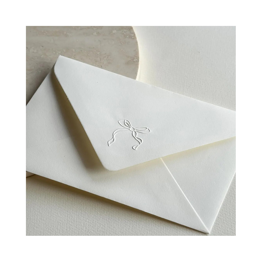
Premium carding fails at the mailbox more often than at the press, so we develop envelopes as a printed component with its own tooling budget. The ivory sample here is photographed from the back because that is the face the recipient sees first, and the only ornament is a tied bow with two small loops, a knot, and two wavy ribbon tails pressed blind into the centre of a pointed flap. No ink, no foil, no window film – just the sheet deformed with a fine-line die until the ribbon exists in shadow. The paper has the same matte tooth as the cards, edges cut crisp, flap apex softly rounded. The effect is deliberately quiet: seen flat on a desk it nearly disappears; held at an angle it reads instantly. That is the envelope-side equivalent of the medallion trick on the card face – spend the relief where the light travels, keep the reading zone calm.
Three pairing rules we apply on every high-end quote. Weight: a duplexed card in the 600gsm class needs an envelope body that will not buckle around it, so we step envelope stock up and set the crease after forming instead of pre-scoring thin sheets. Fit: a rounded-corner card needs the corner cut of the envelope matched, or the card shows a limp diagonal shadow inside the flap; we ship corner-punched pairs, not a card and a hope. Registration: if the flap carries both a blind bow and a printed or foiled address zone, they are plated into one holder so the seal motif never fights the type. Liners exist as an upsell, not a default – a tone-on-tone tissue between the bow and the body adds unboxing theatre for wedding suites and adds a unit price you may not want on a corporate reorder. Common pocket sizes for the card formats and their matching envelopes are quoted on request, and envelope options without a photographed sample go out as physical references before bulk, not as promises in a PDF.
Program buyers should also note how blind flap work behaves in mail streams. An inkless pressed motif is the only decoration that survives a postal cancelling machine without becoming unreadable, because there is no pigment for the roller to drag – an embossed flap seal gets deformed by transit but never defaced, while a foiled monogram sitting in the same machine path scuffs white. For invitation runs that genuinely travel through national postal systems rather than hand delivery, that is a real argument for the relief treatment over the metallic one on the envelope face, even though the metallic version photographs better on a shop wall.
Suite Architecture: Date Card, Details Card, Map Card
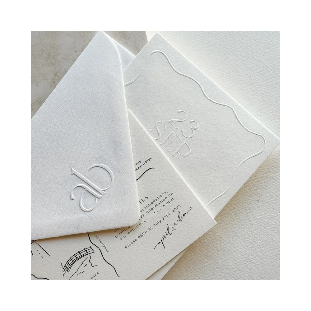
The layered flat lay exists because suites are where premium programs earn their margin and lose their deadlines. Photographed together: an envelope back carrying a ligated lowercase couple cipher pressed blind into its pointed flap; a date card whose entire design is one raised wavy frame with a month abbreviation tucked low-left and a day number high-right, both embossed without ink so the date throws shadow all by itself; a details card beneath with charcoal printed type organised in zones – a venue name line over a thin rule, a bold section heading, a body block pointing guests to accommodation notes, an RSVP deadline line with a hard calendar date, and a handwritten-style script signature closing it; and peeking out at the bottom, a line-art map card with roads, a bridge over a river, a dashed route and rotated street labels, printed flat in black. Four components, four different jobs, one press language. That last phrase is the procurement point: the suite stays coherent because every piece inherits the same board, the same tooth, the same relief vocabulary – the eye reads one wedding, not four printings.
Field logic across the suite is worth stating plainly because buyers inherit it from us already sorted. The date card carries the one fact guests screenshot, so it takes the loudest treatment and the fewest words. The details card carries the changeable facts, so it prints flat – variable venue, times, deadlines read better in ink than under relief, and reprinting a flat card mid-run is cheap and fast. The map card is pure artwork, so its only customisation is the route itself. When we board a suite program, dates and names live in one card’s fields, never spread across four, because every extra variable zone multiplies proof rounds. On the photographed specimen the visible dates are the designer’s own mock event, quoted here as layout evidence only; your text arrives through the artwork file and our free digital mock-up locks it before tooling.
Shipping the suite as one program rather than five SKUs changes the paperwork in ways purchase officers notice. Components arrive in a single carton with per-piece counts on the inner label, so a church office or wedding reseller can repack without re-ordering against five separate minimums, and the sample that leaves our press for approval is the whole layered set on one board, exactly as the photograph composes it – because a suite approved piecewise is a suite that drifts piecewise. When one component’s delivery blocks a season, only the details card ever earns that power, which is why its plate is scheduled first and its proof signed before the relief dies book press time.
Component count is the suite’s second lever. Five pieces reads formal and costs five packing steps; three pieces reads modern and costs the customer less at the register than you would expect, because the components share one carton and one poly line either way. Where resellers get burned is dropping a piece between seasons – the details card survives a venue change, the map card does not – so we flag artwork with hard geography at boarding stage and print the flexible trio (invitation, date card, details card) as the re-order core, with the map offered as a same-plate-session extra rather than a dependency. The flat lay above happens to show all four because that is the full grammar; your invoice can run any three of it.
Two Names, One Frame: The Invitation Face That Keeps Its Calm
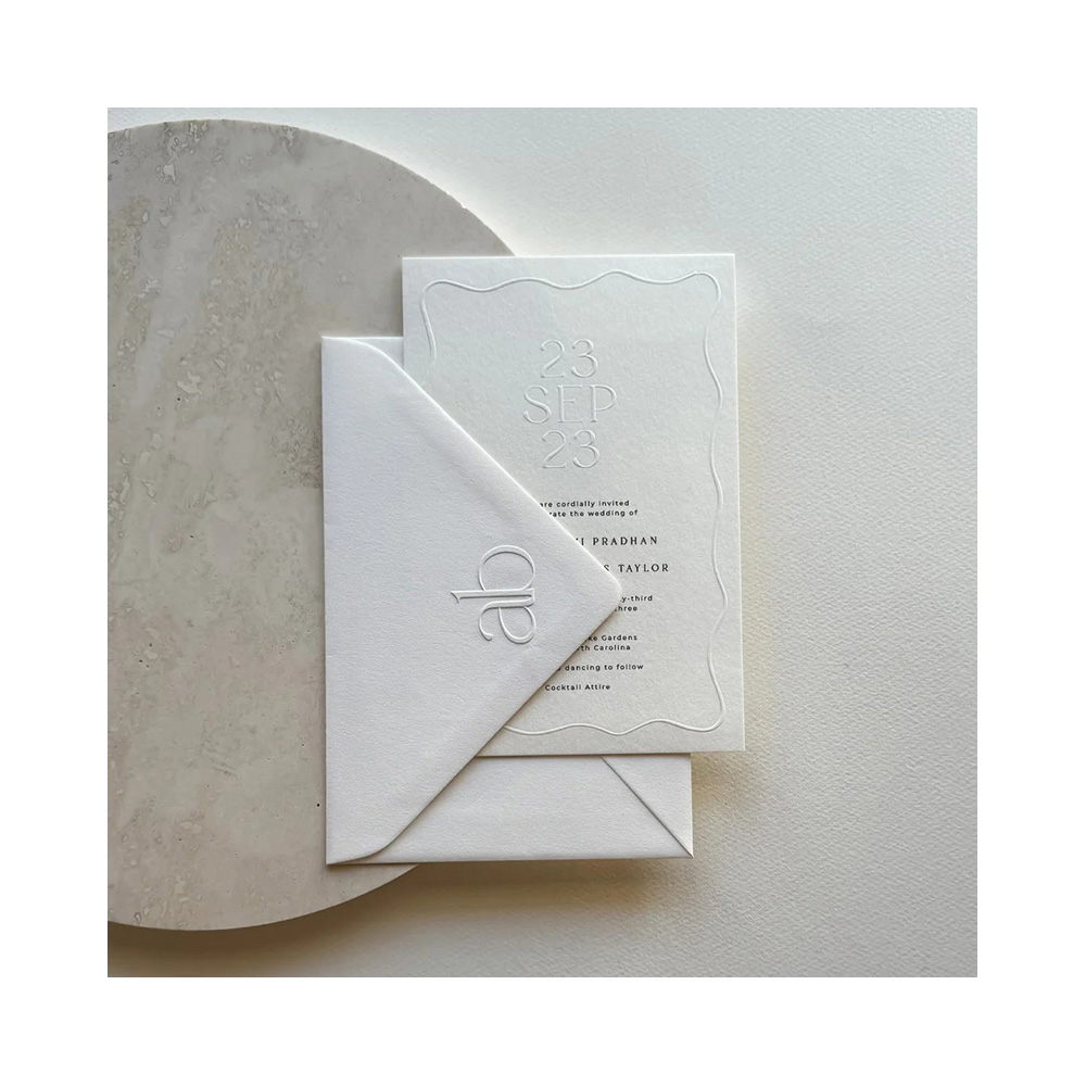
The final card pair is the anchor piece of any suite, and it is a masterclass in spending relief like ammunition. A portrait sheet of warm white cotton board carries a raised wavy frame the length of the card – blind, inkless, the only border on the page. Inside the frame, at the head, the wedding date stands in large embossed numerals with the month between them, pressed without a trace of colour; the date is literally the loudest element precisely because it uses no ink at all. Beneath it the formal copy runs in centred charcoal serif: the invitation line, the celebration line, two name lines in small capitals, day and hour, a venue pair on two lines, a reception kicker, and a dress-code note closing the column. The envelope underneath contributes exactly one mark, the folded-up triangular flap showing a two-letter intertwined cipher pressed blind – not a stamp, not a logo, a signature the recipient reads with their fingertips before their eyes.
This construction has one engineering tradeoff we always brief. Deep embossed numerals sit on the sheet’s soft side; a wrong crush in a carton corners the batch, which is why duplexed boards get chosen for date-heavy faces and why our packing section below is not decorative. The printed serif copy must register beside, never across, the relief frame – two plates, one holder, one pass. And because the frame is decorative while the type is contractual, proofs are shot in pairs: one flat scan for the words, one raking-light photo for the depth, both signed off before the die is retired. Retail packs and suite sets follow the same evidence rule – if you cannot photograph the impression, the spec is not finished.
Quantity logic across a suite deserves one honest sentence: equal counts per component are usually waste. Invitations travel with guests who reply early; details cards get pocketed; date cards get photographed and filed in the cloud; map cards survive only for out-of-town guests. Programs we board therefore start at one hundred percent of the head count on the invitation face and trim enclosure counts from there, all within the same plate session, so the mixed per-piece carton comes off the press in the ratio the room will consume instead of the ratio the invoice template assumed.
Counting tolerance gets written into the packing note rather than promised verbally: program quantities ship counted to the carton label, and any overage band approved at boarding travels as its own sleeve so a parish hall can reconcile intake in one minute instead of one evening. Buyers who have ever unpacked a mixed suite know the difference between that sentence and a shrug, and it is why our pick-list template carries counts, formats and plate generations on the same inner label.
What You Can Specify on This Line
- Board: cotton-feel uncoated whites and ivories, single-ply or duplexed up to business-card-class thickness for deep relief and cut work
- Relief: blind emboss or deboss, full-bleed texture fields, framed medallions with clear reading zones, inkless date numerals
- Metal: hot-foil stamping in gold, bronze and rose tones; foil monograms, script wordmarks, pattern leaves; metallic-ink downgrade discussed at quote stage
- Cut work: die-cut skyline and silhouette bands, rounded corners, corner-punched cards with matched envelope cuts
- Edges: painted edge or tinted-core lamination on duplexed builds, quoted as an option per colour count
- Envelopes: weight-matched stock, blind-pressed flap motifs, optional tone liners, printed or foiled address zones registered to the seal
- Suite splits: invitation, date card, details card, map card, enclosure cards – one board and one press language across all pieces
- Variable handling: changeable names, dates and deadlines kept in flat-print zones so mid-program reprinting stays cheap
Specification Summary
| Item | Custom embossed foil luxury greeting cards with envelopes (card, date card, details card, map card, suite components) |
| Size | Common pocket sizes quoted on request; suite formats developed from your field list |
| Stock & Finish | Uncoated cotton-feel board, matte tooth; duplex builds available for deep relief; soft or clay white surfaces specified per tool |
| Printing & Artwork | Blind emboss/deboss dies, hot-foil stations, flat serif and script type in charcoal or metallic; die-cut bands on request; vector artwork preferred, free digital mock-up before tooling |
| Envelope or Extras | Weight-matched envelopes with blind-pressed flap motifs; optional liners, painted edges, tinted cores – each quoted per zone |
| Packing | Components individually poly bagged, master export cartons, counts set by card size |
| MOQ | 100 pcs per design; suite components developed per design line |
| Sample time | 3-5 days |
| Lead time | 7-15 days after artwork approval |
| Capacity | 1,000,000 pcs per month across our gift lines |
Proofing Before Tooling, Then Tooling Once
High-end relief programs die in the gap between a beautiful proof and an ugly stock run, so our sampling sequence is built to close it. You send the artwork file; we return a digital mock-up free, with the medallion, frame and foil zones drawn in place. Then a physical sample in three to five days, shot twice – flat for the copy, raking light for the depth – so whoever signs it in Ohio or Manchester is signing the actual impression, not a vibe. Die fees are the heavy part of the first order; reorders of an approved tool run materially cheaper, which is exactly the behaviour wedding resellers and corporate gift programs plan around. The reference figure listed on this page anchors the 100-piece tier; contact us for pricing on other quantities, and mix-design splits are quoted per design line because every new name on the press is a new holder setup. Approval is the gate for everything after it: bulk runs seven to fifteen days after artwork approval, and a late text change past sign-off reruns the die-holder, not just the plate.
Packing, Freight, and the FBA Question
Embossed faces are structural, which means they fear corner crush and carton stacking the way coated cards fear scuffing. Every build ships components individually poly bagged, interleaved with stiffeners when the relief class is deep, inside master export cartons sized per card format so the pallet cube matches the product instead of shipping air. Cartons are labelled for warehouse intake, and the packing photo below is our standard export configuration rather than a one-off hero shot.
Freight runs by sea, air, or express with DHL, UPS, FedEx and TNT all available, and route choice is seasonal: spring wedding suites ship early to dodge the last pre-Valentine press crunch, and Q4 corporate programs consolidate against holiday sailings. For Amazon sellers, FBA labelling and prep are routine, including combining these cards into the same carton as matched insert or invitation SKUs so one inbound appointment covers a whole event-season line instead of two half-empty shipments.

Questions Purchase Teams Actually Ask
How much more does a hot-foil monogram cost than a gold metallic ink version?
Can a blind embossed field stay crisp if we reprint names every season?
Which boards take deep relief without the fibre cracking?
Do you match envelope stock to a duplexed card, or is that our problem?
How far ahead should a spring wedding suite be in production?
Where These Cards Sit in Our Line
This program sits inside our wider printed cards range, alongside the paper gift lines it shares board and tooling with. For event planners assembling a full paper program, the matching baby shower invitation cards use the same field-stack logic at a friendlier price point, and our graduation advice cards take the foil treatment into keepsake territory. When the suite outgrows paper and needs a box, the gift sets category carries the rigid options. Send artwork questions through the request quote desk or to [email protected] or +86-15967739086 – if the impression you are chasing is not photographed here, we will prove it on your spec before you buy it.
Start the press conversation: submit the artwork you have, get the free digital mock-up back, and let the raking-light sample decide whether your relief is real.