
Custom Graduation Advice Cards – Keepsake Guest Pack
$0.60
Landscape keepsake cards built for signing tables: a black-and-gold frame, mortarboard icon and script title sit above three engineered handwriting zones – a wish block, two advice lines, and a guest name rule – so thirty different pens produce one shoebox archive a graduate actually keeps. Bought as ceremony packs by schools, PTAs and alumni offices, with school crest, class-year and date zones set at artwork stage on a plate that stays fixed year over year. Matte uncoated writing face, MOQ 100 pcs per design, samples in 3-5 days, bulk 7-15 days after artwork approval timed backwards from June ceremonies, FBA prep and multi-campus carton splits available.
These are custom graduation advice cards – the keepsake a teacher, a grandparent, or a friend signs at a June ceremony and the graduate reads aloud alone in September. The photographed specimen sets the whole program: a landscape card in a bold black frame with a thin gold rule, a mortarboard icon overhead, a script title, and three prompts down the middle – “I wish you:”, “Words of Advice”, “Guest name:” – each riding dotted rules that hold a guest’s actual handwriting. Schools, PTAs, alumni offices and party-supply channels buy this exact object at ceremony-timing volume, and the economics are different from greeting-card retail: one ceremony needs thirty signed cards and zero returns, on a fixed date, in one carton. That is the product this page quotes.
Pricing mechanics on this line are the standard ones stated plainly, because June compresses negotiation windows: the displayed figure on this listing anchors the 100 piece tier, contact us for pricing on other quantities, and a district that wants four school variants orders each variant as its own design line. What consolidation does buy is shipping: one production week, four banded destinations, one artwork approval to reissue next spring with only the year zone edited on the plate.
What The Graduate Keeps: The Layout, Read Top To Bottom
The fanned-stack specimen lets you audit the design like a proof sheet. Everything above the writing zone is ceremony language: a black mortarboard with a gold tassel hanging off one corner, flanked by two symmetric scroll flourishes, then the title in a large flowing gold script. Everything below is furniture for a stranger’s handwriting – and this is where advice cards live or die commercially. The first prompt carries one dotted rule on its own baseline plus a full-width dotted line beneath it, so a wish can be a phrase or a sentence without the guest improvising margin space. A centred section header opens the second block: two more dotted rules for the actual advice, the longest field on the card because the memorable lines are always the advice lines. The final row is a name field with its own trailing rule, which is the entire reason this product outlives the party – a signed keepsake without a signature line is just stationery.
The bottom edge closes with a full-width gold silhouette band: raised arms, fists, a few figures mid-throw with mortarboards in the air – a crowd celebrating, rendered in a metallic-look gold that gradients slightly across the width. Scattered stars and curling confetti doodles fill the left and right margins so the writing zone never sits on dead white. None of it is embossed; it all reads as flat print with a foil-style metallic face, which is the right construction for a card destined to be handled by thirty different guests and archived in a shoebox, not a display case.
The dotted rules deserve one engineering sentence because cheap advice cards get them wrong: solid lines compete with handwriting, and no lines produce a ragged keepsake, so the guide marks print as dots at a weight that steers a pen and disappears under ink. Rule length, gap height and caption size all hold at the same measurements across every pack we print from this plate, which is what makes a district’s second year look like its first. Signature capacity sits at the end of the column deliberately – guests sign last, and the eye lands on the name before the crowd band beneath it, so the card photographs as a wall of signatures rather than a wall of graphics when a parent posts the finished box.
Packs, Not Singles: The Procurement Shape Of Graduation Season
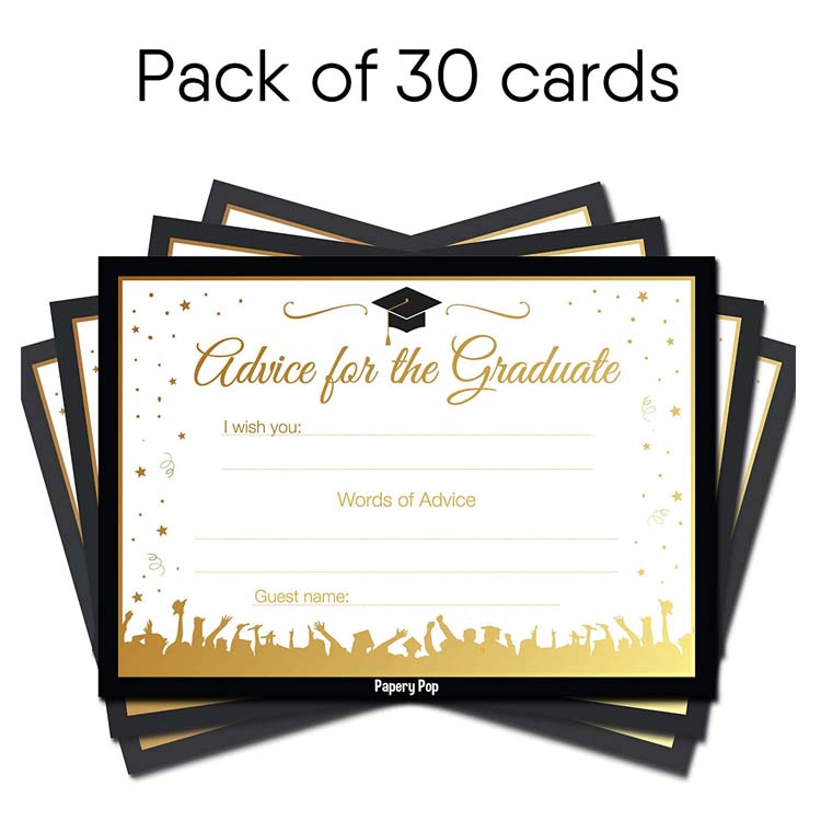
The second specimen is a listing graphic doing exactly the job a school purchaser needs the internet to do: a plain bold quantity headline over a fanned pile of identical framed cards, the black borders and gold inner rules stepping out behind the top sheet so the eye counts stack depth before reading anything else. The visible face repeats the layout from the photograph above – cap icon, script title, wish lines, advice header, name rule, crowd band – and the quantity claim sits where a procurement officer expects it. Graduation programs are bought as packs because the ceremony math is fixed: one homeroom of thirty guests, one signing table, one box. Nobody buys an advice card the way they buy a birthday card.
That pack logic shapes our quote structure. The MOQ is 100 pcs per design, which lands deliberately: a single classroom order can consolidate across a term, a PTA can run one design across every grade’s ceremony, and an event channel can stock a June wall. The school-year field zones – class year, school name, ceremony date – are added at artwork stage along the black frame or beside the title; nothing on the photographed proof carries them yet, so they are specified in your file, not assumed from ours. Ceremony calendars compress everything into the same four weeks of May and June, so we board programs the way sports teams do a season: artwork approved in spring, samples in hand before the district’s first signing table, bulk on the 7-15 day after artwork approval window timed to the earliest ceremony date in the batch, not the average one.
Reorder behaviour here mirrors textbook adoption more than greeting-card retail. A PTA that standardises on one advice-card design across three ceremony years renews a single plate annually – only the class-year zone edits, everything else in the frame is fixed – and that continuity is worth shelf presence at graduation supply tables because families recognise the card before they read it. Districts that redesign every spring pay full artwork and proof rounds annually and get a keepsake their own alumni do not recognise. The fanned-pack specimen above is what a stable-design program looks like in a carton: identical frames, no mixed plate generations, one counting step at intake.
The quantity headline in the mockup is also a hint about proofing: committee sign-off moves faster when the sample arrives pack-counted rather than as one loose card.
Designed For Thirty Different Hands And One Ballpoint Each
The third specimen answers the question teachers ask first: what does a filled card look like? Demo handwriting prints across every rule – a two-part wish spilling from the first line to the second, an imperative advice sentence plus a send-off line in the advice block, and a guest name closing the last rule. Read it as a capacity test. The wish block absorbed a phrase with a comma; the advice block took a short exhortation and a second thought without touching the crowd band; the name rule fitted a full first-and-last at normal pen size. Those dotted guides are printed as thin marks deliberately – heavy enough to steer a hand, light enough to disappear behind actual ink in a photo of the finished keepsake.
Under this much handwriting the surface choice stops being aesthetic. The face is matte, the metallic zones are flat print rather than a raised or slick finish, and that combination is what makes ballpoint and gel pen behave on the same card: tooth for the ink to grab, no coating for a left-handed senior to smear. The frame design carries a functional job too – the black border is where a school’s own colours can swap in (a district athletically dark-blue instead of black reads instantly official), while the gold inner rule keeps the ceremony tone whatever the outer band becomes. When alumni offices ask whether these can double as retirement signing cards, the honest answer is the architecture allows it: change the title line and the icon, keep every rule the same length, and the proof round takes one artwork edit rather than a new die.
Frame geometry carries a storage consequence nobody tests until May. Landscape cards riding in oversized portrait cartons migrate their corners against the carton wall through sea transit, and a black frame printed to the trim shows every migrated corner as a pale nick. We size cartons to the format rather than the other way round and band packs grain-direction consistent, which costs centimetres of carton and removes an entire complaint category from the first week of signing season. The photographed frame proportions are the ones that survive that math from the smallest approved run up.
School-zone text deserves one proof-stage check per year group: a long district name set in a compressed font breaks the calm geometry above the writing rules, and the mock-up review is where that gets caught at no cost rather than at a signing table at some cost. Year bumps are the classic offender – a four-digit class year plus a two-line school name plus a ceremony date wants more horizontal room than any committee expects, and the frame absorbs the overflow by shrinking type, not by growing the card.

What You Can Specify
- Frame colours: standard black outer band, swappable to school colours; gold inner rule fixed or recoloured per district
- Title and icon: script headline line plus mortarboard mark; alternate icons and school-crest zones added at artwork stage
- Field zones: wish lines, advice lines and name rule lengths locked from the photographed proof; class-year, school-name and ceremony-date zones added without changing the writing geometry
- Back face: plain, or a second zone for a graduate’s own line – one plate either way
- Pack build: banded counts per ceremony with an insert card, or loose hundreds for party-channel repack
- Keepsake extras: matching signing-table pens, card boxes and belly bands quoted separately against the gift-set tree
Specification Summary
| Item | Graduation advice keepsake cards, landscape format with black-and-gold frame |
| Size | Common pocket sizes quoted on request; landscape proof format as photographed |
| Stock & Finish | Matte cardstock, uncoated writing face so ballpoint and gel ink grab without smearing |
| Printing & Artwork | Full-colour print with metallic-gold face zones; variable school/class zones set in the fixed plate at artwork stage; free digital mock-up before tooling |
| Envelope or Extras | No envelope standard – signing-table format; optional header bags, boxes or banding per pack |
| Packing | Cards individually poly bagged or banded by ceremony count, master export cartons |
| MOQ | 100 pcs per design |
| Sample time | 3-5 days |
| Lead time | 7-15 days after artwork approval |
| Capacity | 1,000,000 pcs per month across our gift lines |
The June Deadline Runs Backwards From The Ceremony
A district signing one May order expects cards on tables May 20, which means artwork final by early April, which means the free digital mock-up and the 3-5 day physical sample inside February and March while proofs staff are still reachable. We have run this calendar enough times to quote it as a sequence rather than a hope: approve the plate, lock the school-zone variables, book production to the 7-15 day after artwork approval window against your earliest ceremony, and let one carton cover a week of events instead of five cartons chasing five principals. The displayed price on this listing anchors the 100-piece tier; contact us for pricing on other quantities, and district programs ordering one design per school count each school zone as its own design line even when the frame geometry is shared – that is the honest way to split the MOQ, and it is also how a multi-school PTA coalition keeps one negotiation going.
Packing, Freight, And Marketplace Channels
Cards move in banded ceremony packs inside master export cartons, individually poly bagged where the buyer is a party retailer rather than a school, because a shrink-banded brick photographs fine but a loose hundred in a bag arrives as curl-cornered confetti at a reseller’s door. Freight ships by sea, air, or express with DHL, UPS, FedEx and TNT, and the graduation run is the one printed-card season where courier restocks genuinely save programs: the ceremony cannot move, so mid-May stock-outs get fixed by air rather than apology. Amazon channels get full FBA prep on this line, including packing advice-card packs with matched graduation gift-box SKUs in one inbound so a single Prime listing can ship a signing kit rather than loose sheets.

Questions From Procurement Offices And Party Channels
Can a school district put its crest and class year on the card without paying for a second die?
Will a guest’s ballpoint actually dry on the gold frame zones?
Our ceremonies spread across three weekends in June – do we need separate production runs?
How does this differ from the baby-shower advice cards you sell?
Can a PTA order enough for an entire K-12 year off one artwork approval?
Where This Program Sits
The keepsake frame treatment shown here shares press language with our embossed and foil card program when districts want depth, and the fill-in architecture carries over from the prediction-card game line minus the die-cut. Both, plus the invitation format for the same event-buy channel and the seasonal bingo game decks, sit inside our cards range and the wider printed goods catalogue; ceremony gift-box programs merge into the gift sets tree. Send the district name and ceremony calendar to the quote desk, or to [email protected] or +86-15967739086.
Approve the frame, lock the school zone, and let June arrive with thirty signed cards per graduate already in cartons.