Custom Weekly Planner Sticker Sheets | Task Icon Packs
$1.10
Custom weekly planner sticker sheets for journaling brands and stationery retail: appointment pills, priority arrow tabs, note pennants, birthday rectangles, mood dots and tracker circles printed on planner-grade low-tack paper that lifts without tearing a day-block. Photographed sets show a header-carded ten-sheet fan, a single staggered label sheet coded by pattern, a 30-dot-plus-21-arrow tracker layout, and a real seven-day spread proving how categories mix with handwriting, washi and a printed page. Shared die-lines recolour across season palettes; label vocabulary is yours to rewrite at proof. MOQ 100 pcs per design, free digital mock-up, samples 3-5 days, bulk 7-15 days after artwork approval. Retail-ready trays, hang cards and FBA prep included; sea or express courier freight.
The line a journaling brand’s sourcing sheet carries is usually five words long: custom planner stickers weekly – and those five words stand for an entire shelf program. Custom planner stickers built for weekly spreads – task pills, deadline flags, note pennants, mood dots – are the consumable that keeps stationery customers returning month after month, which makes them the highest-margin small SKU in most journal catalogs. This page is for the buyers who order by the sheet layout: stationery brands, planner publishers, gift-box assemblers and retail card programs. The photography is ours, the functional vocabulary is yours to redesign, and the production floor treats every sheet grid as a die-line conversation rather than a template drop.
The Weekly Spread Is a Different Product Than the Monthly One
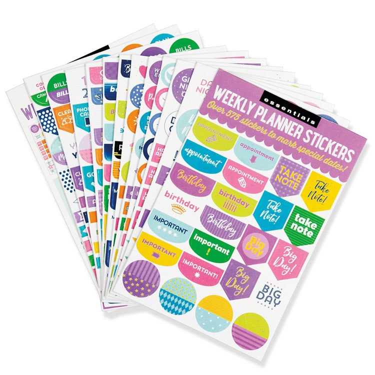
Weekly layouts live or die on at-a-glance flags. Seven day-blocks, a few hours of ink per square, and a reader scanning for what matters: the appointment, the deadline, the thing that must not slide. So the sheets that sell in this segment are not pretty first – they are legible first. The fanned pack in the first photo shows exactly that grammar: a coloured header card, then a loose grid of small pills, scalloped squares, pointed pennants and patterned dots, in a saturated five-colour palette that reads instantly on a cream page. Around ten sheets fan behind the top one, which is how brands present variety – the same mechanic repeats across a colour set, and the shopper buys two sets.
For purchasing teams, that fan is also a tooling statement: shared die-lines, recoloured artwork, many SKUs from one cutting setup. Sheet count, sticker count per sheet and header design all change the per-unit price; the mock-up stage is where those dials get turned against your target shelf price.
That grammar – legible first, pretty second – is also why weekly packs and monthly reminder pages are different products with different die-lines, even though stationery shoppers put them in the same basket. A monthly spread is a wide, low-density field where one large label or a vertical month strip does the work; a weekly spread is seven narrow rows where six tiny identical pills, repeated, create a colour rhythm the eye scans top to bottom. Design a sheet for one mechanic and it looks wrong on the other, which is why we quote planner programs by the mechanic, not by the aesthetic. Your colour palette travels between them; the shape system does not.
One retail note while you are reading the fan: the number of visible sheets in a fanned photograph sets a price expectation at the shelf. A shopper who sees ten sheets fanned behind a header assumes a ten-sheet pack and pays accordingly. If your program is genuinely a six-sheet pack, photograph it as a deliberate six; if it is a twelve-sheet pack, say the count on the header card in plain numerals, because planner shoppers count sheets the way notebook shoppers count pages, and a vague photo invites a bad review you will pay to replace.
What a Functional Sheet Actually Carries
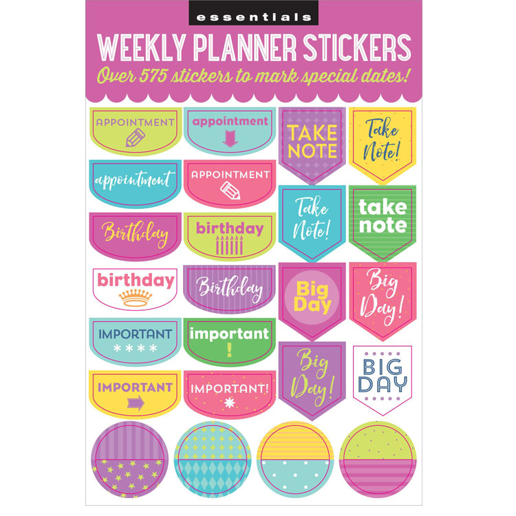
Open one sheet and the system becomes obvious. The second photo is a single weekly pack laid flat: rounded pills for appointments, pointed banners for notes and big-day markers, small rectangles for birthdays, four patterned circles in a bottom row, everything set in staggered columns with a bunting-edge header announcing the set. The label words are the job titles a week contains – appointment, important, take note, birthday, big day – printed in bold caps, lowercase and script so one sheet covers the full emotional register from payroll to party.
Notice the pattern fills: argyle, vertical stripes, dots, mixed half-and-half circles. Those are not filler; they are hierarchy. A brand can code priority to pattern (stripes = work, dots = personal) so users build their own legend without reading a word. When you send your label list, our studio can propose pattern-grouping for your icon set at proof stage – it is the difference between a sticker sheet and a system, and systems are what reorder.
Function packs also age well. Trendy artwork sells a season; task vocabulary sells a catalog year. Many journaling brands run the same functional layout for three seasons with a recolour, which amortises their tooling to almost nothing by the second print.
Here is the sheet-specification arithmetic no planner brand wants to discover mid-launch. Stickers per sheet is a product of three variables: the shape size, the gap required between die-cuts, and the sheet size itself. Shrink every label by fifteen percent and a sheet that held twenty-four pieces holds thirty-one – but each piece also reads smaller against a handwritten week. Keep the scale and drop one colourway from the set, and you print longer runs of fewer files at lower cost. Both moves are legitimate; what matters is that the decision happens against your real planner page size in the mock-up, not against a stock photo. Send us the planner’s finished page dimensions and the day-block height in millimetres, and the first proof arrives with labels that already fit the box they have to live in – which is how a sheet earns its spot in a kit rather than being cut from it.
Print discipline hides in the unglamorous details here. Type set at four to six millimetres tall sits right on the edge of what a flexo press holds crisp, and script faces lose their thin terminals before bold sans does; when we retypes a label set, the point size floor gets tested on the actual sheet sample, not on a screen. Brands that scale artwork down themselves after approving a large proof are the ones who come back with a “soft printing” complaint we cannot fix without reprinting.
Mood Dots and Priority Arrows: The Second Language of Planning
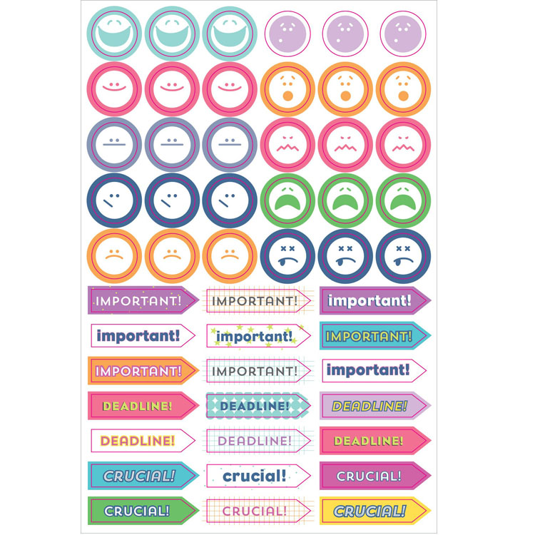
Weekly logging has a twin system beside the task flag: the tracker. The third photo shows it plainly – five rows of round face stickers up top, laughing, tired, surprised, flat, sad, each a clean two-colour disc; and seven rows of right-pointing arrow tabs below, stamped with the three words every project manager has ever bled over: IMPORTANT, DEADLINE, CRUCIAL, repeated across solid, grid-pattern and outlined treatments. Thirty circles and twenty-one arrows on one sheet, matte print on white, no dimensions printed because the sheet is built to the customer’s planner, not ours.
The arrow shape deserves a purchasing note. A right-pointing pennant is the classic planner-tab grammar: it survives being applied inside a day-block, points the eye toward the entry, and peels from the paper without tearing the page when the task finally clears. That peel-clean behaviour on planner paper is an adhesive decision, not luck – our tracker-grade stock is specified so the sticker leaves the paper intact and takes only its own adhesive with it, which is what journalers tell their friends about on review pages.
Two construction cautions from the press floor. First, tiny circles below roughly half an inch kiss-cut poorly in dense grids; if your mood dot is smaller than a pencil eraser, tell us at die-line stage. Second, heavy ink coverage on arrow tabs can show cut dust if the sheet is trimmed after printing; we print-then-cut, not cut-then-print, which is why the photographed edges are clean.
Colour naming is the last production detail that separates professional planner packs from amateur ones. Shoppers buy the set by palette name, not hex code: mint, magenta, lemon, aqua. Our studio builds label sets so the same five colours recur across every sheet in a program, because a journaler’s shelf is a colour system and a stray sixth colour in one sheet reads as a misprint even when it was deliberate. When you brief season palettes, brief them as families of five and let each sheet rotate which shape carries which hue – the system stays consistent, the variety stays visible, and your January colourway and your September colourway remain recognisably the same brand sitting on the same peg.
Tracker packs deserve one more commercial sentence, because they change what a sheet is worth. A priority-flag sheet sells on usefulness and gets reordered out of habit; a mood-dot sheet sells on personality and gets reordered out of attachment – the buyer’s photo grid is full of your faces by December. Programs that pair the two in one pack report the obvious result: the functional half carries the purchase, the expressive half carries the review, and the review carries the next customer. When we build tracker layouts, we deliberately mix the register – grid-patterned arrows next to plain discs, one italic word among eight upright ones – so the sheet reads as a character set instead of a spreadsheet. That one layout choice shows up in your five-star reviews as “cute” or “fun,” which is free marketing no ad budget buys at this price point.
Density math matters for trackers more than any other planner format. Thirty circles on a sheet is not decoration; it is a logging month – four weeks of weekly-mood dots plus buffer. Twenty-one priority flags is three per day with spares. When brands brief us for a month’s supply, we layout to the calendar first and the artwork second, so the sheet count sells the duration in the shopper’s head: this pack lasts a month. That single framing – monthly supply rather than sticker count – is the difference between a consumable that reorders on schedule and a novelty that sits in a drawer, and it costs nothing to design for.
Ink on Paper: How the End User Actually Arranges a Week
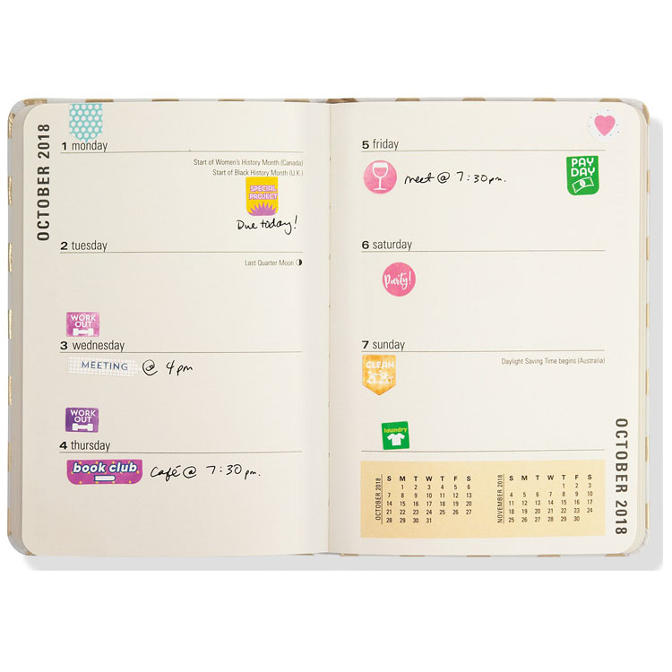
The most useful photo on this page is the last one – a real weekly spread, photographed open on a table, showing what buyers are really selling into. Seven day-blocks across two pages, warm cream paper, thin rule lines. Task stickers carry the structure: a sunburst marker for the special project, square chips for workouts, a pill for book club, a round dot for the payday Friday, a downward pennant for the weekend clean, a green square for laundry, a pink circle for the Saturday party. Handwritten ink fills in times and places around them. Washi strips anchor corners; a mini two-month calendar runs along the page foot. Nothing on that spread is fancy, and everything on it is sold – that is the honest business of planner stickers.
Worth naming what a spread like that tells a supplier about SKU mix. Notice the handwriting does most of the work and the stickers do the structure – category, priority, colour code. That division is why functional sheets outsell decorative ones in the planner channel: the customer’s content changes weekly and the stickers’ job never does. A brand whose pack forces users to write nothing is selling stationery that finishes itself; a pack that leaves ink room keeps selling forever. So when we proof planner sheets, we print them on a real page and handwrite fake entries over them under warm light – a workout chip that fights the pen stroke around it gets recoloured, not defended. That small rehearsal has prevented more launch returns than any prepress checklist, and it is part of the standard sample on this line.
For a stationery brand, this image is your design brief: your functional set must survive being mixed with handwriting, tape and a printed page without fighting for attention. Colour discipline matters more than motif count. When we proof planner packs, we print your sheet and stick it on a cream-stock page under warm light before you ever see the mock-up, because shelf screens flatter colours that daylight buries.
Buyers should also note what the photographed week proves about mix-and-match behaviour. The functional labels sit in colours that do not shout – magenta, teal, green, orange – while the handwriting stays black and blue. No sticker on that page is fighting the ink written beside it, and that is the design target: the stickers carry the categories, the pen carries the specifics. A planner pack that wins on a real page looks modest in a catalogue photo and generous in a customer’s; one that wins on a catalogue photo gets returned from a real page. When you evaluate competitor packs before your own launch, count how much blank page space survives around the stickers – surviving white space is the exact thing your end users cannot articulate but do return.
Reading a Dated Sample Spread Before You Spec Your Own
The spread above is a working example, printed planner page and all, which makes it a purchasing tool if you read it slowly. Left page, four days; right page, three; day headers in small lowercase type with the month running up both outer margins. The stickers are doing four distinct jobs on it: a starburst marker pulls the eye to the week’s one big project, square and pill chips label recurring events (the workouts, the book club), a round dot claims the payday and the Saturday party, and a downward pennant handles the weekend chore. That is a four-shape system covering an entire human week – and every one of those shapes could exist in your catalogue under different words. When you list your label vocabulary for a first order, sort it into these four roles instead of alphabetically; the shape count falls out of the role count, and with it the die-line budget.
The page also proves an adhesive truth we cannot test for you: stickers applied over printed rules and underlined headers still peeled straight in this sample, no ink pick-up, no torn rule. That depends on your planner’s ink cure and paper coating, which is exactly why the signed sample gets stuck on your actual page before approval. Bring the page; we bring the pack; the week decides.
What We Customise for Planner Programs
- Label vocabulary: your words for appointments, deadlines, chores, moods, self-care, meals – we set them in matched type families
- Shape system: pills, pennants, circles, squares, sunbursts, tabs; one die-line set reused across colours
- Sheet layout: staggered grids like the photographs, strict grids, or tracker-style rows
- Colourways: season palettes from one shared artwork set; recolours cost layout time, not new tooling
- Stock: matte paper faces as photographed; vinyl and glossy options quoted on request
- Adhesive: planner-grade low-tack that lifts from paper without tearing – standard on this line
- Header cards: printed bunting-edge or plain cards, hang-hole punched for retail pegs
- Bundling: foil accent sheets and food-theme die-cuts join the same order for gift-set SKUs
Spec Snapshot: Planner Sheet Programs
| Parameter | How this line ships |
|---|---|
| Item | Custom weekly planner sticker sheets – task flags, icons, mood dots and tracker tabs for journaling brands |
| Size | From 1″ mini to 6″ wall decals quoted on request; sheet dimensions built to your planner page |
| Stock & Finish | Matte printed paper faces as photographed; vinyl and gloss stock options quoted on request |
| Cutting | Kiss-cut sheets with backing card; die-cut loose shapes for tracker packs; header-card hang holes |
| Printing & Artwork | CMYK on white ground; vector preferred; type and pattern library supplied at proof stage |
| Packing | Sheets banded into sets, sets bagged, counted into export cartons; shrink-wrap retail units optional; FBA prep in-house |
| MOQ | 100 pcs per design |
| Sample time | 3-5 days |
| Lead time | 7-15 days after artwork approval |
| Capacity | 1,000,000 pcs per month across our gift lines |
Order Rhythm for Stationery Retail
Planner retail runs on calendar pressure: January is the category’s Christmas, September the second bell. A shelf-ready program therefore starts its clock two seasons out. The flow on our side never varies – artwork or label brief in, free digital mock-up back within days, physical sheets in 3-5 days, and 7-15 days of bulk once the sample is signed. Capacity across our gift lines is 1,000,000 pcs per month, so a September launch does not need special pleading, just a booked slot. Where brands stall is header-card artwork: the sheet gets approved and the card gets rushed. Treat the header as part of the die-line conversation and both halves land together.
Mixed-design economics for first orders: 100 pcs counted per design means a six-colourway program opens at 600 packs, and colourways that move get restocked on the original die-lines while dead palettes retire without tooling write-offs. That is the quiet reason small stationery brands grow shelf presence faster than shelf space.
Packing, Cartons and the Last Mile to Shelf
Sheet packs ship flat and stiff, which is the packing problem solved. Sets banded against abrasion, interleaf tissue between header cards, counted quantities into inner boxes, inner boxes into five-ply export cartons, carton counts matched to your FBA plan or retail DC receiving sheet. Header-carded units can arrive shelf-tied in retail-ready trays on request. Freight by sea for season stock, air or express courier – DHL, UPS, FedEx, TNT – for restocks that missed the boat. The dock photo below is our standard stage-out: labelled, palletised, photographed before pickup, so your receiving team gets the same picture we did.

Planner-Line Questions Worth Asking Before a PO
Will these stickers damage planner paper when moved?
How many stickers fit on one sheet, and how many sheets per pack?
Can we keep the same shapes but change every label word?
What artwork file do you need for a first planner sheet?
Is there an order floor for colourway programs?
Can planner sheets ship together with gift or party print?
The Rest of the Sticker Shelf
Task sheets print on the same lines as every format in our sticker category, one stop inside the wider printed items catalog. Gift-season bundles cross to gold foil seal sheets for premium accent packs, and kids-retail programs pair these functional grids with kawaii food die-cuts as the reward-SKU half of a two-tier shelf. When a planner brand extends into lifestyle merch, waterproof vinyl decals take the bottle-and-laptop side of the artwork, and removable sticker packs cover window and event signage for launch weeks. Party add-ons for event planners sit in the party items range. The quote desk wants three things: label list, pack-out, shelf date.
Before the form – photograph a page of the planner your stickers will live in. One paper sample decides more about adhesive and colour than any spec sheet.