Custom Tour Merchandise Gift Sets with Logo
A tour operation sells the ride and the memory of the ride. These custom tour merchandise gift sets put one artwork system across the point of sale itself: a wheeled red kiosk cart with swing-out sign wings and a striped parasol, then counter and gift-shelf tiers built from the same lockup: glazed ceramic mug, carabiner bottle, printed spiral journal, blind-embossed hardcover, embroidered cap, all-over patterned tie and a model of the fleet vehicle. Each line clears the 100 pcs per design MOQ on its own, samples arrive in 3-5 days, production closes 7-15 days after artwork approval, and cushioned export cartons plus FBA prep keep the season’s shelf stocked from the first coach run onward.
A tour operation sells two products: the ride and the memory of the ride. Custom tour merchandise gift sets exist to make the second one portable, and the photographed programme shows how seriously that job can be taken: a wheeled information kiosk doubling as the point of sale, a striped parasol parked through its top, then a red merchandise family built from one lockup: a glossy ceramic mug, a metallic carabiner bottle, an elastic-close hardcover notebook, a spiral day-trip journal, an embroidered cap, an all-over patterned necktie, even a die-cut model of the double-decker fleet. For attraction operators, hop-on hop-off lines and gift-shop buyers, the procurement task is identical each season: one artwork system that survives counter, coach and gift-shelf contexts, ordered against a fixed high-season opening date rather than whenever the design office finishes.
The Kiosk Is the Merchandising Plan
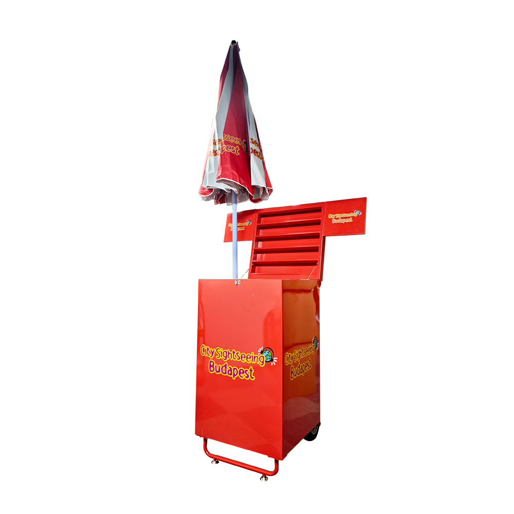
Start with the fixture, because it dictates the range. The photographed cart is red sheet metal on a gloss clear coat: a cabinet body on one larger rear wheel plus a tubular front frame resting on swivel casters, a slatted display back for leaflets, a raised compartment top-left, two horizontal sign wings that swing out to frame the unit, and a closed striped parasol standing in a hole at the front of the top surface. Print zones sit where an operator needs them: a compact lockup with a small radiating-disc icon on the cabinet front, the same block high on the side face, one line per wing, a repeated band on alternating canopy panels. The umbrella is both shade and signage; the wings make the unit visible from cross-aisle approach; the slats hold the printed matter that converts a looker into a ticket-holder.
Why does a kiosk belong on a gift-sets page? Because on a promenade or a terminal forecourt the kiosk is the till. Everything else in the range is what the till produces. Specifying merchandise around the fixture, instead of the other way round, keeps panel sizes, wing heights and canopy placement consistent with the mug and bottle artwork, which is precisely what makes a photo of the pitch look like a brand rather than a stall.
Two construction details from the photographed unit carry real weight in the quote. The mobility system pairs one larger rear wheel with a front caster frame, a tilt-and-roll arrangement: the operator tips the cabinet back against the handle bar and the whole stand moves across terminal tile or cobble as one load, then rests on the casters when parked. And the closed parasol in its top hole is both future shade for the staff member and present-day signage for the guest twenty metres away, which means canopy colour banding has to read as brand even furled, the alternating panels doing that work. Neither detail requires your artwork file to change; both decide dielines, so they belong in the mock-up round at true scale rather than in an email during load-in.
Reading the Range Collage: Which SKUs Earn the Shelf
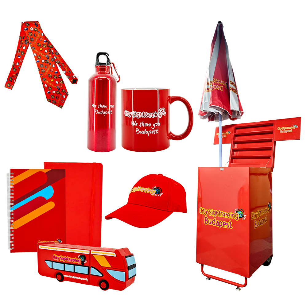
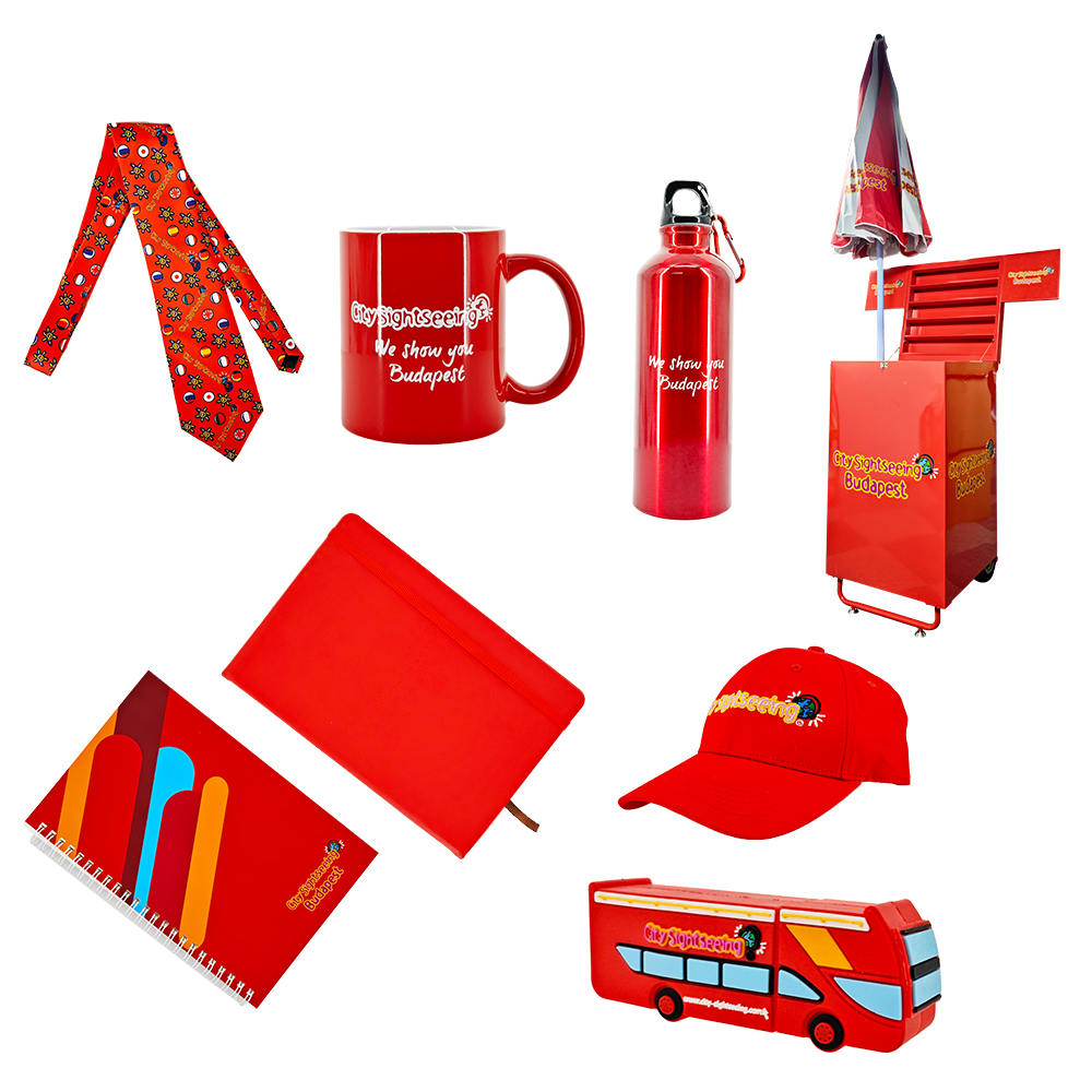
The wide range shots lay the family out as a flat three-tier grid on white. Two patterned ties, red ground with small repeated motifs, cross at the top. A high-gloss red mug with white interior and a centred print band sits beside a metallic red bottle. The umbrella-mounted cart anchors the right column. Middle row: a flat red document pouch with a faint centred embossed zone, and a red cap carrying an embroidered lockup across the front panel. Bottom: a spiral notebook with an arch-band graphic running along one edge and a small corner brand block, and a small red model of the fleet vehicle, windows pale blue, one thin text strip along the roofline and a horizontal band mid-side. Every item repeats the same two devices, a stacked wordmark and a small radiating-disc icon, placed once per object at the distance each is actually seen.
That layout is a merchandising brief in itself. Drinkware and stationery sell at the counter; headwear sells at the mirror; the tie and the toy vehicle are gift-shelf pieces bought for someone else. An operator that stocks all five price points from one artwork file can dress a kiosk, a shop and an online store from the same design office, which is the argument for ordering the range as a set rather than as five replenishment POs.
Read the same collage as a planogram and the ordering maths becomes obvious. The three cheapest units, spiral journal, bottle and cap, are the walk-away volume that funds shelf presence; the mug is the mid-tier giftable; the tie, pouch and model vehicle are the margin pieces that make the rack look like a store rather than a giveaway bin. Most operators start by testing one price tier at one terminal, then extend the winning lines fleet-wide once the season’s sales data exists. Because every line clears its own 100 pcs per design threshold independently, that test-and-extend behaviour is what the MOQ structure is built for; nothing in the programme forces a speculative order of the slowest seller just to activate the fastest one.
One more read of the same frame rewards attention: notice how the light print devices are distributed. The wordmark-plus-disc combination lands once per object, and the objects that live flat in a hand, notebooks and the pouch, carry their mark at the corner or the centre, while upright items, mug, bottle, cap, wear it at eye height on the front face. There is no second placement anywhere in the range, which keeps production costs to one plate per line and keeps the family coherent when a guest photographs three of the items together. Collage discipline like this is the cheapest brand consistency a tour operator can buy.
Two Anchors at the Till: Mug and Bottle
Before the individual items, one observation about how the two hero drinkware pieces photograph. Both appear once in the collages and once as standalone single-object shots, which mirrors how operators should actually think about the range: the collage is the shelf, the single shot is the SKU page. Your e-commerce images need the same logic, a family shot that sells the destination brand and clean single-item crops that answer the gift-shop listing at search-result zoom. The files here do double duty in that way, and when you order the programme we export artwork-ready placements per surface at the same proportions the photographs establish.
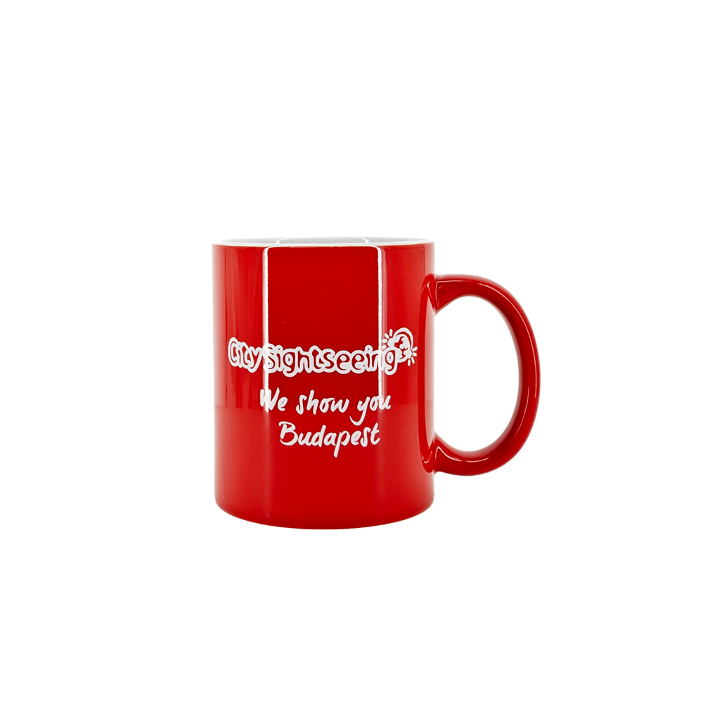
The mug is the highest-turn souvenir in outdoor-attraction retail, and the photographed one is spec’d accordingly: a cylindrical glazed ceramic body in saturated red, high-gloss with visible light streaks, white interior rim, handle at right, and the brand carried as a horizontal outlined band with the disc icon riding at its end, plus a loose two-line script block centred beneath. That stacked treatment is deliberate: a mug on a shelf faces the aisle with the handle to one side, and print that works at that exact rotation sells. Decoration is a fired decal or pad print on glaze; for counter stock that faces commercial dishwashers, the method gets chosen at sample stage rather than assumed, and both options are quoted against the same artwork placement.
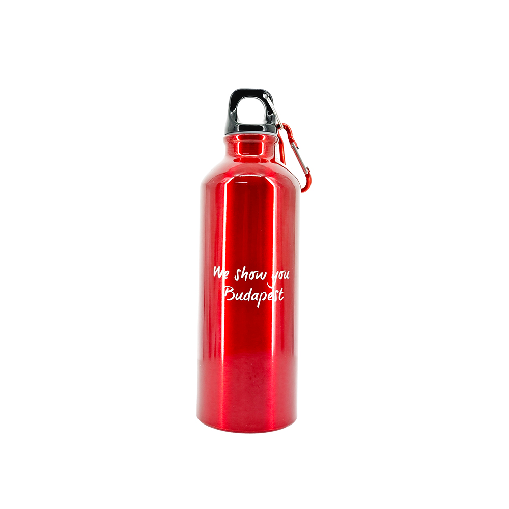
The bottle is the active version of the same idea: anodised metallic red body with a mirror sheen, tapered neck, black loop cap, and a red carabiner clipped through the carry loop, which moves it from desk object to bag attachment in one step. Its print zone is a centred two-line script on the upper body, small and clean because a cylinder in a bike cage shows every overprinted square centimetre. Capacity, lid spec and case packing are quoted exactly on request from the line sheet; what artwork needs is the seam position marked so the wrap never breaks the lockup.
Order the pair together and the till layout solves itself: mug facing the queue at eye height, bottle clipped beside it as the weather-variant upsell. When operators ask which drinkware piece should anchor the counter, the honest answer depends on who walks in. City-break guests buy the mug because it fits a suitcase and survives as kitchenware at home; coach-tour regulars buy the bottle because it rides the bag all week and repeats the route name to everyone in the seat beside them. The two pieces are not competing products, they are two different advertising cycles running from the same artwork file, and shelf placement should reflect that split rather than crowding one onto the other.
Stationery Tiers: Day-Trip Spiral and Keepsake Hardcover
Stationery carries the lowest unit price in the range and the longest afterlife, which makes it the tier worth over-thinking at artwork stage. A guest who buys nothing else will almost always leave with something to write on, and the object will sit in a kitchen drawer in another country for a decade, legible enough to remind its owner which city they stood in when they bought it. That endurance puts unusual responsibility on a cheap SKU: the print has to survive thumb-oil and bag friction, and the brand zone has to stay readable when the notebook is closed, stacked and half-buried. Both formats below solve that problem in opposite ways, and an operator stocking both covers both ends of the gift decision without a third product.
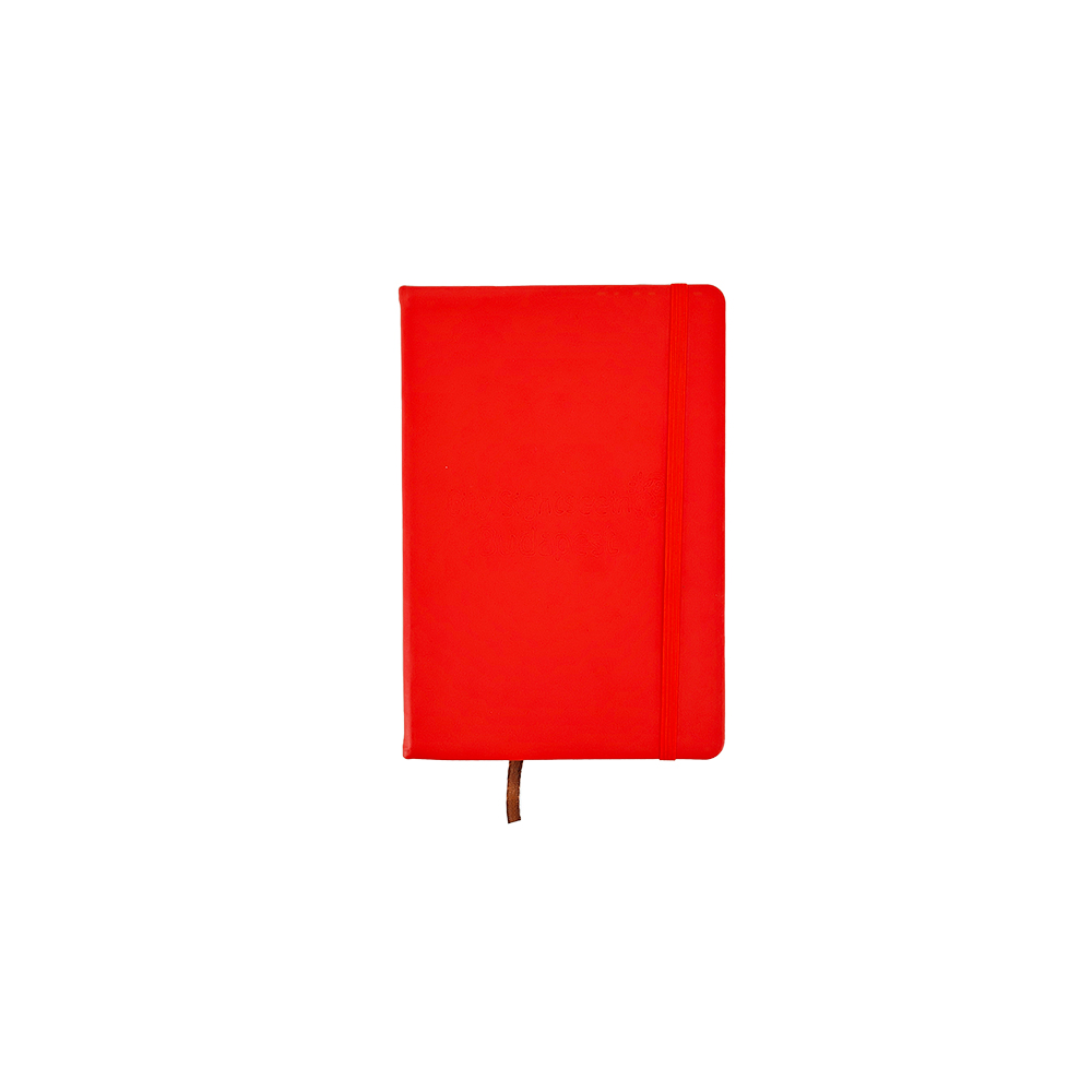
Notebooks do double duty in tourism: one for the trip, one for the memory. The range collages and the detail photographs show both formats in the same red language. The spiral version is a day-trip journal: coloured arch bands stacked along the cover’s left edge, brand block small at the lower corner, white wire binding running the bottom edge as photographed. It is the register-attach item, cheap to buy at impulse height, and it advertises the operator every time its owner writes a phone number in a café. The hardcover version is the keepsake: a red coated hardcover with right corners rounded, a matching elastic closure band vertical near the fore-edge, a tan ribbon tail below the block, and the lockup blind-embossed dead centre, tone-on-tone with no ink at all.
Emboss-only branding is the decision buyers misread most often, so state it plainly to your design office: nothing is printed on that cover, the mark exists as relief, legible at an angle and invisible in flat light. On a gift-shelf item it reads as quiet quality; on a promotional freebie it reads as a missing logo. When the notebook is merchandise someone pays for, the embossed route usually wins the margin conversation because perceived value rises without ink costs. The spiral’s printed arch graphic and corner block follow the opposite logic: loud, cheap to reproduce, built for volume. Ordering both from one artwork file means the same season’s design office produces a journal for the till and a diary for the gift box without two briefs. Page ruling, paper weight and cover finish are line-sheet decisions we walk through at sample stage, and the ribbon colour on the hardcover can be matched to a second brand tone if one exists in your file.
Wearables, the Vehicle Model and the Pattern Problem
The bottle deserves one more look before moving on, because it is the item the operator’s own staff use and the guest buys. The photographed example stands upright on white, black loop cap closed, red carabiner swung through the carry loop at its shoulder: this is the configuration that survives a day clipped to a backpack on a walking tour, and the loop-plus-clip pairing is why the cap model was chosen over a flat screw lid. Two lines of light script sit centred on the upper body, deliberately small, since a metallic cylinder shows every overprinted edge under sunlight. For staff stock, operators usually order the same bottle without the clip print and add the crew wordmark instead; both variants share the artwork sheet and clear the 100 pcs per design threshold as one design, because only the placed layer changes.
The cap is the simplest wearable: red twill, curved brim, the lockup embroidered horizontally across the front panel with the disc icon at its end. Crew stock and guest stock run from the same line at different quantities, and because embroidery scale is capped by panel size, the same mark geometry that fits the mug band fits the crown with proportion intact. The flat red pouch in the collage, leather-smooth with a faint centred embossed zone, is the corporate-tier companion: route-map holders, document wallets and crew lanyards all extend this pattern without new artwork.
Neckties carry the hardest version of one-lockup discipline: the all-over print. The photographed ties repeat small motifs across the whole blade, which means your pattern tile, not your logo file, drives production, and the corner mark has to survive the cut. We require a pattern proof at true scale in the mock-up round before any tie bulk is quoted, because a repeat drawn in a design tool rarely tessellates the way the finished blade will read. The fleet model vehicle is the collector tier: a moulded red double-decker with pale windows and print bands on the side that replicate exactly what a full-size coach wears. It answers the question every operator hears at the till: can I take the bus home? When the model and the real livery share the same side-panel placement, the answer photographs well, and that photograph sells the next unit.
Range Decisions per SKU
- Kiosk panel set: cabinet, wing and parasol prints sized to your fixture profile; frame colour and caster layout
- Mug body and interior colour, print method chosen per dishwasher duty, band and script zones at true rotation
- Bottle anodise colour, carabiner colour, wrap seam position for the script zone
- Notebook format split: printed spiral journal versus blind-embossed hardcover, elastic and ribbon colours
- Cap embroidery thread colours and front-panel lockup scale; pouch emboss depth
- All-over tie pattern tile with corner mark placement proven at true scale
- Model fleet vehicle livery matched to real coach side-panel artwork
Merch Range Spec Sheet
| Item | Custom tour merchandise gift set programme for operators and attraction gift shops |
| Set contents | Configured per pitch: wheeled kiosk with parasol, ceramic mug, carabiner bottle, spiral journal, embossed hardcover, cap, pouch, patterned tie, model fleet vehicle |
| Materials | Painted sheet-metal fixture with metal and swivel-caster base; glazed ceramic; anodised aluminium; card stock, wire binding and hardcover boards; cotton/poly twill cap; PU-leather face pouch; woven tie fabric; moulded plastic model |
| Colour | Signal red family with white interior and accent icon colours; alternate colourways per line on request |
| Logo | Pad print, decal, sublimation, embroidery, blind emboss or all-over pattern per substrate; free true-scale digital mock-up on each face |
| Packing | Polybag per piece, cushioned dividers for ceramic, export master cartons; retail-ready hang packing available |
| MOQ | 100 pcs per design (each line or colourway counts separately) |
| Sample time | 3-5 days |
| Lead time | 7-15 days after artwork approval |
| Capacity | 1,000,000 pcs per month across our gift lines |
Seasonal Timelines: Building Backwards from the First Coach Run
Tourism merchandising has one immovable date: the day the season’s first full-capacity coach leaves the terminal. Stock that misses it is discounted by July; stock that arrives early sits in a storage unit with damp risk. The order mechanics answer this directly. Artwork approval triggers production at 7-15 days; physical samples take 3-5 days ahead of that; the mock-up pack arrives within working days of a locked-up file. A six-week runway covers design office sign-off, one revision round and sea freight. The displayed figure on this listing anchors the 100-piece tier, and gift-shop reorders through the season draw against the same signed placement sheet, so replenishment never restarts the artwork conversation. Where the kiosk itself is new, quote its panels with the first range order: flat-packed boards travel with the cartons and the pitch opens dressed.
Packing, Freight and Multi-Site Distribution
Ceramics decide the packing plan. Mugs ship in cushioned cell dividers inside rated master cartons, and the carton label flags orientation because glaze chips at the rim are invisible until a tourist picks the shelf stock up. Bottles polybag individually with the carabiner unclipped so it cannot scuff neighbouring prints; notebooks flat-pack between stiff boards; caps stuff-shaped and bag in pairs to survive pallet weight. The kiosk’s metal body arrives as one protected unit with the parasol, pole and wings banded inside its own carton. Operators with several pick-up points can have stock split by site at our end rather than yours, and gift ranges sold through marketplaces get FBA labelling and prep done before departure. Freight runs by sea for the season build, air for the mid-summer gap-fill, DHL, UPS, FedEx or TNT for the single-terminal rescue.

Questions Attraction and Operator Buyers Ask
These come up every season with a fixed opening date already in the calendar, from gift-shop managers, tour-operator marketing offices and franchise merchandising teams alike. Most of them are really one question in five costumes: can a single design file survive a terminal, a coach, a shelf and a web listing without the brand drifting. The short answer is yes, if placement is engineered per surface at mock-up time rather than copied between them, and if every change you plan for next season stays a layer swap instead of a redraw. The last entry covers the artwork question operators reach too late: what changes when the fleet livery does.
Can we buy the kiosk and the merchandise in one order?
Will red ceramic mugs survive retail dishwashers at the depot café?
Can the model vehicle artwork exactly match our coach livery?
What happens to our set when the city route map or slogan changes?
Is a single-print blind-embossed notebook too quiet for brand promotion?
Adjacent Programmes Worth Comparing
The same one-lockup thinking runs through the rest of the gift sets category. Compare cafe and retail counter sets for the till-attach version of a branded range, company anniversary recognition sets for internal milestone programmes, and trade show booth uniform kits for the expo-floor equivalent of kiosk-plus-crew. Seasonal weather add-ons live on the umbrella and electric fan gift sets page, and boxed keepsake tiers worth shipping as a gift sit in the box-packed gift sets subcategory.
Open the Season Fully Dressed
Send the lockup, the opening date, the pitch list and your current coach livery; the true-scale mock-up pack across kiosk, mug, bottle, notebooks, cap, tie and model returns within working days. Start at the request-a-quote page, +86-15967739086, or [email protected]. Samples in 3-5 days, production in 7-15 after artwork approval, and the first full coach of the year pulls out past a till that already looks like the fleet.