Custom Printed Hardcover Notebooks | Full-Bleed Cover Art
$2.80
Custom printed hardcover notebook with edge-to-edge artwork carried across the front panel, the spine and both inside boards, plus the journal hardware mounted under the wrap before the case closes: colour-matched elastic closure, woven pen loop, twin satin ribbon markers, dot-grid interior and optional micro-perforated pages. Matte or soft-touch laminate as photographed; foil stamping, blind emboss, gloss varnish and spot UV quoted per design. MOQ 100 pcs per design, physical samples in 3-5 days, bulk production in 7-15 days after artwork approval. FBA labelling, unit barcodes and poly-bag retail prep run on the same line, so brand books and private-label stationery ship shelf-ready without a second repack stop anywhere in the chain.
A custom printed hardcover notebook succeeds or fails at the cover, and the cover work is where this page earns its place in the catalogue. We build rigid-board cases that carry artwork edge to edge — front panel, spine, wrap-around margins and both inside boards — then add the journal hardware those cases accept: elastic closure, pen loop, ribbon markers, micro-perforated sheets where the program needs them. The photographed sample is one art-led execution of that build; your file replaces the painting, and the same press routes carry a logo lockup, a pattern, a photograph or a foil monogram with equal fidelity.
This is the full-custom axis of the hardcover line: not a stock notebook with a stamp added, but the board, wrap, laminate, hardware and interior specified from one artwork package. Minimums start at 100 pcs per design, physical samples leave in 3-5 days, and bulk production runs 7-15 days after artwork approval — so a brand book for a book-fair drop or a retail private-label SKU can move from file to freight inside one season window.
Buyers arrive here from three directions, and the honest answer differs for each. A corporate gifting team wants a cover that carries a mark with the weight print gives it; a publisher or museum shop wants shelf presence that survives being handled under glass; a DTC brand testing a stationery line wants small-run flexibility with real binding, not the paper-over-foam softcover that photographs beautifully and dies in a drawer. The printed-board build answers all three because everything downstream — foil, emboss, edge colour, ribbon hardware — is mounted on the same decision made at board stage. What follows is that decision unpacked surface by surface, using the four studio photographs as the spec sheet.
What Full-Bleed Print on a Rigid Board Actually Takes
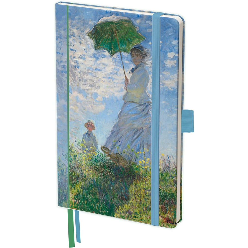
Look at the standing sample without reading it as decoration. The artwork runs to every edge of the front panel and continues around the spine, which means the print sheet is made oversized, wrapped over board, and turned in at the joints — the image has to be registered to the case, not just printed. Any design that crosses the spine (a panoramic image, a continuous pattern, a horizon line) needs artwork built with the spine geometry in mind, and we proof that wrap before plates: the mock-up shows which pixels land on the front, which disappear around the curve.
The photographed surface finishes low-glare, which is the difference between a catalogue cover and a desk object: a matte or soft-touch laminate over the print kills studio gloss and keeps fingerprints off dark fields. Gloss varnish is the other direction — it deepens colour and adds contrast on busy artwork — and spot UV over a logo is a third. All three are laminate-stage choices on the same base build, quoted per design. Corner radius is also visible in the photos: softly rounded rather than square-cut, which is a tooling decision, not a coincidence, and the radius carries through the board cutting stage.
Hardware That Rides Under the Wrap
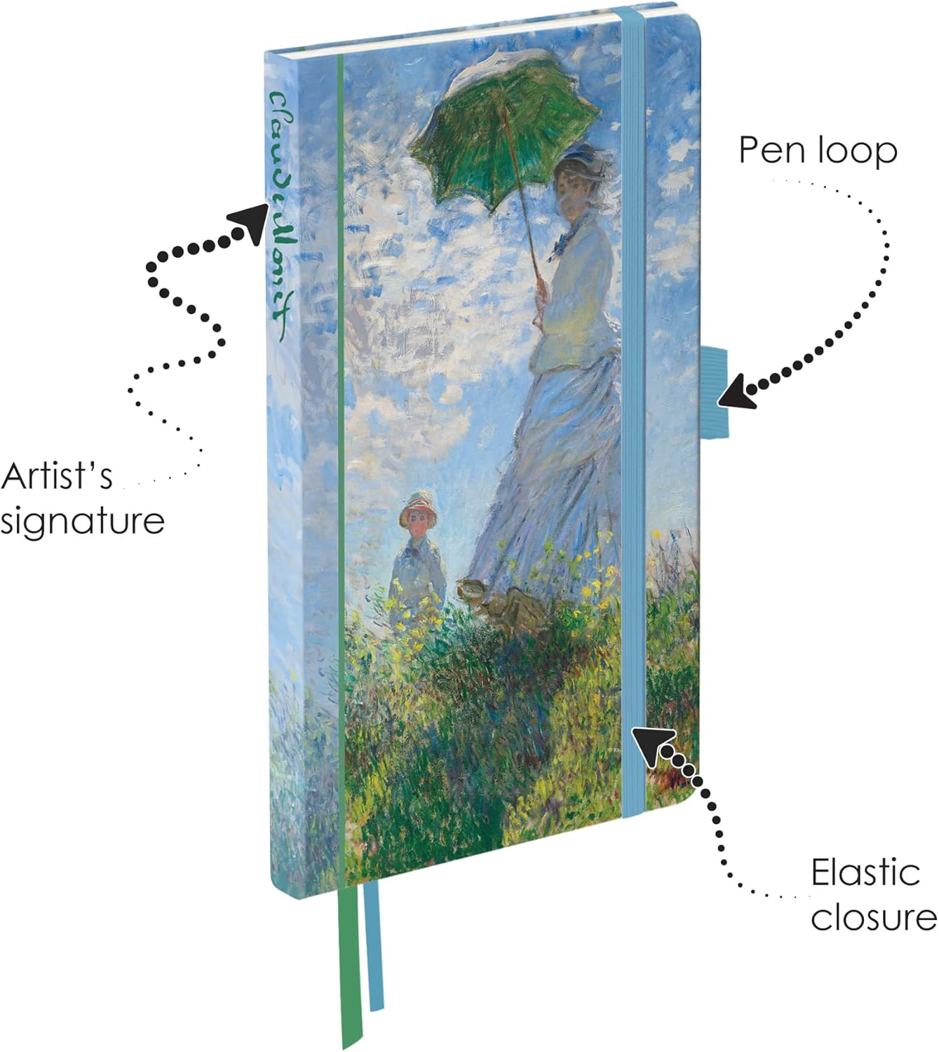
The annotated studio shot reads like a parts list, and that is deliberate. A sky-blue elastic closure runs vertically over the front panel, anchored under the turned-in wrap. A matching woven pen loop exits at the fore-edge so a pen sits against the board rather than loose in a bag. Two satin ribbon markers drop from the spine gutter, cut on the bias, and the artist signature prints vertically down the spine itself. Each of these elements is installed before the case shell closes — which is why they can be recoloured to your palette at sample stage and cannot be added after the book is built.
Swap the art for your brand and the same anatomy becomes a corporate spec: elastic and ribbons dyed to house colour, foil logo where the sample carries the signature, a pen loop when the notebook ships inside a welcome kit — and no loop at all when it sells as pure stationery. Nothing here is a decorative claim — every component named is visible in the photograph, and the quote for your build prices exactly the subset you tick.
There is a longevity argument hiding in the elastic, and retail buyers care about it. A closure band keeps the book shut inside a tote, which is where cover corners usually get knocked; the band takes the abrasion so the printed board does not. Ribbon markers do quieter work: a journal used for meetings or sketching gets reopened to the same context repeatedly, and a bookmark positioned by the reader keeps the book behaving like a tool instead of a stack of paper that fell open in the wrong section. The pen loop is the one component we usually advise testing in the sample round with an actual pen from your kit supplier — loop webbing tension varies with barrel diameter, and a fat marker pulling against a thin loop is the one hardware failure that shows up at month three rather than month one. Send the pen with the artwork and the sample comes back looped, so nobody discovers the mismatch after a pallet of gift sets ships.
Colour is the last hardware decision that actually costs money to change late. Elastic, ribbon and loop webbing are sourced in dyed lots, and matching a specific house colour means committing to the dye standard at sample stage, when a physical reference exists. The photographed sample pairs a sky-blue band against blue and green ribbons because the cover artwork suggested it; a brand program pairs everything against a Pantone chip and the sample round proves the dye under warehouse lighting, not studio lighting. This is the part of hardcover craft that photographs easy and specifies hard, and it is exactly what the 3-5 day sample exists to settle.
The Inside Boards Are the Unread Real Estate
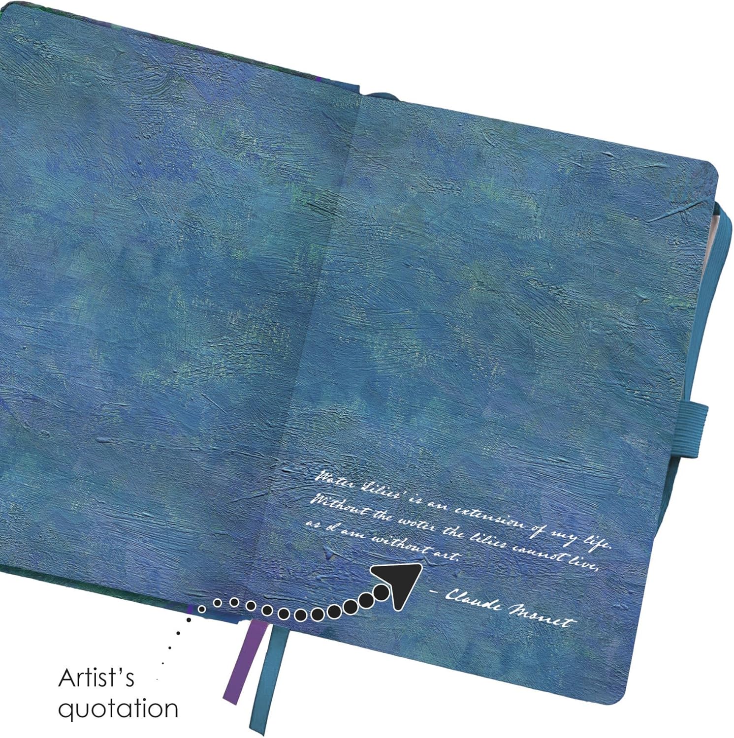
Open the cover flat and the artwork keeps going: both inner boards carry the painterly field, and the sample uses the right-hand panel to print a quotation in white script — attributed lines from the painter, set like a caption. That panel is the most under-used surface in brand stationery. It is what a reader sees first after the cover, it photographs beautifully for unboxing content, and it prints with the boards rather than as an applied endpaper, so it cannot lift at the edges.
Programs typically spend that surface on a founder’s line, a manifesto, a map, a product timeline, or the small-type legal block that has to live somewhere. Because the inside print runs in the same wrap stage as the outside, adding it does not open a second print process — it is artwork time, not machine time. The one discipline: keep the script or key copy outside the hinge zone, where board movement eventually cracks tight ink lines. We mark safe zones on your dieline during the mock-up so the designer learns this once, on our file, instead of on a pallet.
Two craft notes that separate a good inside board from a wasted one. First, dark field artwork on the inner panels shows board cut edges more than light layouts, so the wrap margin gets specified at proof stage, not discovered at inspection. Second, the quotation format visible in the photograph — short text block, generous margin, attribution line — works because it is set small and high-contrast against a painterly field; dense paragraphs against busy artwork turn to mud at journal scale, and no laminate saves them. If your inside panel carries legal text, a QR code or a serial number zone instead of copy, tell us at mock-up: contrast and quiet-zone rules for scannable codes get built into the dieline the same way, and a code printed too close to the hinge groove is the one inside-panel mistake that cannot be fixed by re-reading the artwork after plates exist.
The economics of the inside panel are simple once you count what brands currently spend around the product. Unboxing content, the inside cover of the gift, the first page of a journal a customer sees twice a day — agencies bill placement against those moments, and the inner board is one of them, printed inside the standard wrap for artwork time only. A founder’s note opposite the first blank page does the job of a printed insert card without the extra component, the extra hand in the kitting line, or the card that ends up in the recycling bin before the notebook is even inked. Programs that skip the surface rarely get to add it later: the boards arrive glued into the case, and an applied endpaper is a second operation with a second misalignment budget.
Inside the Book: Grid, Ribbon, Tear Line
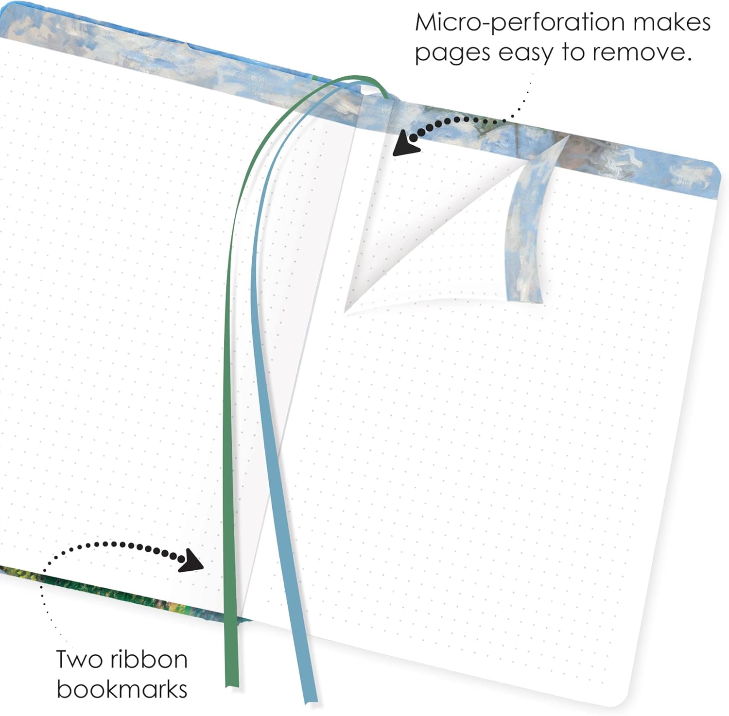
Inside, the photographed spread in the third sample photo shows the working interior. Pages carry a fine dot grid on white stock — the ruling planners and product teams default to, light enough to disappear under ink. Head and tail edges repeat the cover artwork in printed bands, so the open book still wears your design while a page is in use. Two ribbons hang in the gutter with chevron-cut ends, and the lifted page corner demonstrates the sheet line the caption states: a micro-perforation along the binding edge makes pages tear out clean instead of ripping ragged.
Perforation is a construction decision made before the text block is collated, which is why it exists as a spec option rather than a post-process. Journals ordered for meeting minutes, field reporting or classroom use often ask for it; retail keepsakes usually skip it. The dot grid shown is not the only ruling in the family — lined, plain and square-grid interiors are standard substitutions quoted against your artwork, and sheet count plus bond weight are not printed anywhere in these photographs, so both get quoted per format instead of asserted here.
Two details from the same frame earn their place in a buyer’s specification. The head and tail artwork bands prove that edge decoration prints before the block is cased, which is why it must be in the file at dieline stage rather than requested later — a text block arrives at the binder already trimmed, and nothing adds ink to three cut edges after that point without a second machine operation priced as one. And the chevron-cut ribbon tails are a finishing choice with a purpose: straight-cut satin frays at the tip after months in a bag, while the angled cut keeps the marker looking new in the exact place the customer’s eye lands when the book lies open. Small craft decisions like these are what separate a hardcover that reads premium on a book-fair shelf from a hardcover that reads generic under the same lights, and neither cost decision is visible to a buyer until it is specified — or missed.
The dot grid itself deserves one more procurement sentence, because it is the ruling most often chosen badly. Dot pitch and dot weight change how a printed page reads under a desk lamp and inside a scanned thumbnail; the photographed sheet sits light and widely spaced, which flatters product photography and stays invisible under graphite. If your program needs the opposite — a denser grid for drafting work — that is a screen change at artwork time and a line on the sample request. Whichever direction you take, the interior ruling is the customer’s daily interface with your brand, and it is the surface they form an opinion about within the first week; it belongs in the same review round as the cover, not after it.
Who Commissions This Build
Three buyer types keep returning to the printed-board construction. Brand owners running a book: a company narrative, founder letters or a product story laid out as a case-bound volume for clients and press, where the hardcover format says something a spiral book cannot. Retail and museum-shop private label: shelf-facing artwork across spine and front, barcode applied where the wrap stage can predict it. Publishing and events: conference programs, limited print runs, gift editions with foil and matched ribbons. The common thread is that the cover does merchandising work, so the print-and-wrap craft above is the actual product — the notebook inside is the vehicle.
What You Can Specify
- Cover artwork: full-bleed print across front, spine and wrap; your file, proofed against case geometry
- Surface: matte or soft-touch laminate as photographed, gloss varnish, or spot UV over key marks
- Extra board marks: foil logo, blind emboss or printed spine detail in place of the sample signature
- Inside boards: printed panels for quotation, map or manifesto, outside the hinge safe zone
- Hardware: elastic closure colour, pen loop on/off, ribbon count and colour, chevron-cut ends
- Interior: dot grid as shown; lined, plain or square grid quoted per build; micro-perforation optional
- Case size, sheet count and bond weight: quoted on request against your quantity tier
The Photographed Build on One Sheet
| Item | Custom printed hardcover notebook, rigid case with wrapped cover art and journal hardware |
| Size | Portrait case as photographed; alternate case sizes quoted on request |
| Paper & Ruling | White dot-grid sheets as photographed; lined, plain and square-grid quoted per build; micro-perforation optional; sheet count and bond weight quoted on request |
| Cover | Rigid board, printed wrap with full-bleed artwork on front, spine and both inside boards; rounded corners; matte/soft-touch laminate as shown, gloss or spot UV per spec |
| Binding | Case bound; opens flat at the cover spread as photographed; text-block construction confirmed at sample stage |
| Logo & Finish | Printed artwork as photographed; foil, emboss or debossed mark replace the sample signature at quote |
| Packing | Poly bag per book into five-ply export carton; retail barcode and gift-box prep optional |
| MOQ | 100 pcs per design |
| Sample time | 3-5 days |
| Lead time | 7-15 days after artwork approval |
| Capacity | 1,000,000 pcs per month across our gift lines |
Artwork In, Press Time Out
The path is mock-up first: send the print file (or a rough layout — our studio redraws it onto the case dieline) and you get a digital mock-up at no charge showing front, spine, wrap and inside panels exactly as the board will receive them. Physical samples take 3-5 days, and for hardware-heavy builds the sample is the honest proof — elastic tension, ribbon colour under your cover art, laminate hand-feel — none of which survive translation from a screen. After artwork approval, bulk production runs 7-15 days. The price shown on this listing anchors the 100-piece tier; retail and book-program quantities re-tier in the quote, where larger runs absorb the foil and perforation steps across more units.
Packing, Freight and Shelf-Ready Prep
Printed boards hate two things: corner hits and bright sun on a hot dock. Books go into individual poly bags, corners protected, into five-ply export cartons counted against your pallet plan; cartons for art editions can be spec’d with dividers so cover print never touches a neighbour’s laminate. Freight moves by sea for volume, air for deadlines, or DHL, UPS, FedEx and TNT express for samples and replenishment. Amazon sellers and retail distributors get FBA prep on the same line — unit labels, poly-bag barcode compliance, carton build to your shipment plan — so shelf-ready books go straight into the fulfilment network instead of a second repack stop.

Can artwork really print edge-to-edge over spine and inside cover?
Beyond printing, what cover finishes does this case accept?
Are the elastic band, pen loop and ribbons optional?
How many pages does the printed case hold, and at what paper weight?
What separates a 100-piece brand book from a retail private-label run?
Can we match a house colour across elastic, ribbon and cover ink?
Adjacent Builds Worth Comparing
Same binding family, different jobs: the grain-wrapped laboratory notebooks carry printed record fields and numbered leaves for compliance files; plain, lined and dotted hardcover composition books cover ruling-choice retail programs; the classic marbled composition line owns back-to-school volume; and thread-sewn planner books show the stitched-signature construction under simpler covers. Cross-category, the printed items catalogue and the notebook category hold the rest of the range, and printed hardcovers slot directly into the notebook-pen-USB gift set when the brand book ships as kit.
Send the File, Proof the Board
Artwork, quantity tier and hardware list to [email protected] or +86-15967739086 — or use the form below — and the first return is a wrap-accurate digital mock-up of your cover across front, spine and inside boards.