Custom Kawaii Food Stickers | Die-Cut Kids Reward Packs
$1.10
Custom kawaii food stickers: die-cut fruit, dessert and drink sheets with original smiling faces, built for classroom reward programs, goodie-bag fillers, scrapbook aisles and sticker-book publishers. Photographed samples show a twelve-sheet pack with printed cover card, a four-scene application set on mug, vase, breakfast plate and notepad, a peel-off detail proving individual contours on white backing, and a spec drawing marking real dimensions – motifs from 1.3 to 3.9 inches, sheet at 8.47 by 5.31. Face systems, eye styles and sheet counts are locked at mock-up; reward-tier builds quote plain and utilitarian when districts buy by the thousand. MOQ 100 pcs per design, free digital mock-up, samples in 3-5 days, bulk in 7-15 days after artwork approval. FBA prep, hang cards and express freight available.
Custom kawaii food stickers are the retail consumable that never needs explaining to a customer: a smiling pear sells itself to a seven-year-old, a scrapbooker and a café gift-shop equally. This page is written for the buyers who stock them – classroom reward programs, goodie-bag fillers, sticker-book publishers, novelty retail and party-supply resellers. Our press prints the format shown in every photo here: contour die-cut fruit, dessert and drink motifs with little faces, nested on white sheets, bundled into multi-sheet packs with printed cover cards. Sizes are not guessed; the last image on this page carries printed inch call-outs from our own product drawing, and the claims quoted along the way are the ones photographed on our own artwork files, confirmed further by physical sample before any bulk carton moves.
What the Pack Photograph Actually Proves
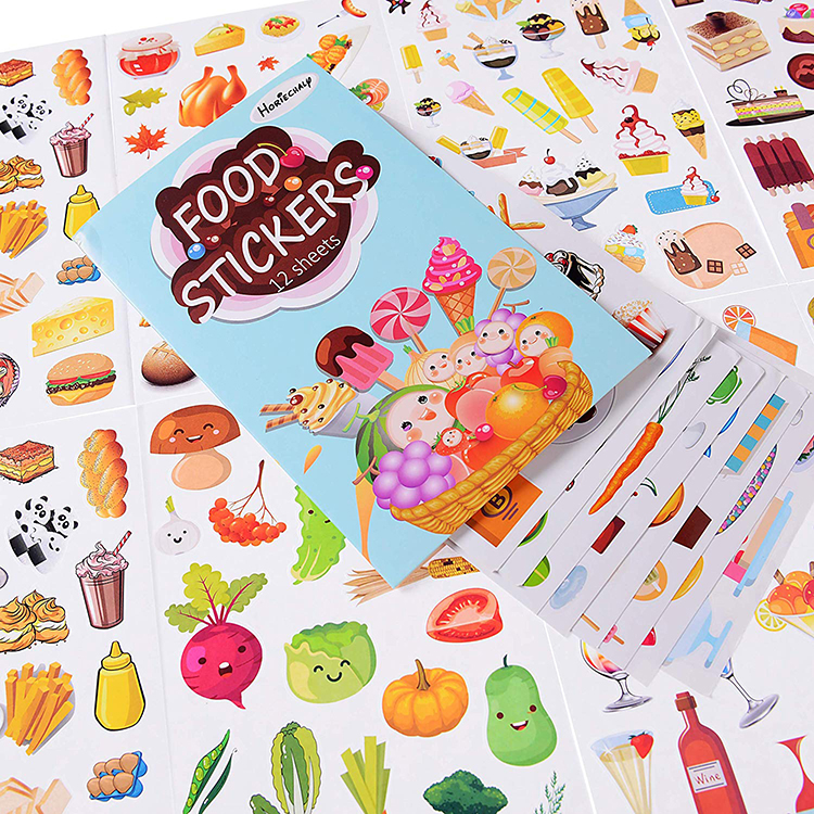
Open with merchandising, not adjectives. The first photo is a pack shot built the way sticker-book brands ask us to build it: a printed cover card lying diagonally across fanned sheets, the card carrying a title block and an illustration – a woven basket brimming with grinning grapes, orange, strawberry, kiwi, apple and an ice-cream cone – while the sheets underneath spread a sampler of the contents. The card marks the set at twelve sheets, and the fan behind it visually backs that number: savory shapes on one sheet, frozen desserts on another, produce rows on a third, drink props down the last edge. A shopper at a newsstand reads that composition in about two seconds, and two seconds is the entire shelf battle.
For a purchasing team, the photo is also an instruction manual on what we print per order: cover card artwork, sheet count, and per-sheet motif density all get decided together, because card cost, sheet stock and pack thickness interact. Twelve matte sheets with a card is one price and one SKU; six glossy sheets in a belly band is another. Say which shelf you are aiming at and the mock-up arrives configured for it rather than configured for our catalog default.
One construction detail the flat lay cannot fake: every motif carries its own soft die-cut contour, which is why the sheets lie open instead of curling. The print is flat colour with light hand-drawn shading – the watercolour-adjacent look that reads warm on cream notepads and stays cheerful, never plasticky, under store lighting. That style decision travels through your listing photos too; food die-cuts are bought almost entirely through pictures.
Why Faces on Fruit Out-Sell Plain Clipart
Anthropomorphism is not decoration here; it is conversion. Closed happy eyes, two pink blush dots, a small smile – the same three-stroke formula repeats across the pear, the sprout and the citrus in our photos, and buyers report the pattern with uncomfortable consistency: packs where several motifs have faces get applied, packs of plain fruit clipart get collected unused. The mechanism is practical. A child hands a sticker to a friend and the face does the talking; a journaler positions a blush-cheeked avocado at the corner of a to-do list and the mood of the page changes; a scrapbooker builds a breakfast-page spread out of smiling toast and grinning melons without drawing a single character themselves.
For brands, that behaviour has a hard procurement consequence: art direction matters more than piece count. Twenty coherent motifs in one face system outperform sixty random ones, because coherence is what makes a pack look branded instead of binned. We redraw your raster uploads into a consistent outline weight and cheek-blush system at proof stage, and we will happily strip faces from half a sheet if you want the mixed plain-and-smiling look – both layouts exist in the photographed sets, and both are defensible shelf choices.
There is a licensing-adjacent reason we stay face-disciplined too. These food characters are original, generic illustrations – no franchise ears, no trademarked sidekicks. Schools, retailers and marketplace sellers can stock this artwork without a compliance conversation, which is exactly the reassurance a reward-program buyer needs when a district asks who owns the cat on the apple.
Face design has its own engineering, and it is worth knowing before you approve artwork because it prices into the die-line like anything else. Three strokes do most of the work: the eye pair, the mouth, the blush pair. Eyes drawn as closed upward arcs read warm and survive the smallest print sizes; dot eyes read alert but fill in under half an inch; the blush is what makes the motif photograph cute instead of merely drawn, and it is the first element to disappear if a recolour saves ink badly. When our studio redraws a client’s food line into a consistent character set, the eye style gets chosen once for the whole sheet, not per fruit – a pack mixing arc-eye pears with dot-eye strawberries reads as a bin of donated art rather than a branded set. Ask for the face-system proof (three motifs in two eye styles) before committing your twenty-piece sheet; it is the cheapest conversation a food-sticker program can have.
One more quiet sales lever: the almost-edible effect. Buyers of food die-cuts are, more often than not, sticking fruit images next to real food – lunch boxes, bakery counters, breakfast-table journaling pages – and the reason the category outdraws abstract novelty packs is that recognition does the marketing for free. A child who likes pears notices a pear sticker; a customer who likes toast notices a toast sheet. Pick motifs your target shopper would actually eat, and the assortment argument with a buyer writes itself.
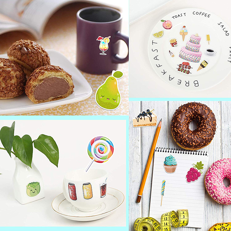
The application photo below was shot for a different purpose – proving decal behaviour on ceramic and paper – and it doubles as a merchandising brief. Read it as a buyer would: four scenes, one art system.
Surfaces That Sell the Pack: Ceramic, Glass, Paper
In those four scenes a green smiling pear stands upright on a tablecloth beside a dark mug, a leafy sprout face decorates the front of a square ceramic vase, a swirl lollipop pokes out of a gold-rimmed cup, and a cupcake, a raspberry cluster and a striped lollipop sit on a ruled notepad next to real glazed donuts. The pairing of printed prop and real pastry is the entire sales pitch: your customer is buying the ability to make their belongings look like that photograph. Note what the stickers are meeting – glazed ceramic, smooth vinyl-coated notepad paper, a matte clay pot – the same mixed surface set a classroom kit or goodie-bag filler will actually encounter.
Two of the scenes carry printed tableware rather than stickers, and honesty is part of the quote conversation: this line prints the adhesive decals, not the ceramic. If your program wants matching printed mugs or breakfast plates alongside the sticker packs, that is a coordinated gift-production ask – our wider printed-gifts desk handles it as a separate spec, and brands bundling both in one carton set routinely cut two suppliers down to one purchase order.
For kids-retail specifically, the application logic drives pack design. Reward stickers get stuck to hands, folders, lunch boxes and water bottles, which means two requirements the artwork photos cannot show: an adhesive strong enough for a textured lunchbox but gentle enough for a nine-year-old’s skin-level cleanup, and a laminate that survives a schoolbag full of crushed pencil shavings. We match those to a stock tier at quoting and prove it on the physical sample – the same 3-5 day sample the rest of this factory runs.
Die-Cut Sheets, Loose Pieces, and the Economics Underneath
Every buyer eventually asks whether to pay for kiss-cut sheets or loose die-cuts, and the honest answer depends on who peels them. Classroom teachers and goodie-bag assemblers want sheets: one sheet hands out thirty small rewards, the backing keeps pieces indexed in a drawer, and pre-cut-but-still-on-the-paper (kiss-cut) storage means no curling in a tote. Sticker-book publishers and novelty counters want loose packs, because the pile photograph sells variety better than a grid, and the perceived value of “look how many” moves units on a peg display.
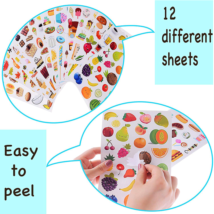
The feature graphic on this page argues the sheet side with actual print: two circular detail photos, one showing a fanned stack of twelve different food sheets, the other showing fingers peeling a single coconut round cleanly off its backing with the caption “Easy to peel” on the artwork. Those are photographed claims, not lab results – the peel force that makes them true is a paper-weight and adhesive combination we specify, and your sample is where the claim becomes your claim too. What the photo does prove structurally: individual motifs are cut one by one on the sheet rather than ganged into blocks, which is why the peeled piece keeps its contour on any curve it lands on.
The cost side is arithmetic worth showing a purchasing manager once. Kiss-cut sheets add a precision-cutting pass to a job that is already printing the same artwork; loose packs skip the backing-sheet lamination but add sorting and packing labour per piece. At 100-piece program scale the delta is noise. At the 5,000-piece reorder it is a rounding decision, and the third format – rolls for dispenser boxes – earns its tooling only above the tens of thousands. Start with the format your channel picks up first, not the cheapest per-piece number.
Sizes Worth Printing on a Product Page
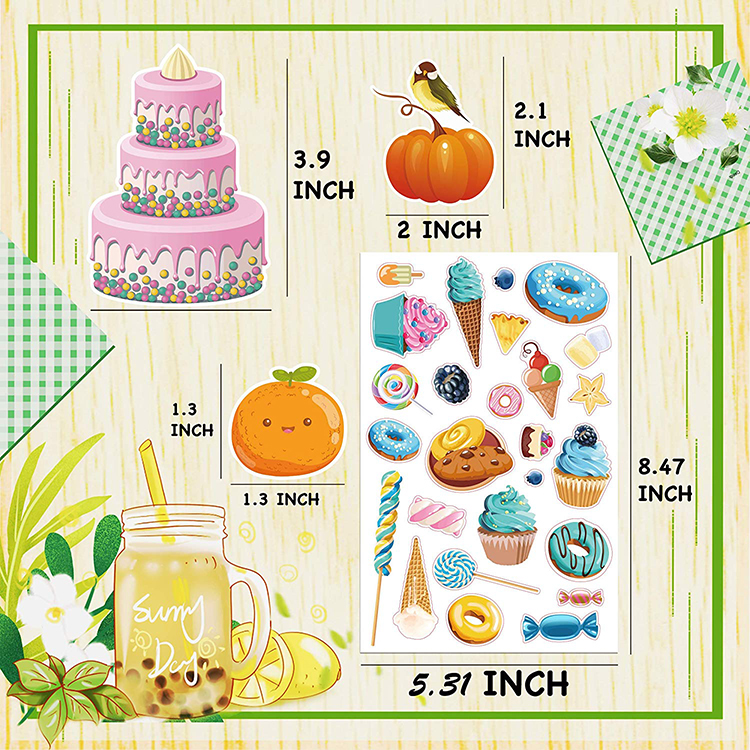
Most food-sticker listings say nothing about size, which is how “too small for a lunchbox” returns start. Our spec drawing does the opposite: the final photo shows the sheet on a cream wood ground with measurement rules printed straight onto the layout – a three-tier cake marked 3.9 inches tall, a pumpkin with a perched bird at 2.1 x 2 inches, a kawaii orange at 1.3 x 1.3, and the full sheet bracketed at 8.47 inches by 5.31 inches. Those numbers came off our artwork file, not a wish list, and they frame the working range of this product family: individual motifs between roughly one and four inches, sheets near postcard-plus scale.
Translation for assortment planning: the 1.3-inch class of shapes is the reward and goodie-bag size – cheap per piece, fits a pencil case, covers a name tag. The 2- to 4-inch class is the scrapbook and journaling size, where a single hero fruit anchors a page and the pack can be priced against sticker books instead of loose novelties. A twelve-sheet set spanning both bands gives one SKU the classroom and the desk, and the artwork file that spans both is only a layout conversation away from the art you already approved. Anything outside those brackets – mini sequin-scale pieces or wall-size fruit – is quoted on request from 1-inch mini to 6-inch shapes against your file.
Bubble-tea mason jars, lemon slices, watercolour sprinkles: the enlarged motifs on that drawing also show the illustrative direction our studio follows when a brand wants the “soft food” look rather than bold cartoon – thinner outlines, hand-painted texture, pastel shading. Both art directions print on the same stocks; the difference is a mood board email and one more proof cycle.
Pricing psychology on this line deserves a blunt paragraph, because food die-cuts compete with imported bulk packs that sell the count rather than the art. The trap is matching their number: a fifty-piece no-face fruit pile at rock-bottom price will outsell your twenty-piece character sheet on count per dollar and lose on repeat rate and review text, every time. The defensible move is to compete on the sheet the bulk pack cannot ship – a coherent face system, readable measurements on the listing, a pack format the channel needs (a twelve-sheet book for the newsstand, a single hero sheet for the till, loose minis for the bag filler) and honest dimensions printed where shoppers can see them. Our own spec drawing marks its numbers because that listing information is worth more than a discount; it converts the parent who worries the fruit will be smaller than the thumbnail and quietly abandons half-priced listings that never say.
Where the cheap packs do win – and this is useful – is the classroom volume tier: teachers who need a thousand tiny apples a term are buying a consumable, and they should buy it like one. Some of our largest reward-program orders are deliberately plain: one motif, one size, kiss-cut dense on sheets, minimal card. If your district is buying that way, say so in the RFQ and we will quote the utilitarian build instead of the boutique one; there is no shame in either format, and there is real money in not paying character-design fees for a sticker handed out forty at a time.
What We Customise on This Line
- Motif set: fruit, desserts, drinks, savory snacks – redrawn original artwork in a consistent face system, or production of your own characters
- Art direction: bold cartoon outlines or soft watercolour shading, matched across every sheet in a set
- Sheet count: sampler packs from 1 to 12+ sheets, with printed cover cards or belly bands
- Formats: kiss-cut sheets, loose die-cut piles, or single-hero sheets per motif
- Sizes: motifs from roughly 1″ to 4″ as photographed, full range 1″ mini to 6″ wall decals quoted on request
- Stock: matte food-safe-looking paper faces as shown; vinyl laminate options quoted on request for lunchbox use
- Adhesive: standard and gentle grades, chosen for hands, folders and ceramic alike
- Retail prep: hang-hole cards, shrink-wrapped units, barcode placement for shelf or FBA receiving
Spec Snapshot: Kawaii Food Die-Cuts
| Parameter | Typical configuration |
|---|---|
| Item | Custom kawaii food die-cut sticker sheets and packs for classroom rewards, goodie bags and scrapbook retail |
| Size | Motifs 1.3″-3.9″ as marked on our spec drawing; from 1″ mini to 6″ wall decals quoted on request; sheet shown at 8.47 x 5.31 in |
| Stock & Finish | Matte printed paper faces as photographed; laminated and vinyl stock options quoted on request |
| Cutting | Die-cut and kiss-cut individual contours; loose packs, sheets or multi-sheet sets |
| Printing & Artwork | Full-colour print; original motif redraw and face-system consistency included at proof stage |
| Packing | Sets bagged with cover card, counted into inner boxes and export cartons; retail hang cards and shrink options; FBA prep in-house |
| MOQ | 100 pcs per design |
| Sample time | 3-5 days |
| Lead time | 7-15 days after artwork approval |
| Capacity | 1,000,000 pcs per month across our gift lines |
From Mood Board to Pallet: Order Flow
Reward and scrapbook buyers rarely arrive with vector files; they arrive with a Pinterest board and a launch date, which suits our process exactly. Step one: brief plus artwork (or none) goes in, a free digital mock-up comes back showing motif set, sheet layout and pack composition at real scale. Step two: physical sheets in 3-5 days – peel one in your classroom, stick one on your own lunchbox, that is the approval meeting. Step three: bulk in 7-15 days after artwork approval, inside a monthly capacity of 1,000,000 pcs across our gift lines. Holiday goodie-bag programs behave like school terms: they cluster. Order the term-start batch early and let the mid-year restock ride the same die-lines.
Multi-school or multi-channel buyers should split programs across designs rather than ordering deep on one set: 100 pcs per design keeps a four-themed test at 400 packs and tells you, with actual shelf data, which food family moves before you commit a warehouse footprint to it.
Packing and Freight
Food die-cuts ship light but bulky in protected form: sets bagged against moisture for sea lanes, cover-carded packs banded so artwork does not scuff, inner boxes counted to your pack-out, five-ply master cartons palletised for DC receiving or FBA dimensions. Because retail orders are date-driven – back-to-school, holiday fillers – freight mixes freely: ocean for the season’s stock, air and express courier (DHL, UPS, FedEx, TNT) for the carton that missed a boat. Every shipment stages like the dock photo below: labelled, counted, photographed before pickup.

Buying Questions Specific to Food Die-Cuts
Can a twelve-sheet set count as one design for the minimum order?
Are these stickers safe for kids’ water bottles and lunch boxes?
How small can a reward sticker get before production complains?
Can you match our existing brand characters to the food style?
What does a goodie-bag program look like as a purchase order?
The Sticker Shelf This Pack Sits On
Food die-cuts print beside every other format in our sticker category, and gift programs that need a premium touch pair them with gold foil seal sheets – same pack-out, different finish. Stationery retailers usually stock the kids set opposite our weekly planner icon sheets, because one shopper buys both. When a brand extends from paper into gear, the durable vinyl decal and removable sticker lines carry the same artwork to bottles and windows. Birthday programs pull favours and tableware from the party items category; everything above lives under the printed items catalog on one order desk. Start the mock-up from the quote page with your motif list and shelf date.
Last tip from the sample table: photograph one sheet stuck on one real lunchbox before approving the run. Food die-cuts are sold in kitchens, not studios – and the kitchen decides the reorder.